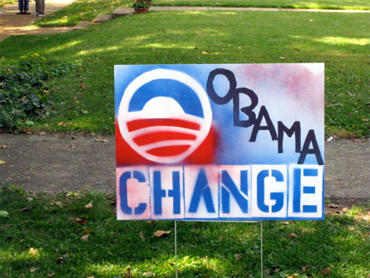
Charlotte Vieth, homemade lawn sign, St. Louis, Missouri, October 2008. Photo by Erich Vieth.
I was talking recently with a group of graphic designers. The subject was good work: not doing it, but how to get it accepted. Designers like to complain. We cast ourselves as embattled defenders of good taste and inventive ideas; arrayed against us are armies of insensitive clients, determined to thwart us, whose pigheadedness can only be defeated by dedication, cunning and guile.
We traded war stories for a while, but one seasoned designer in our midst was silent. We finally asked him what tricks he used to get good work done. “Well, I guess I’m lazy,” he said. “I just make sure all my clients are smart people with unique messages and good products. The rest is easy.”
The rest is easy. Looking back at the design work that led to Barack Obama’s historic victory in November 2008, I wonder if that was the trick. Although much has been made — rightly so — of the ingenious and adaptable “O” logo developed by Sol Sender’s team, Obama himself was his own best logo. Young, African-American, charismatic, change wasn’t just a message, it was the candidate’s very embodiment. When it was all said and done, Barack Obama was a smart guy with a unique message and a good product. And what designer wouldn’t wish for that in a client?
Selling change isn’t easy in a world that tends to prefer the comfort of the familiar. We all know what a revolution looks like: handmade signs, scrawled graffiti, the voice of the people. But Obama’s campaign was the opposite. Reportedly, the candidate resisted at first. “He did not initially like the campaign’s blue and white logo — intended to appear like a horizon, symbolizing hope and opportunity — saying he found it too polished and corporate,” reported the New York Times. But David Axelrod and his team prevailed. They must have known that the revolution, when it finally came, would have to be wrapped up in the most comprehensive corporate identity program the 21st century has yet seen. And it worked, as Designing Obama, the new book from Scott Thomas, Design Director of New Media for Obama for America, reveals.
Like every other graphic designer I know, I watched the live images of campaign rallies from Toledo to Topeka to Tallahassee with a growing feeling of awe. Obama’s oratorical skills were one thing. But the awe-inspiring part was the way all of the signs were faithfully, and beautifully, set in Hoefler and Frere-Jones’s typeface Gotham. “Trust me,” I told Newsweek back in February 2008. “I've done graphics for events — and I know what it takes to have rally after rally without someone saying, ‘Oh, we ran out of signs, let's do a batch in Arial.’” But it isn’t just strict standards and constant police work that keeps an organization on brand. It’s the mutual desire for everyone to have every part of the effort look like The Real Thing. At the height of the campaign, my daughter asked me if I could design a flyer for a friend’s Obama benefit party at a little bar in Hoboken, New Jersey. We took the text and reset it in Gotham, downloaded the O logo, and put it together in minutes. “Wow,” my daughter said. “It looks like Obama’s actually going to be there!” Exactly.
The same thing was happening all over the country. In a world where access to digital media and social networks is becoming increasingly ubiquitous, Obama 08 became the first Open Source political campaign. Shepard Fairey’s “Hope” poster — an icon that’s destined, if you ask me, to occupy the 2008 slot of any historical timeline drawn up a hundred years from now — sits at the top of an astonishingly vast collection of posters, websites, buttons, You Tube videos, and even pumpkins, some generated by professionals, some by ordinary citizens, all of whom motivated by the urge to create a sense that their candidate was actually going to be there.
Political operatives will study this campaign and its design program for years, trying to unlock its secrets. Many will copy it. But few will capture its magic. It seems so simple, doesn’t it? A good logo, consistent typography, get everyone to join in. They’ll have all the ingredients in place except the hardest one: the client. You need a smart person with a unique message and a good product. Then, like the fellow said, the rest is easy.
This essay has been adapted from the introduction to Designing Obama, a 360-page book by Scott Thomas, which is available for preorder now.
