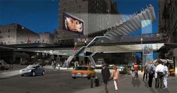
The High Line competition entry, Field Operations and Diller, Scofidio & Renfro, 2004
The winner of the competition to transform New York City's High Line - an abandoned elevated freight track that winds among the buildings of lower Manhattan - has been announced: a team led by landscape architects Field Operations and architects and planners Diller, Scofidio & Renfro. (The extended team includes my partner Paula Scher, a long time consultant to Friends of the High Line.) And with the announcement comes a vision of what, presumably, we can expect. A rendering of the project viewed from street level at 23rd Street and Tenth Avenue reveals a dreamlike urban wonderland of skateboarders and film buffs, suspended above the sidewalks in magical equipoise beneath the climatic sequence from Kubrick's 2001: A Space Odyssey.
Predictably, the team's renderings have come in for their share of criticism from cynical New Yorkers who claim with absolute assurance that whatever the finished product looks like, it will never look like this. But, for architects, the rendering has a completely different purpose than the blueprint. The latter governs the nitty-gritty of construction, the former is designed to excite the imagination.
Highlights, that magazine you may remember from your childhood visits to the dentist, had a feature called What's Wrong with this Picture? A child could play the same game with FO/DS&R's 23rd Street rendering. The auditorium seats for the outdoor cinema have no visible means of support. Neither does the movie screen itself. The elevator from street to High Line rises in a transparent glass shaft without the help of machinery. The graceful stairs have no handrails. The cinema has no projection booth.
And the whole thing looks incredibly cool, which is undoubtedly the point.
Architects have a real challenge. They have to make people believe in - and accept, and support, and pay for - a reality that lies far in the future. And that reality is built incrementally: all the renderings submitted for the High Line competition, no matter how convincing, are sketches to show general design intent rather than fully developed proposals. Unlike their lucky graphic designer cousins, architects can't show their clients a same-size prototype with every detail in place. That's why so many architects compensate with out-of-scale personalities: it takes real personal magnetism to make a bunch of suspicious people give you a lot of money to remake the world.
The architectural rendering is central to this process. Libeskind and Childs's design for Ground Zero's Freedom Tower is usually shown from far across New York Harbor, the better to emphasize the relationship of its assymetrical crown and the raised arm of the Statue of Liberty; this exotic viewpoint is the clearly the money shot. Philip Johnson's AT&T Building became a post-modern cause celebre because its Chippendale profile was presented, again and again, in point-blank Palladian elevation; no matter that no one has ever seen the real building that way, or ever will. Again and again, architects present their offerings in splendid isolation, editing out anything that inconveniently impedes the view, adding those props that support the rhetorical theme.
In some cases, the renderings themselves have acquired a life of their own. Michael Graves and Zaha Hadid became famous through what has been unfairly dismissed as "paper architecture." Before them loom artists like Claude-Nicolas Ledoux and Hugh Ferris. who created extraordinary - and imaginary - drawn environments that anticipated, influenced, and in some cases, superceded, reality.
"Make no small plans, for they have no magic to stir men's blood." There isn't an architect alive who can't recite Daniel Burnham's famous admonition. It's a long, torturous path from sketchpad to ribbon-cutting. It is the fever dream of the architectural rendering that sustains us on the journey.
