Albert Einstein once wrote that time and space are only modes by which we think — not conditions in which we live — but he might have reconsidered this supposition had he lived to see Microsoft's new foray into weblog development, introduced earlier this week to minimal fanfare.
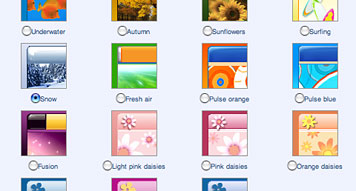
Microsoft's "Spaces" brings the concept of incipient suburban sprawl to the blogisphere. Its templates are minimal and unappealing, streamlined with the rounded edges that resemble so many computer applications. But what's worse are its implicit editorial expectations: photos and music (segregated, each comprising its own category) let users post their albums of pictures, or songlists, or wishlists as a disenfranchised bar of buttons. There is nothing to allow — let alone encourage — a more integrated platform for words and pictures, or, for that matter, real discussion and outside input. These aren't spaces: they're straightjackets, offering little if anything original in the way of advancing social, conversational, editorial or critical dialogue.
When I was a child, space was often described as the ultimate frontier. I was never quite sure what the last one had been — surely something important had taken place between Westward Expansion in the 1860s and the lunar landing a century later — but as far as I was concerned, space was a concept I could never quite wrap my mind around. My older sister, already courting the mercurial vicissitudes of teenage malaise, often revealed a fondness for such phrases as "spacey" — or it's more lyrical variant, "spaced out" — which I came to equate with a kind of comatose state you could only attain if you no longer had your name sewed into the collars of your shirts. If space was the ultimate frontier, I felt certain that just surviving childhood — with its attendant melodramas, most of them played out with my sister in the privacy of our own home — was the penultimate.
Years later, as a freshman in college, I studied architectural theory, where I read Gaston Bachelard's The Poetics of Space with the kind of obsessive zeal of the newly converted. I'd finally come to realize that spatial awareness had a deep and complex relationship to questions of taste, matters of cultural interpretation and formal expression. Here, understanding space meant questioning things like the idea of shelter, the notion of enclosure, the illusion of intimacy. Frank Lloyd Wright once wrote of the "space within" as "the reality of the building," but as I began my professional life as a graphic designer, the spaces I came to embrace were perhaps less about 3D than 2D, less about construction and more about composition — first in print, and subsequently, on screen. To the extent that the relationship between time and space might be said to characterize the very essence of modern thought, my own little metaphysical odyssey in spatial awareness may seem trite, even inconsequential. But don't we all struggle to reconcile these polarities, to some degree, as we grow more comfortable (some might say even passive) with the role technology plays in our lives? Weblogs may not, by their nature, connote the notion of "shelter" any more than a home page really looks like home: but at the same time, designers implicitly understand — and by conjecture, appreciate — the idea that customization means more than choosing backgrounds with daisies. And if blogging has any real future, and its design permutations have any impact upon that future, we should.
Marshall McLuhan once observed that whereas tribal man had deemed space an uncontrollable mystery, it was time that dominated our contemporary preoccupations. If Microsoft displayed its marketing genius by introducing "Spaces" three weeks before Christmas, its failure as a compelling editorial product — as evidenced by its restrictive format, its templated narrowcasting, its uninspired design parameters — illuminates its ultimate weakness: these spaces have nothing to do with space, in all its rich, fascinating and deeply human complexity. (Westward, Ho, Ho, Ho? I don't think so.) Perhaps the next frontier isn't space, but meaning. Or at the very least, smarter design solutions.
