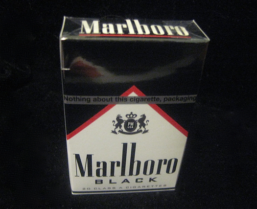
At my local convenience store yesterday, Marlboro Blacks caught my eye. No surprise, given that a pack was on prominent display. Cursory Web investigation indicates that this product is only selectively available, perhaps in a testing phase, but I find it rather fascinating. Pairing the notion of cigarettes with the word “black,” underscored by packaging, called to mind a variety of associations, none of which might sound like a good idea — lungs blacked by smoking, darkened teeth, poisoned bodily systems, the blackness of death itself.
All of which sounds like new-product suicide by design. But is it?

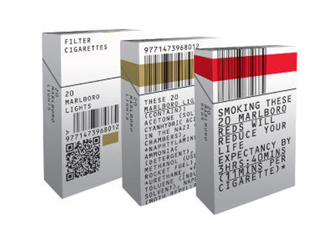
Speculative package design by DJ Stout
Marlboro Black immediately reminded me of a two sets of speculative cigarette-pack designs from recent years. One is from DJ Stout, of Pentagram. After a new set of smoke-marketing rules was devised in 2009, The St. Petersburg Times asked Stout how manufacturers might respond, graphically. Stout suggested that “tobacco companies should embrace the restrictions and make cigarettes look truly dangerous.” Basically, everybody already knows that smoking is bad for you, so instead of trying to dodge the ever-expanding rules for repeating this point to consumers via design, Stout said, “just transform the whole cigarette pack into a three-dimensional warning label.”

Speculative package design by Build
Separately, Build, in an exercise for Icon, reacted to UK anti-cigarette legislation with a “debranded” pack — in this fiction, the cigarette-maker can offer little more than an anti-smoking warning, and/or a list of scary ingredients. (Note that both Stout and Build used Marlboro as the basis of their riffs.)
Marlboro Black, to me, offers a more subtle articulation of precisely the pack-as-warning strategy suggested by both imaginary designs above. It’s striking that the flagship Marlboro is known by its dominant packaging color — “Reds” — and I wonder if Philip Morris has long wanted to formalize and extend that idea across a spectrum of smokes. Marlboro Pink would be out of the question, of course, since it would appear to be sending a signal the Hello Kitty crowd. But the interesting thing about Marlboro Black is that it’s a color that speaks to the hardcore — the defiant smoker, undeterred by all the negative connotations I noted above, pleased to blow smoke in the face of nanny-state condemnation of the habit. After all, cigarettes have long connoted rebellion, and no color deepens that association better than black, the color of motorcycle jackets, pirate flags, and villiainy.
Amusingly, a disclaimer on the zip ribbon says: “Nothing about this cigarette, packaging, or color should be interpreted to mean safer.” Who would make that interpretation? The pack’s visual implication is that this is a particularly unsafe product. (At least that’s my interpretation; there’s no actual information about what makes a Black different from a Red — it just says “special blend,” which is obviously a meaningless phrase.) It functions as graphic design jujitsu: Yes, this is dangerous, mortally so; and that’s why you want it.
