The "pinwheel of death," via Polyvore.
The spinning rainbow circle informing a Mac user that his or her device is working on a problem, mild or severe, is sometimes informally referred to as the “pinwheel of death.” It’s a bit of a stealth icon: A symbol that’s become almost as recognizable and meaningful as a logo, even though it wasn’t really designed to take on that role. It’s not quite at the Fail Whale level of emblem-of-not-working. But I’m sure that Apple would just as soon not see the thing become so familiar that it can serve as the basis of a comedy bit at TED.
I’ve always wondered if the pinwheel intentionally references the color-bar version of the test pattern that I remember from childhood — the image that wordlessly told us to “please stand by.” (At least that’s my color-bar association, though I realize “SMPTE bars” serve a color-calibration function.) I can’t remember the last time I encountered color bars on an actual television set, but it’s a visual cue that I see referenced all the time; there’s a sort of nostalgia to the image, I think. Or maybe spinning wheel’s color scheme is a lingering reference to the rainbow pattern Apple used to use in its logo. According to the surprisingly interesting “spinning wait cursor” Wikipedia entry, the icon originated at NeXT, the computer company Steve Jobs ran between his Apple stints.
Whatever the intent, “please stand by” is a fair summation of what the pinwheel communicates. The video from TED, linked above, shows Improv Everywhere having fun with this signal, as an ersatz presenter finds himself with a slide show that won’t load; the uncomfortable moment he and the audience spend staring helplessly at the pinwheel is resolved with a silly dance number that’s almost a celebration of this colorful icon of the techno-glitch. The pinwheel is also referred to sometimes as a “beachball,” and this figures into the performance. It’s not the best thing Improv Everywhere has ever done, but I like the idea of converting the pinwheel of death into a focal point and a creative inspiration. (For a more subtle reuse of the pinwheel, see this amusing GIF.)
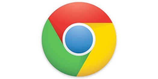
But mulling this while I watched the TED video on YouTube, I noticed something odd: an ad off to the side for Google Chromebook. (These are laptops running Google Chrome OS; Chrome may be better known as Google’s Web browser.) I was struck by the resemblance of the Chrome logo to the pinwheel of death.

Screen shot from TED video viewed on YouTube.
I can’t imagine this was intentional. Nobody would consciously set out to reference a graphic symbol associated with waiting, and possible failure.
Unless, it’s some sort of incredibly roundabout attempt on Google’s part to subconsciously remind us all that Apple products aren’t perfect? Okay, probably not. And maybe I’m just on a tangent here, and should get back to work on more substantial matters. Please stand by.

Previous examples of stealth iconography: The Google Maps pin, and the waveformh
