I can’t be the only person who feels slightly embarrassed when I swipe — or, in particular, pinch — the touchscreen of an iPad. The gestures look ridiculous to me when I see other people performing them. Plus, they make me feel I’ve been somehow trained to operate this expensive device, touching a machine in a way I’ve never done before because these are the terms the machine has set for me. Perhaps I should just be thankful that Apple doesn’t make us kiss its products before we can operate them.
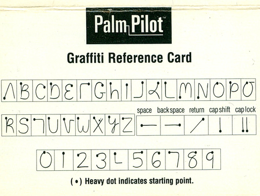
Anyway, I’ve been brooding about this for a few days, since I randomly encountered, in a box full of dusty computer/device manuals and the like, the “Graffiti Reference Card” and stickers that came with a Palm Pilot I owned years ago. It felt like discovering evidence of a dead language. Look at these evocative and mysterious interaction-design runes:

For those of you who don’t recall, or who simply ignored it, Palm was for a time a leading brand in the “personal digital assistant” market, enjoying a fair amount of success with its digital address/calendar devices. These products did not, obviously, reach the cultural-phenomenon level of Apple’s iThings, but they were certainly more pervasive than, say, the Newton.
Today it seems absurd to purchase and carry an object that does little but hold digitized calendar and contact information, functions that are afterthoughts on modern cell phones. But what’s far more amazing to me is the notion of demanding users adjust their gestural relationship to the alphabet itself.
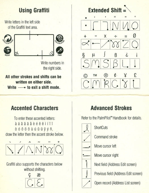
To add new entries to the Palm Pilot, you could use your computer and sync them to the device. Or, if you wanted to add something “on the go,” you could write it onto the screen with a stylus. But that involved mastering this uncanny alphabet. I was never very good at it, and ultimately found it more efficient to write things down (in traditional English, with a pen, onto paper) and add them via the desktop software later. I have no memory at all of the “Advanced Strokes” offered on the instruction card (with the daunting directive to refer to the Palm’s “handbook” for “details”). I’m astonished to see that it was possible to add accent marks and a variety of specialty characters.

At the time, Palm’s “Graffiti” language was seen as an improvement over previous versions of such software. But I’m less interested in the overall history of handwriting recognition and the stylus and so on — or its progress since then — than I am in this little graphic time capsule. I love the way many letters are somewhat recognizable but incomplete (like “A” and “K”) while others seem harder to comprehend without looking at adjacent letters to deduce what they represent (“F,” and “T,” for instance).
It seems unnatural to have invented symbolic stand-ins for the alphabet. Then again, the alphabet itself is a symbolic stand-in; the word “tree” doesn’t reflect the reality it refers to any more naturally, as it were, than its Graffiti Alphabet equivalent. (I poked around a little to see if someone has devised a type-translator that would allow me to render words in a sort of Graffiti Alphabet font, but I came up empty.)
And I guess this is what the swipe and pinch and stroke and poke of touch-screen technology really transcends. At times it feels unnatural to me to interact with a gizmo this way, but to be honest, it often doesn’t feel unnatural at all; most of the time, I hardly think about it. Probably what matters more in judging post-language touch-screen navigation — and this can be a litttle unnerving — is watching a toddler, too young to speak, but evidently hard-wired to swipe and poke, navigate a touch-screen device. No reference card required.
Speaking of which, having discovered these artifacts, I'm not quite sure what do with them. Although the card seems like evidence of something, I suspect I'll throw it out. But I did find a use for the stickers: They're affixed, now, to the back of my iPad. A little joke that I'm sure anyone who notices will find perfectly inscrutable.

