Vogel always had a love for old signs, but began his career about 30 years ago hand-setting headline type for an advertising agency on the now “ancient” PhotoTypositor. With time, he rose in the ranks to become a creative director until 1999, when he opened a small, furniture-making business he named Nutmegger Workshop. That slowly evolved into his full-time business today — an artisan of high-quality, custom signs and vintage sign reproductions.
Vogel accepts commissions and will paint whatever you want on a sign. But when he is not busy producing custom orders, Vogel says he gets to paint the signs he finds in old photographs — the ones he loves to create the most.
Bravo, Peter Vogel.
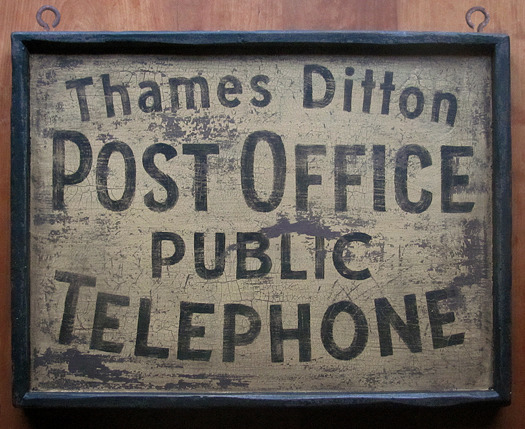
A 1912 postcard from Surrey, England was our latest inspiration to celebrate the simple handpainted letter form. Busy municipal sign shops were once staffed with career signwriters and eager apprentices, and their unadorned works were hung throughout villages by the hundreds. The human hand brought warm personality to the most mundane of signs with nuances that can only be appreciated now that the golden age of the signwriter has passed.
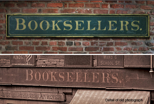
Reproduction of a sign found on a 19th century photograph.
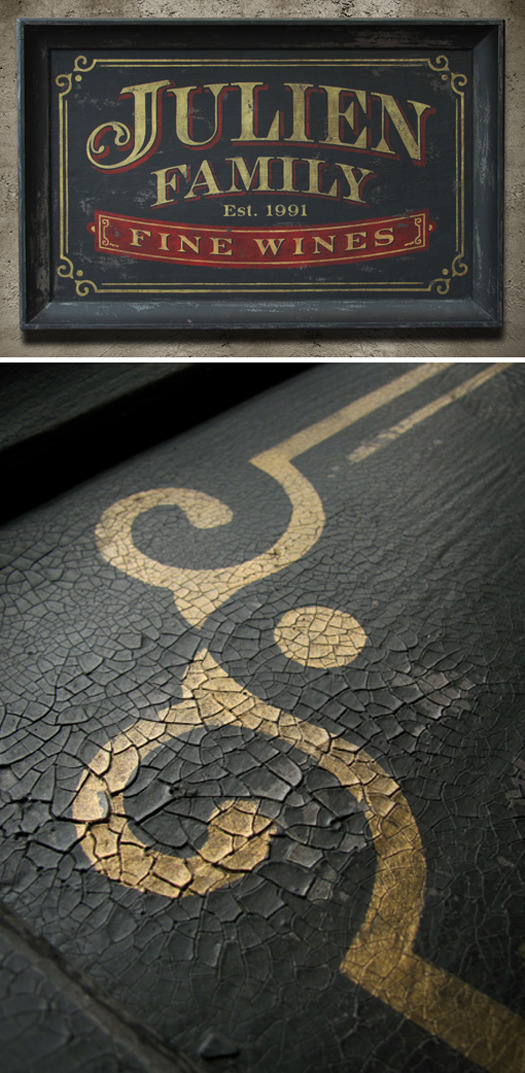
Commissioned sign
After several years of designing and building, our clients finally moved into their dream home. He’s an avid wine collector, and she surprised him with this housewarming gift to hang outside his spacious, exquisitely appointed wine room complete with floor-to-ceiling 1,500-bottle storage. This sign is generously sized at five-feet wide and features a deeply beveled handcrafted, shop-made frame. Original design, size is 60” x 36”.
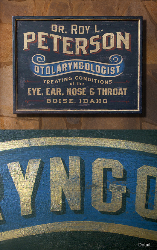
Commissioned sign
An eastern Oregon doctor and his wife thought it best to honor his grandfather when deciding on an art piece to hang above their stone fireplace. Dr. Roy L. Peterson (and his father as well) worked as a doctor in Boise, Idaho generations ago, often flying to remote backcountry areas to treat his patients. Original design, size 42” x 32.”

The Bike Commuter, one of Portland, Oregon’s newest bicycle shops, recently opened in the historic 1907 Sellwood Bank building. Creaky floor boards and distinct period details add historic flavor to the interior space — and the double-doored, walk-in bank vault still occupies the basement, now re-commissioned to protect stockpiled inventory. As the official bike mechanic for Nutmegger Workshop, we thought we’d make them a sign to show our appreciation for their trusted service. Original design.

A Portland, Oregon patent attorney’s wife decided his firm’s lobby needed functional art with a bit of scale to fill a void that had needed attention for some time. Our instructions were to design a vintage-style sign that “looked old — but not damaged.” A refined black-and-gold combination with classic early 1900s letter forms make for a warm and trusted greeting. Original design, 66” x 23.”
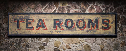
This near-replica was inspired by a weathered sign above an old shuttered tea room in London’s Camden borough. New tenants recently painted over the entire facade, including the sign. Just over 5-feet wide at 64" x 13.25."

1920s Portland, Oregon was certainly the center of style and sophistication. Downtown streets bustled with shoppers, horses, streetcar railways and Model-T Fords — and just off the corner of 2nd and Morrison was this popular haberdashery. We carefully replicated the sign’s original size and shape (though we took liberties with the type design) and constructed it from reclaimed wood. Sign hangs away from the wall several inches for added dimension. Perfect for a restaurant, pub, the urban historian, or a hat enthusiast! Five-feet wide at the brim tips, 60” x 30,” to be exact.
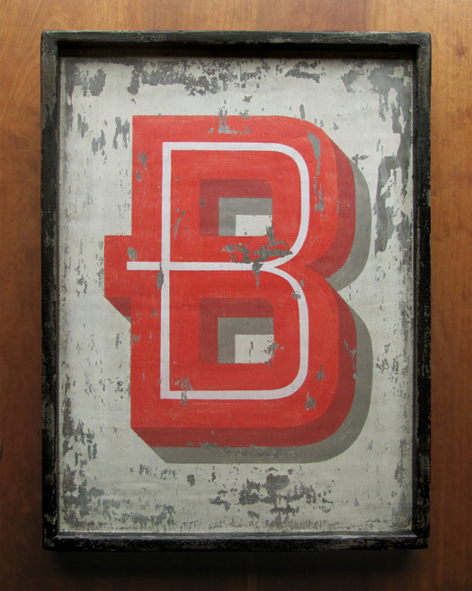
Innovative graphic design studio MineTM asked us to produce an interior decor piece for San Francisco’s newest sandwich shop. A bold new identity design and crisp interior renovation has Bun Mee ready to serve up their creative fusions for their April 2011 grand opening. According to staff, they’ll be ready with “traditional and modern takes on street food and bánh mi inspired sandwiches.” Sign features the first letter of the restaurant’s new logo. Size: 18” x 24”.
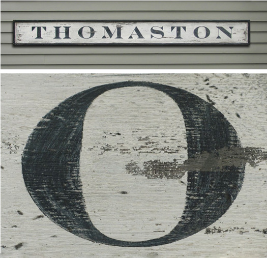
As early as 1630, a trading post was established on the eastern bank of the St. George River in southern Maine. 150 years later, Thomaston — named after General John Thomas of the Continental Army — was incorporated in 1777. Many settlers arrived in Thomaston following the Revolutionary War in 1783, and today, about 5,000 residents call Thomaston home. Original design inspired by old town hall and post office signs. 8 feet in length x 10.5”.
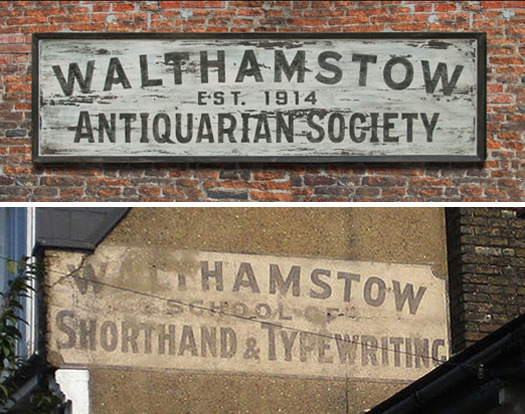
Walthamstow, England was founded in 1075 as Wilcumestowe—“The Place of Welcome.” In 1914—nearly 900 years later—an antiquarian society was established. Its Web site states: The origins of the Society lie in a small band of enthusiasts who were keen to further the study of local history and publish books in which such knowledge would be available “for all comers and for all time.” The group eventually changed their name to Walthamstow Historical Society. Typography inspired by a fading sign in the age-old London borough which reads “Walthamstow School of Shorthand & Typewriting.” Just over 8 feet in length, with loads of character, the actual size is 98" x 28.”
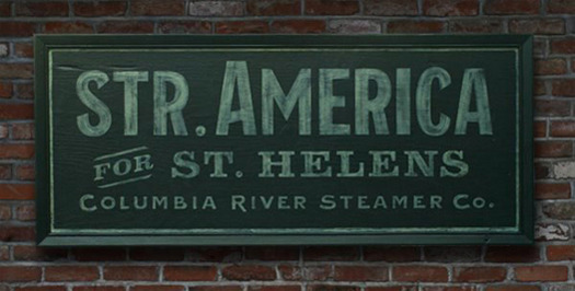
One of many signs spotted in a photo of the turn-of-the-century Portland, Oregon waterfront. Size is 56.25” x 24”
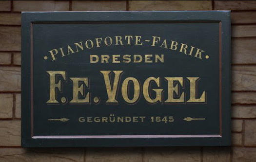
An original design inspired by 150-year-old factory documents from a mid-1800s piano maker in Dresden, Germany. No other known records of this factory exist due to the fire-bombing of Dresden in 1945 and the total destruction of city archives. Efforts to locate an F.E. Vogel Piano have proved futile until recently, when a simple Google search turned up a fine specimen in the UK being offered for free (inset). Sign made from a 1920s reclaimed door panel. The gold-brushed letters simulate aging gold leaf. Size: 46.25” x 30.”

The first commercial order for Nutmegger Workshop. 78 signs were ordered by Kimberlee Jaynes Interior Designs for Grand Lodges Resort at Mt. Hood. Original, nostalgic signs of various sizes were designed and fabricated by Nutmegger Workshop and installed throughout 16 luxury condos in Government Camp, Oregon.
