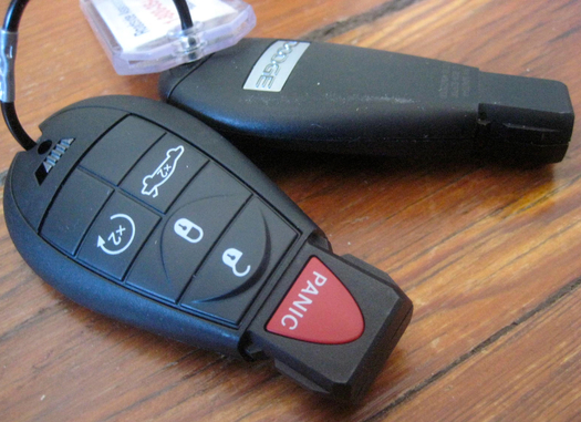
Panic is a special occasion. Or at least it ought to be something far less routine than, let’s say, unlocking a car door. But I recently found myself thinking about panic several times a day, as a result of a set of rental-car keys.
Our actual car is rather venerable, so I’m used to old-school analog keys. But over the years I’ve of course become familiar with the buttony-fob variety, and I’d noticed (without thinking much of it) that these often include a red button that I assume causes some sort of piercing shriek to frighten away a threat or summon help in a moment of … panic. I don't know how commonplace this variety of key has become, but it's curious to think of walking around with a panic button in one's pocket as a routine phenomenon.
Anyway, this most recent set of keys is the first I’ve encountered that replaces the familiar slender metal blade with a squatty plastic one. This style appears to have originated at Mercedes (correct me if I’m wrong, and as long as I came across this during my search I may as well share with you the most boring listicle on the internet: Top 10 Car Keys). As a functional matter, you still slide it into a slot and twist to start the ignition.
But as you can see, the button layout of this key gives quite a bit of prominence to the Panic option: Not only is it the mandatory red, it’s bigger and much more invitingly pressable than other choices. Aggressive and shouty, it overwhelms the ho-hum buttons below. Thus, every time I locked or unlocked the rental car's door, or started it up, I treated the key gingerly. Instead of a comforting signal of safety, the panic button was a constant irritant, making me slightly tense.
It seems to me that panic, being a special occasion, ought to be separated from routine functionalities. Perhaps this button could be on the other side of the blade-block.
Or perhaps the designers of this object don’t see panic as a special occasion at all: Perhaps, influenced by Shawn Wolfe, for instance, they view panic as the existential status quo of contemporary life. If a jittery culture seems bent on keeping us on edge, always nervous about what we’ve missed, what hidden threats lurk where, what life we are failing to attain and why, then why not represent that in a handy button we look at many times a day, one that practically begs to be pressed?
Come to think of it, what I probably need in my pocket is a button, soothing and blue, that says “Calm Down.”
