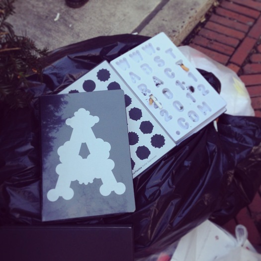
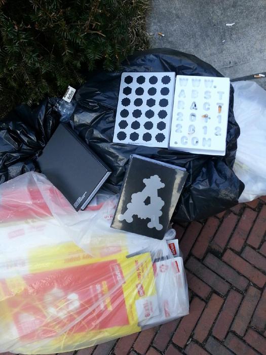
The relationship between a book and its cover is famously fraught. Keep that in mind when considering the unhappy reaction of at least some in Columbia University’s Graduate School of Architecture, Planning and Preservation program to its most recent annual publication of student work — Abstract, as it’s titled — suggested by the photographs here.

Here's the deal. Departing with the familiar tradition of producing a hefty physical volume, GSAPP offered its most recent Abstract in the form of an iPad app. In addition to (or on cover-like behalf of) this app, students received an object: It looks like a book, but turns out to be a book-shaped plastic box, and its contents consist of a URL, where the app can be downloaded. This object, as you can see, has not been universally embraced.
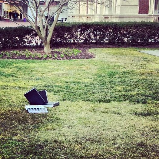
Images of the non-book strewn about campus like so much trash made their way to me from individuals who prefer to remain anonymous. I was intrigued — obviously it’s attention-getting when people are this hostile to any object designed to have some kind of lasting value. But at first I wasn’t quite certain what, if anything, I wanted to say about it — I am in no position to know what the real function of an architecture school’s annual publication is supposed to be, so who am I to weigh in?
But this has stuck with me, and I finally realize that it's is because I think the real question is whether these students were reacting to the “book,” or its “cover.”

Archetizer assessed the app that is available via said URL, pronouncing it “stunning” — and furthermore declaring those un-stunned to be fuddy-duddy enemies of progress: “This tribe stands stoically entrenched in the smell of ink, in the touch of uncoated paper,” etc. An app, in short, is better than a book, because “anyone can download” it, for free.
Well, just to clarify: Anyone who has an iPad (the app is for that device only*) can download it, and of course books in libraries are also viewable for free. [*April 16 Update: It appears I'm wrong about that, and you can also download the app to certain Windows and Mac computers; I regret the error, but my basic points remain (and, again, really I'm more focused on "cover" than "book").] Nostalgia aside, an ink-on-paper book on a shelf today will still be a book in ten, twenty, fifty years, or possibly much longer; I don't know what kind of commitment Columbia has made to future-proofing this edition of Abstract, but do you think today’s iPad apps, as-is, will function seamlessly in whatever digital-consumption environment exists in a generation or two? If so, I’ll be happy to sell you some lasesr discs.
Then again, maybe Abstract is not meant to transcend time, but rather to perform as a here-and-now portfolio credential. If so, then an iPad app might be the right “book” — but that still doesn’t explain the “cover” strategy here.
I’ve seen interesting examples of a physical thing that serves as a keepsake, trophy, or similar marker of digitally captured expression: See this 2010 column about Ghostly International and Boym Partners collaborating on a sculptural object tied to a Matthew Dear music release.
The general notion of "built to last" seems consistent with the architect ethos. But alternatively one could conceive a “cover” that's instead built to spread: A limited set of letterpress cards, for instance. Like the plastic box, such cards — or a sculpture, or any number of physical markers — could easily incorporate the URL. While that may still be a needlessly material way of communicating a digital location (which could obviously be spread by a simple email), the materiality might at least signal value, special-ness.
Instead what students received was something closer to a decoy, a pulled rug, a trompe l'oeil: It resembles a book — but it’s just a stand-in. As such, it seems vaguely ridiculous as a keepsake. (The decision to use plastic, of all materials, is particularly strange, given that plastic is almost synonymous with the worst kind of disposability.) But because the object poses as a keepsake, it’s also impractical as a means of spreading the associated “book.”
I’m sure you could come up with something better than the “cover” alternatives I’ve floated above. The bar, after all, is not terribly high. While the dissatisfied students could surely have devised a more productively creative way of expressing their reaction, it’s not exactly shocking that some might respond to a function-less plastic box as, in essence, garbage.

