Surely we all remember — however dimly — that lesson back in middle school or thereabouts on the word “gerrymandering.” And surely I’m not the only one who has to resort to Wikipedia to remind myself of the details: One of the state senate districts on an election map drawn up under Massachusetts governor Elbridge Gerry in the early 19th Century, and favorable to his party, looked so ridiculous that its shape was compared that of a salamander. Actually what I really recall is the memorable illustration, attributed to Elkanah Tisdale, underscoring this point. As a visceral bit of visual rhetoric, it remains tough to beat.
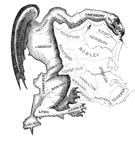
Via Wikipedia
I found myself ruminating about gerrymandering — and about its relationship to strategies for graphic communication — for the first time in ages a couple of weeks ago. It was at the height of the government budget/default showdown, and I was on a solo eight-hour road trip, toggling beteween NPR and various news-talk shows. The pundits around the dial seemed exhausted not only with the subject, but with their own talking points and sound bites. On some show or other, the host keep bringing up a poll concluding that 60% of Americans endorsed the notion of voting out Congress en masse.
That’s a ludicrous finding on its face (the system doesn’t work that way, everybody knows about the disconnect between what voters say about Congress in general and how frequently they reelect the incumbent in their own district, etc.). But at some point the chatter turned to gerrymandering. And the more I listened, the clearer it seemed that this poll and the appealing "throw the bums out" line of thinking it representd not only miss the point, but obscure the point.
Now I’m wondering if there isn’t some sort of opportunity to create a visual campaign to make that memorably, unforgettably clear.
Without turning this into a civics lesson, I have to make a short detour regarding the problem such a campaign would address. I’ll rely on remarks from NPR’s Ron Elving, whose explanation on The Diane Rehm show I found particularly useful.
While drawing electoral boundaries with partisan goals in mind never went away, the process has for most of its history been pretty unreliable; while parties tried to draw lines to their advantage, they failed as often as not. But according to Elving, increasingly sophisticated, computer-aided voter-data parsing has lately changed the game: “Now they do it perfectly,” he said. And in some cases that’s resulted in profoundly partisan districts. Some of these produced the most ideologically extreme Tea Party members whose hardline views contributed so mightily to the default battle — precisely because they were doing exactly what their Gerrymandering 2.0-selected constituents wanted.
Similar scenarios exist on the Democratic side. The upshot is that thanks to the new, hyper-effective gerrymandering, even if it were somehow possible to throw the bums out, they would be replaced by a highly similar set of bums. The problem is not the individual congresspeople. The problem is the data-driven maps that produce them
As I listened to this, I really wanted to see some of these districts — their shape and form. Later I learned that, not surprisingly, there have been any number of journalistic roundups of the “most gerrymandered districts” — described as “contorted,” even “ugly.” The writers of these pieces employ vivid language: the districts are crazy, ridiculous, a “blood splatter,” a “broken-winged pterodactyl, lying prostrate.”
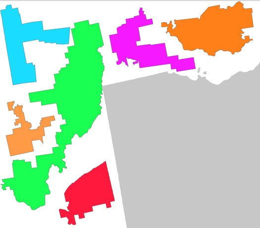
And yet, visually, the graphics used to illustrate these reports have little impact.
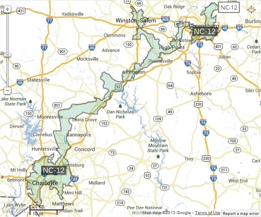
From "The Ten Most Gerrymandered Districts In America," on Buzzfeed.
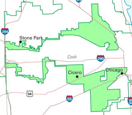
From "The Top Ten Most Gerrymandered Congressional Districts in the United States," on PJ Media.
Somewhat better is this Slate interactive puzzle: The clever idea is to challenge you to piece together the weird district shapes within various states. But I wonder if this approach adds up to less than sum of its parts — I mean, look at those weird parts! That’s what I wanted to see, and instead of playing the game, I found myself clumping the strangest districts in a corner and wondering if anyone could possibly guess what state they were a part of.
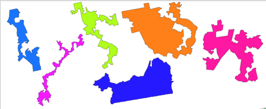
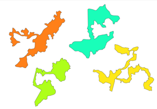
Screen grabs from "Can You Solve Slate's Gerrymandering Jigsaw Puzzle?"
Here, I think, is the idea to communicate — visually. Maybe the most suspicious districts of our time could be reimagined as a horrible parade of grotesque monsters, trampling the spirit of representative democracy. Or maybe each mysterious shape could suggest some sort of frighteningly arcane scientific/medical instrument. (I’ve been watching a lot of American Horror Story lately.) Robert Draper once maintained that a particular district in Texas looks like a Glock — maybe a collection of weapons is the way to go.
Or maybe suggesting menace is the wrong approach; maybe it’s better to find some inviting or even cute way to appropriate these bizarre shapes and depict the problem — even if the problem strikes me as distinctly menacing.
The point is that finding some way of communicating the issue through the language of graphic rhetoric wouldn’t be a merely self-reflexive enterprise. Apparently there are reform experiments underway — alternative, non-partisan approaches to drawing electoral boundaries in Iowa, California, Florida. The goal of this visual campaign could be to support those efforts, and encourage more.
Maybe if more of us can see how contemporary Gerrymandering 2.0 is twisting our system into hideous knots, we’ll be more likely to do support the idea of doing something about it.
