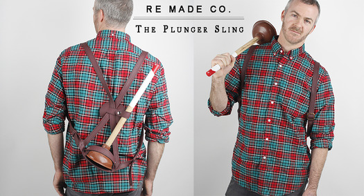
Months ago I was highly amused by this video, above, for the Re Made plunger.
An overtly ridiculous product pitch for an artisanal plunger (fictional, of course), the clip effectively satirizes the products of a much-lauded brand called Best Made, whose flagship offering is a (nonfictional) line of really fancy and expensive axes.
For whatever reason, certain corners of the design-obsessed Internet are positively bonkers over Best Made and its various tools, which frankly look too luscious and luxurious (or maybe just too prissy) to besmirch with the dirt and sweat of actual work.I’d go on, but the Re Made plunger makes this point with an object better than I can with words. (Actually, I had my shot at using words to assess Best Made some years back.) And to appreciate just how cunningly the satirical brand exploited the silliness of its target, there's another video that basically pairs them, to remarkable effect:
RE MADE / BEST MADE ECHO from Max Shelley on Vimeo.
I bring all this up because last week Mark Maynard published a great Q&A with Re Made’s creator, who turns out to be University of Michigan Stamps School of Art & Design professor Rebekah Modrak. (When Re Made “launched,” its creator wasn’t known.)The interview is long, very thoughtful — and worth your time. But at least watch the videos or visit remadeco.org if you haven’t. This is certainly not the first time a designed object has been used to make a point — or even to satirize another designed object.
But it’s a very pointed, and useful, example of object-as-critique, setting off a very serious line of questioning about the ideologies and biases embedded in designed things. If a picture is a worth a thousand words, maybe sometimes the right critical object is worth a thousand critical essays.


