Those with an interest in typography — which I’m going to take a wild guess is somewhere in the neighborhood of everyone reading this — are advised to dip into an enjoyable series-in-progress over at HiLobrow.com.
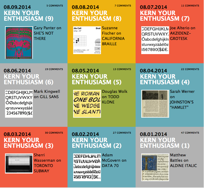
“Kern Your Enthusiasm” is partway through a nearly month-long run of short pieces by a variety of interesting designers and writers and thinkers, musing concisely on their favorite (or least favorite) manifestations of typography.

The term is defined loosely. This made me happy as a contributor to the series (more on that below) but even happier as a reader. Already there have been a bunch of smart and insightful entries.
Matthew Battles, a fellow at Harvard's Berkman Center for Internet and Society, combines deep history with forward-looking insight in his assessment of Aldine Italic. Artist/illustrator Joe Alterio offers a passionate brief on behalf of Akzidenz-Grotesk — “the granddaddy of all those sharp sans serif typefaces that seem to rule our internets these days.” Writer Adam McGovern makes a case for Data 70’s suggestion, decades ago, of the “oncoming ephemerality of computer culture.”
Those with strong opinions about typography, or even how to define what typography is — and again I’m going to guess that’s not a few of you — will find plenty to wrestle about in this series. Already there are some delightfully idiosyncratic choices — like artist/designer Sherri Wasserman’s assessment of Toronto Subway, and its surprising cult following. And I particularly enjoyed Gary Panter’s lovely writeup on the intentionally hard-to-read 1960s poster lettering style that he gives the name She’s Not There.
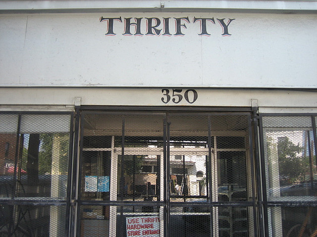
Clearly some contributors are bending the rules about what counts as typography, but I’m all in favor of that — not least because I contributed to the series, and probably bent the rules. My writeup (about a particular style of hand-painted sign lettering that is unique to Savannah) has just gone up on HiLobrow today.

I am of course flattered to be part of the series (organized by Joshua Glenn, my Significant Objects collaborator and friend, I hereby announced I the spirit of full disclosure), but I can’t wait to read what else is coming — writers like Alissa Walker, Jacob Covey, Cintra Wilson, etc.; subjects from Diploma Reegular to “Chinese Shipping Box.”
