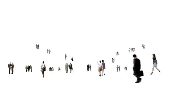
Apparently the little human figures who populate the imaginary world of architectural renderings are having a moment.
You know what I’m talking about, right? No such rendering is complete without representations of humans using or enjoying whatever space is being described or proposed. By and large, we focus our attention on the structure or project, hardly (consciously) noticing the uncanny “people” enjoying the depicted fantasy world.
But Alissa Walker of Gizmodo reported recently that the Environmental Design Archives at the University of California Berkeley is putting those figures in the spotlight, hosting a show called Designing People: “From the watercolor Victorian to the scalie hipster, this exhibit features more than a century of designers’ representations of people from the Environmental Design Archives.”
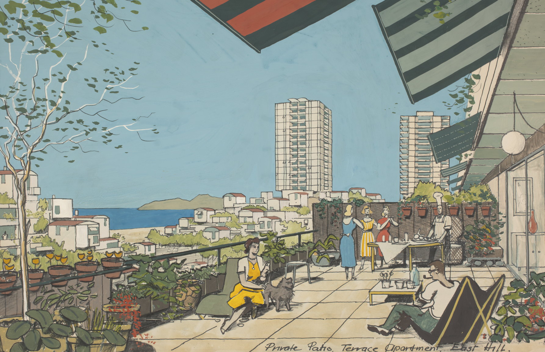
The show is up through May 19, and I’m sorry to say I won’t be able to see it. I haven’t thought about these wee figures in a while, but I used to think about them quite a bit.
That started after a 2011 Consumed column I wrote about “scalies”—the term references the figures’ scale-giving function; I picked it up from my friend Kirsten Hively—drew a surprisingly enthusiastic reaction. I even gathered the various tips and responses from blogs and notes that people sent me afterward in this post on the now-idle Murketing.com, and continued to collect scalie-related items at the Letters From Here Tumblr for a year or two after that. (I’m repurposing some of that material to help illustrate this post.)
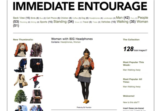
Via Architectural Fictions: Renderings, Rats, and the Virtualization of Urban Space, a deconstruction of scalie aesthetics and practice, by Amy Herzog, in Semiotic Review.
So it’s fascinating to learn, from the Gizmodo piece, that people are still creating new scalie sets, or at least circulating fresh scalie options. Skalgubbar is described as a free site created by a Swedish architecture student featuring photos of his own friends—“plenty of young, well-dressed folks, often engaging in rendering-friendly activities like biking.” And a Tumblr called Easy Entourage “showcases one-off [Creative Commons-] licensed images.”
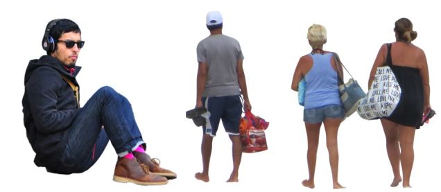
From Easy Entourage, via Gizmodo
Evidently the UC Berkeley show draws on decades of rendering archives that had interested a curator there for years. Possibly the visual evolution of scalies over the decades tells a broader story. Walker writes that these days renderings have come to include scalies and other flourishes that at times seem to border on the parodic.
“There's a reason for these bizarre, nonsensical additions—ooooh, balloons!—to these future landscapes,” she maintains. “Architecture is becoming less about a single walled-off phallus on the horizon, and more about parks and public spaces which engage with the city. As these types of projects evolve, they're not as much about bombastic design as they are about community-focused improvements, so the people and how they're actually using the space become even more important.”
Real Estate from Jonathan Weston on Vimeo: Scalies come to life.
Scalies still strike me as primarily a form of visual rhetoric—much more closely tied to seducing viewers into embracing the renderer’s pitch than to any attempt at depicting “actual use.” Particularly in the Web era, the most widely seen renderings may be contest entries or similarly earnest but purely speculative proposals that have more to do with portfolios than reality. (In a semi-related post here on Design Observer, I referred to such images as “Postcards from Portfoliopolis.”)
It may be that this is why I’m still more drawn to projects and critiques that subvert scalies, or at least remove them from their intended contexts. Fusion’s Alexis C. Madrigal picked up on the Gizmodo piece, and cited an example that I’d previously missed (or had forgotten): Render Ghosts, by James Bridle, places scalies in “the liminal space between the present and the future, the real and the virtual, the physical and the digital.” High-flown language aside, this produced some pleasing and tangible results—such as six-foot blowups of scalies, mounted on foamboard, and photographed in the physical world.
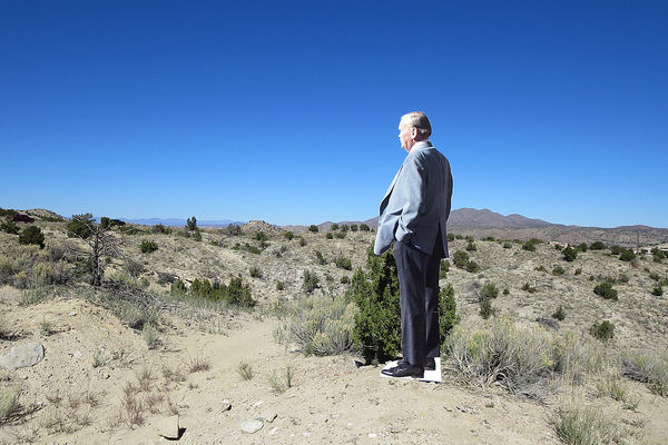
From Render Ghosts, by James Bridle
Some of my favorite (mis)uses of scalies were those deployed by participants in the Hypothetical Development Organization (which I co-founded, so I'm obviously biased). Candy Chang, for example, included Sad Keanu among the figures enjoying her Mobile Cornucopia. Mark Clayton has a barely clad woman soliciting attention (at the very least) outside his N.O. Loitering Centre. A paramilitary-style guard rides a Segway through Sergio Humberto Padilla’s rendition of the Radtke Reading Room. And I don’t know how to describe some of the characters gathered at the Theater of Escape, as rendered by Michael Doyle.
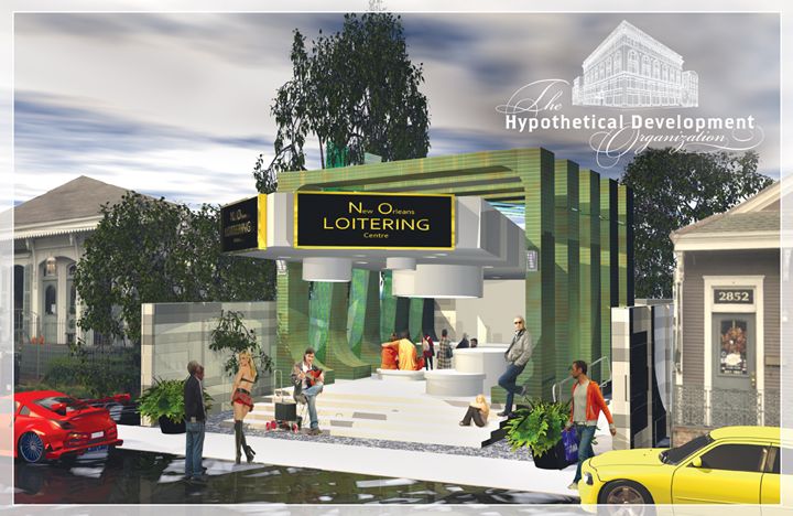
N.O. Loitering Centre, by Mark Clayton
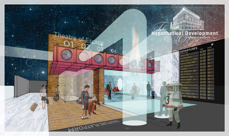
Theater of Escape, by Michael Doyle
The apparent new interest in scalies has, in fact, reminded me of a Hypothetical Development sequel we never got around to pursuing—creating a set of absurd and possibly disturbing Hypothetical Scalies that anyone could use: panhandlers, obnoxious tourists, menacing police officers, and any other figure that’s highly unlikely to make an appearance in the cheery realms where scalies can be found. This never got done, in part, because of course the set would likely never be used.
Maybe a better solution, sparked by the focus on scalie history, would involve looking to the past for inspiration instead. I can no longer remember who raised to me the idea of a connection between modern scalies and Le Corbusier’s Modulor figure. I like the idea of imaginary urban environments populated with variations on this ur-scalie: a bunch of oddly muscled silhouettes, each with one arm raised—in theatrical greeting, or clenched-fist anger, or possibly just catching a Frisbee. They would look unrealistic, and ridiculous. But I’d argue that scalies always look ridiculous, once you learn to see them.
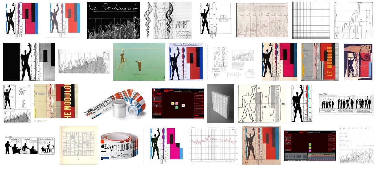
“Modulor,” via Google Image Search Results
