The man behind Rotten Apple remains anonymous because his work is generally installed without permission. But there was an email address on his site, so I dropped him a line. And earlier this year, we met in person, and took an enjoyable walk around the Greenpoint section of Brooklyn. He’s young and his practice is still taking shape, but it was a genuine pleasure to see the world through his eyes for an hour—he’s truly explored every aspect of the cityscape that most of us are trained to overlook, and he has a gift for spotting opportunity everywhere.
I’ve continued to follow the work on his site, and through his Instagram feed (which is also sprinkled with examples of others’ work that he finds inspiring). And shortly after he released documentation of a new batch of projects and interventions, we decided to arrange a phone conversation. A transcript, edited for length and clarity, follows.
Under the name Rotten Apple, you’ve been doing these human-scale pieces that to me fall somewhere between street art and social design. Is that how you’d describe the work?
I think you hit it spot-on. It’s a blend of design, street art, some urban hacking—but definitely at the individual level of interaction.
And you’ve been doing this for how long?
I’d say about five years now. But I really didn’t hone my style until after I finished with school, about three years ago. That’s when I really started cranking out work, and when people started to take notice. That’s when I actually knew what I was trying to do.
Has your agenda evolved?
Originally I was just trying to be playful and provocative—but now I see some real value in it. The waste/sustainability component is a layer that I really didn’t initially set out to have as part of my practice. It just came out of the availability of source material on the streets. I saw an opportunity to play that up, and highlight some of our consumption habits at the same time. Because design is kind of about consuming.
You told me a story about one of your inspirations—someone trying to find somewhere to sit down?
I used to walk around the streets and observe what I could about how people interact with “urban furniture,” and the urban environment, really. It struck me how that environment was not always welcoming of people.
One day, as I was approaching a really busy street corner, with a bus stop, I saw these two elderly women—dressed up, carrying multiple bags of groceries. They were sweating, they were tired, just waiting for this bus. What they’d ended up doing was sitting on these two bollards.
And somehow they looked like they’d gotten comfortable. There was this space between them. It looked almost like it could be this really social environment, with these dressed-up, sort of sophisticated women, sitting on bollards. I thought: “It’d be great if they had a little table between them. It would be almost like a little pop-up coffee shop.”
So I started to zero in on how we use space, and how space isn’t always reciprocating the intentions of its users.
You saw people misusing the environment, and decided to help them misuse it some more.
I guess I developed a lot of empathy for those two women, and I knew that this was not the only instance of the city not embracing people. I started seeking out those points where we could make it a little softer, a little more approachable.
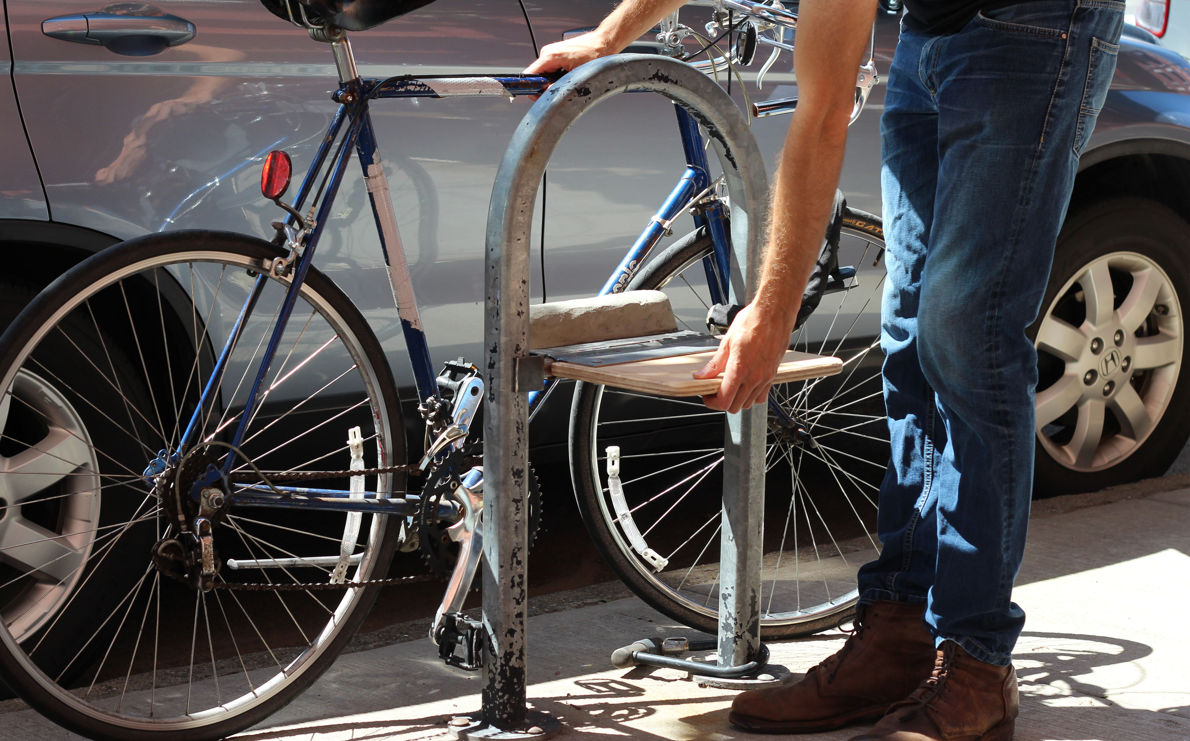
Bike Rack Folding Seat, Rotten Apple
Let’s start with a few projects that got traction in the past. Like the bike-rack folding seats.
There are so many of these bike racks in so many iterations. The city had just released that new circular design, and everyone was celebrating it. But I was wondering, “What about these old ones? What are we going to do with these?” People are talking about them like they’re obsolete, but they’re 100 percent functional. Let’s not give up on them.
How can we draw attention to them? And make them even better than the new design that was just approved? I saw that as a design challenge to tackle. And I wanted people, again, to engage with the built environment, but also to hang out and activate the community around them. If you have people hanging out longer, you can get that social friction. So the chair seemed like a great idea. It had to be a fold-down chair, minimally invasive to maintain the function of the base unit, the bike rack.
Recycling Rack, Rotten Apple
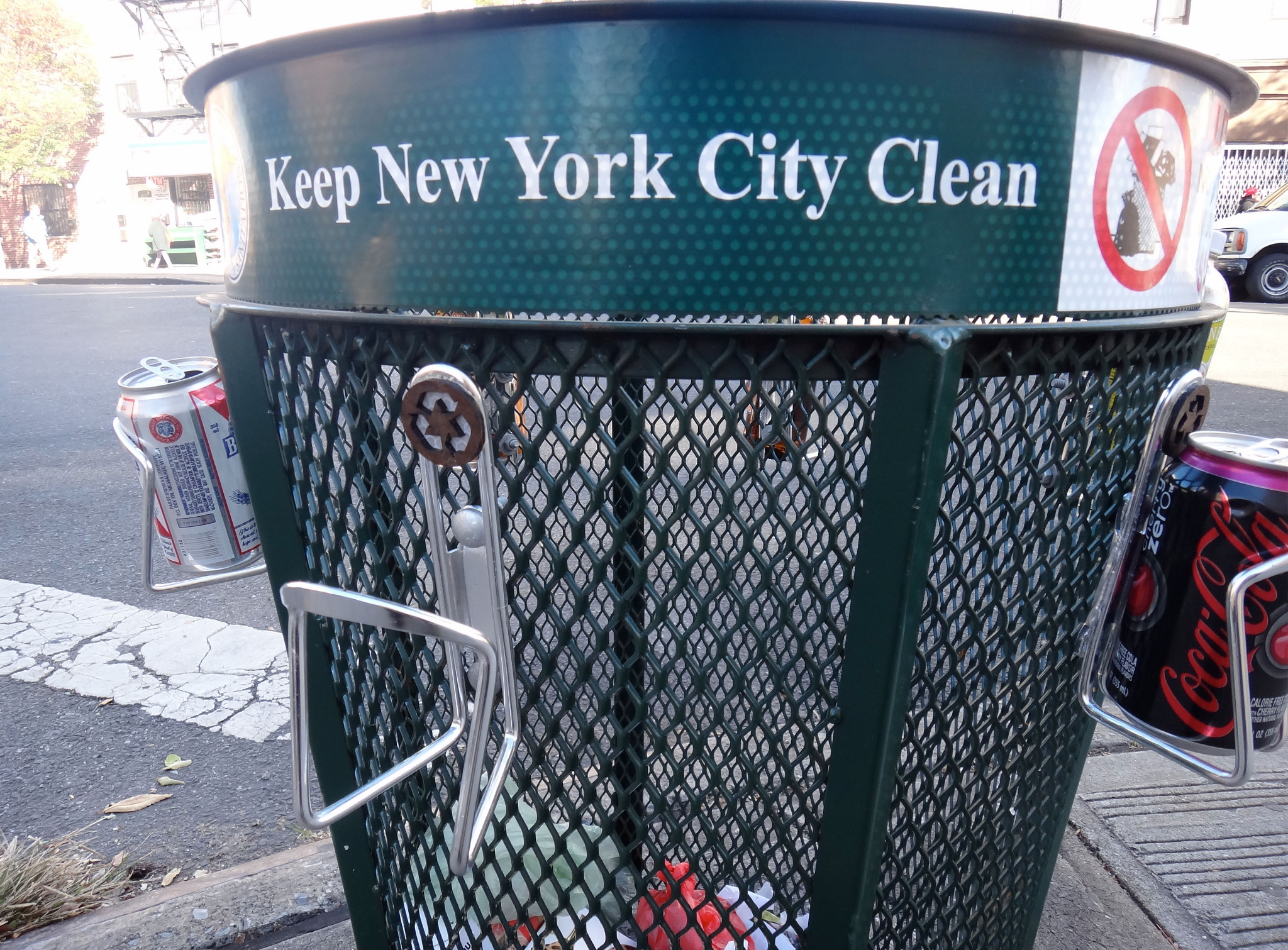
How about these bottle-holders on trash cans?
I hate seeing people picking through the trash. It’s dehumanizing; they can get hurt. It’s just not healthy practice. But we obviously see trash cans as aggregation points for waste. So, how can you delineate between waste and what still has value to certain populations? Can-and-bottle collectors are a like a whole economy within New York City.
So I started collecting bottle-holders off heaps of what used to be bicycles, just left for dead on the streets. They’re all over the place. And I’d attach them to trash cans using simple bolts and nuts. That was an early design. The recycling symbols—I thought I needed that level of communication, but I really didn’t. As I was installing it people were walking by saying, “Hey, that’s a really good idea.”
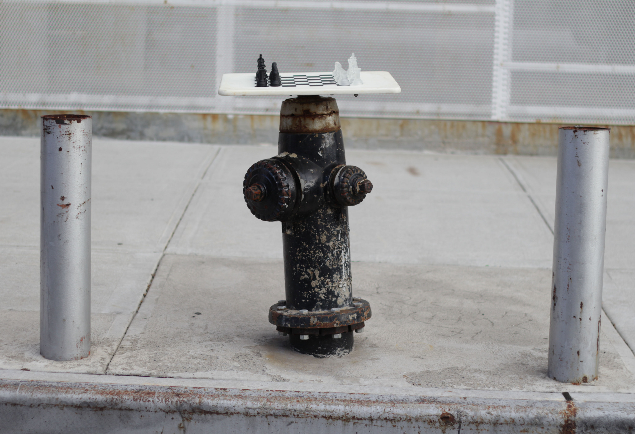
Fire Hydrant Chessboard, Rotten Apple
You’ve done some tabletops, as well—and variations like the chessboards, for example.
That uses cutting boards, from the trash—dense, high-quality plastic ones. I took an old fire hydrant wrench and modified it to clip on and off the housing; it can be removed easily, it just pops off. The fire hydrant remains 100 percent accessible—that was a big constraint when I was designing that. You shouldn’t be putting unsafe designs out there.
One more older one: the jump rope. You’ve done a couple of exercise-focused pieces–“Workout Bricks,” “Crosswalk Pull-ups”—but this one’s a little different.
I came across a roll of caution tape someone had left out at a former worksite that had finished and packed up. I started braiding it, to add weight to it, so you could do a full rotation. Then I found some old bike handlebars and removed the grips, and glued those to the ends of the braided rope. I put it somewhere where people were waiting to cross a road.So a single found object led to a single new object, that someone could walk off with. It’s not really an installation or—
Right, it’s more like a product. But I hung it there as a kind of installation. I hoped people would just do a few jumps, the light would turn, they could leave it there for the next passerby.
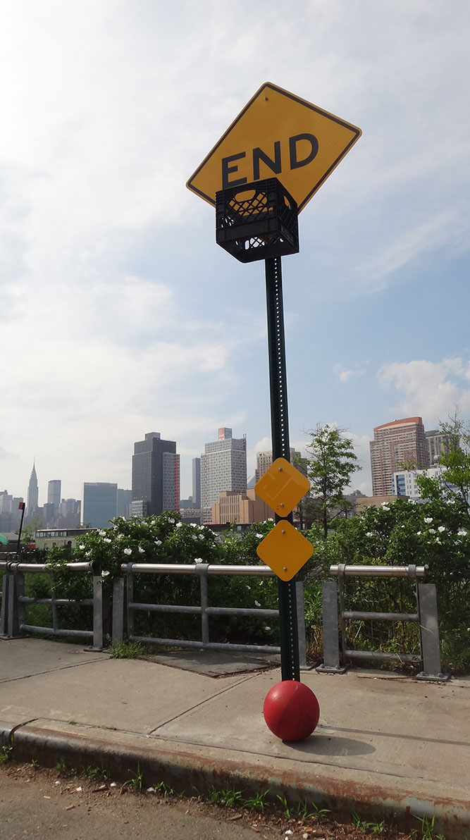
Let’s jump to some of the more recent work. I was looking at your Instagram—how about these basketball pieces?
The first work I was doing was more about empathetic awareness. Now, I want to make it more engaging. I feel like people are always on their phones, they’re not interacting with anything else. So I want to disrupt that passage through physical space with these provocations, hopefully to spark creativity within the audience.
So the dead-end basketball goal … I’ve always been inspired by how inner-city youth would put up milk crates as basketball hoops. Basketball is a city sport. For this one I wanted to find a setting where not a lot of car traffic would go, but there would be a lot of foot traffic. And I felt this particular space [a dead-end street in Greenpoint] was so under-utilized. It felt safe—a place where people wouldn’t be harmed, and it would actually enhance that spot.
I found the milk crate. It probably came from one of the street-cart vendors who just kind of leave them behind. Whenever I see them I try to grab them. They’re really versatile, and I think they’re like a technical nutrient, a building block that the city has such an abundance of, and they’re just discarded. In this case I attached it with zip-ties. The ball I found randomly, walking down the street one day. The piece was installed at night, and it took a while to find the right lull within the activity of the night to put it up.
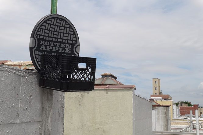
And you did these other basketball hoops on a satellite dish?
I felt I could do this elsewhere, but I wanted to put an artistic touch on it. So I stenciled my own artwork over these reclaimed satellite dishes that I’d found. No one was using them. I ended up doing two–the drip-style one, and a manhole-cover design. I did the stenciling in my studio and then put them back out on the street.

How about the motivational steps?
That came from the contrast you see when you come out of Penn Station to Seventh Avenue—you can take the stairs or the escalator. I wanted to come up with ways to encourage people to take the stairs, kind of challenge them so they feel like they’re getting something out of it beyond the physical exertion. I’ve got more of these to do.
And you have subway Sudoku, using an existing grid in the tile wall. You put the numbers up?
We spend a lot of time waiting on trains, a lot of passive time. I wanted to activate that. This was something that could be reused, and it’s playful. Plus it kind of relates to reading the newspaper underground.
So, yes, I figured out my own medium-difficulty puzzle. The hardest part was finding the nine-by-nine tile structures at a level where you could interact with them, and where I’d be safe spending the time putting up the sticky-back vinyl numbers, and the placard giving the clues and explaining the rules.
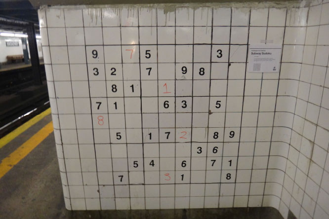
Subway Sudoku , Rotten Apple
Your logo is on the placard (and the satellite dish hoops). You didn’t used to do that.
As I’m building more work and have more found my voice, I have no problem with promoting myself in that fashion. But in this case I also wanted to play into the MTA style guide and how they do things—that’s why it’s laid out like that, with Helvetica, consistent with their wayfinding system. The more subtly I do that, I think the longer the piece stays up. And I want the audience to question it: “Why would the city do this?”
When we took that walk, I really enjoyed learning from your knowledgeable observations of street material—I never knew, for example, that those orange traffic barriers are weighted with water. Is that the sort of detail you always paid attention to, or a result of this work?
It’s some of both. I had more of a rural upbringing. Now as a designer who is really interested in and motivated by the built environment and the urban landscape, it just struck me that everything out there has a function, either apparent or latent. How do we keep out the latency and build on the utility? It’s all just investigative. I really admire homeless people who have learned how to use the built environment to enhance their lives.
The “Power Plant” piece would be an example of that, right? It’s a symbol added to the base of a light pole, indicating that these are often open and there’s an outlet inside. (That seems vaguely dangerous to me!)
I just saw a homeless guy one night, outside a pizza place, charging his phone this way. I started exploring it and I found that a lot of these light poles–these outlets are everywhere. People will pop open the base of a light post—workers, or street fair vendors, that sort of thing—and that gets left open. I’d just identify the ones that are popped, and developed something that would draw your attention to it. That was one of my first pieces, and it got a lot of traction.
I don’t think it’s dangerous. The wires all have conduits around them, they're concealed. I wouldn’t put your hands all through it, but you’ll probably see what amounts to an extension cord, hanging down. You don’t have to unplug anything; it doesn’t disable the light itself. You just plug a male connector into a female socket. It’s that simple.
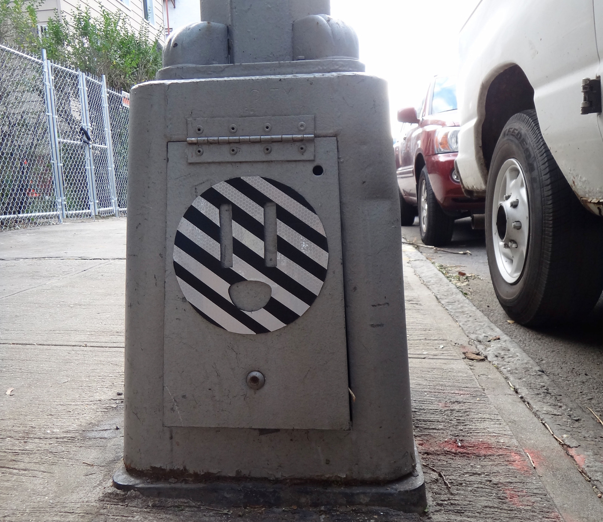
I guess I’ll be the one to point out that it’s also probably illegal. Anyway, what else is coming up?
There’s only so many tabletops you can build before people start saying, “Well he’s not really innovative anymore.” That’s why I started doing the games. I hit the gas in April and May before I had to leave the city for a while. I’m very happy with this series.
Now I’m thinking about creating souvenirs, and something like products that are more in line with reusing wasted items. It’s an interesting challenge: How do you secure a material stream to steadily produce that kind of work? How do you routinize that? So I think I might try to do a souvenir set. Do you know of the Boyms?
Yes.
I really like their series of castings, for things like the O.J. Simpson chase, the Oklahoma City bombing. I want to build off that, but make some souvenirs for the city—ways where you don’t actually have to be there to experience my work.
You’ve done a little bit of workshop and collaborative stuff, any more of that on the horizon?
I try to use my site as something like Instructables—showing you how to do everything. It’s documented so it can be replicated. That’s the goal. I would like to come up with a facilitation manual, something I can produce and distribute. I’m always trying to find architecture and urban planning students who are the black sheep who want to come over to the dark side.
Ha, okay. Any last projects you want to mention?
The construction barrier soccer goals got a really good reaction. I’d always wanted to do something around soccer, it’s such a universal sport. And there are just so many construction barriers and deactivated construction sites around the city—all that stuff is just everywhere, and I wanted to draw attention to these byproducts of the construction industry. It’s a city that’s constantly developing, but that development has an impact. So I wanted to use that source material.
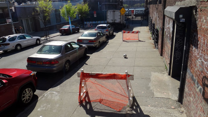
Construction Sawhorse Soccer , Rotten Apple
Also, you want your design to communicate its use. That’s a big design challenge for me. I can make something really playful, but if the person seeing it doesn’t identify with it, doesn’t understand it really quickly, they’re not going to engage with it. So using high-intensity orange netting, and the barriers set up like goals on a soccer pitch—that was all part of the design.
It’s interesting, I thought the street art community would be really receptive to the work, but I haven’t gotten much traction there. Instead, the biggest champion has been the design community. And that made me really reflect on my practice. Every piece I put out now is functional. I want the work to be provocative—but useful.

