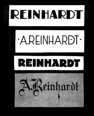
Ad Reinhardt, detail of scrapbook page, ca. 1934. Courtesy of Smithsonian Archives of American Art.
The American abstract expressionist painter Adolph Dietrich Friedrich Reinhardt, who died in 1967 at the age of 54, is remembered as a staunch minimalist, an outspoken polemicist, and an unequivocal purist. ("Art is art," he once said. "Everything else is everything else.") For the last twelve years of his life, he worked almost exclusively in black, producing a series of stark, monochromatic paintings — nothingness art, as it is sometimes called — devoid of meaning, stripped of evident associations. But prior to these years of devout reductivism was a quarter-century of eclecticism, a flurry of activity borne of the kind of fundamental uncertainty that characterizes all young makers. Reinhardt fretted about the meaning of life. He agonized about the purpose of painting. He questioned everyone, critiqued everything, and worked incessantly.
In other words, he was a graphic designer.
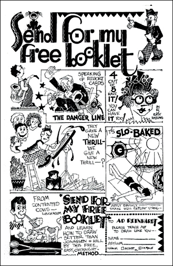
Ad Reinhardt, "Please Teach Me To Draw Like You." Comic strip, early 1930s. Courtesy of Smithsonian Archives of American Art.
As a student at Columbia University in the 1930s, Ad Reinhardt studied art history with Meyer Shapiro and was active in numerous student activities as a reporter and illustrator. His published work from this period nods somewhat overtly to the angular jazz-age poses of John Held Jr. and the comic gestures of Frank Briggs and H.T. Webster. The college-age Reinhardt produced drawings that were spirited and giddy; as he matured, his renderings grew less cartoony and more refined. (His later drawings sooner resemble the work of the Mexican artist Miguel Covarrubias than, say, the slapstick antics of Mutt and Jeff.)
But Reinhardt's interest was in words as well as in pictures. As the editor of Columbia's undergraduate magazine, The Jester, Reinhardt was responsible for, among other things, its redesign. (He critiqued the existing magazine for being "moribund" and vowed, under his leadership, to make the new magazine "satirical, sophisticated and screwy.") Within two years of graduating, he was experimenting with cubism, calligraphy and collage. By the late 1930s, Reinhardt had found employment with the WPA Federal Art Project, and for a period in the early 1940s, as a freelance writer and graphic artist. Here, an undated ad for BBDO shows a series of goofy faces, and includes the artist's signature, suggesting that long before he would jettison such methods, Reinhardt experimented with them, with varying degrees of humor, clumsiness, and indeed — success.
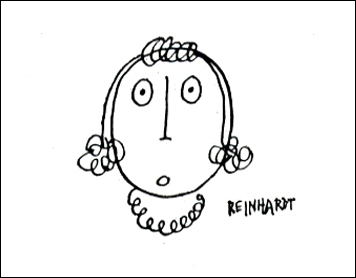
Detail from a signed, undated advertisement by BBDO for The Saturday Evening Post. Courtesy of Smithsonian Archives of American Art.
Reinhardt's influence as a writer and teacher paralleled his prolific studio life, and it is likely that his painting benefited from the kind of inquiry and scrutiny he pursued in the classroom. As a teacher of art history at Brooklyn College for two decades — a period in which his own painting progressed rapidly toward the minimalist reduction for which he is best remembered — he also found time to design posters. Combining found imagery, collage and a playful amalgamation of ransom-style letterforms, Reinhardt's broadsides are whimsical and goofy, and about as far from minimalism as you can get.
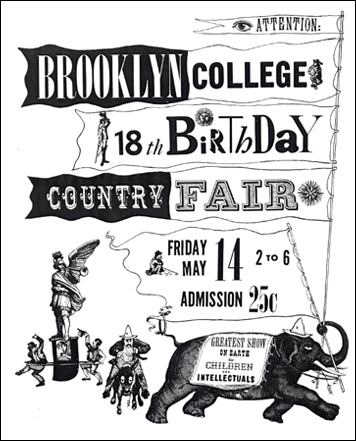
Ad Reinhardt, poster for the Brooklyn College Country Fair, 1948. Courtesy of Smithsonian Archives of American Art.
Throughout his comparatively brief life, Ad Reinhardt was a prodigious maker. He traveled frequently to Asia, wrote essays and criticism, and painted furiously. But he also drew cartoons. He designed magazines, posters and typefaces. He made illustrations, building a small but not insignificant body of work that, by all accounts, provided an alternate source of entertainment and exasperation. How, for example, could a "picture" artist be a real artist?
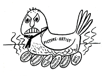
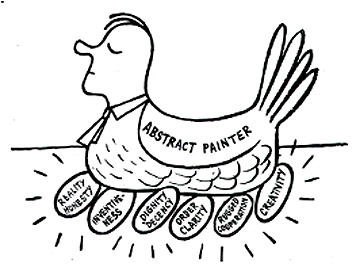
Illustrations by Ad Reinhardt, undated. Courtesy of Smithsonian Archives of American Art.
What's particularly fascinating is that these were lifelong preoccupations. Reinhardt struggled to define art for himself as well as others — but so, too, did he wrestle with what it meant to make things, to address the bigger picture. As a high school student, he was already imploring his classmates to ask themselves the tough questions. "The world needs students who are realists, fixing their gaze on what is near," he wrote in an editorial in his high school newspaper. "But far more does it need idealists — dreamers, architects of air castles." Excellent questions for graphic designers. Even today.
