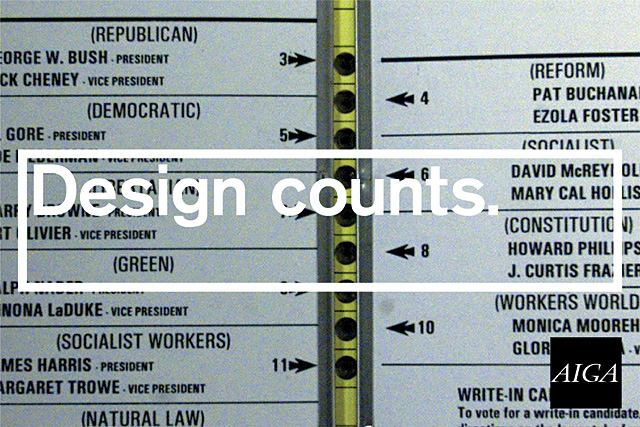
AIGA Design Conference Design Counts poster (2001). Design by Michael Bierut.
This article is the first in a new and ongoing Design Observer series, Artifact, which takes one piece out of AIGA’s Design Archives and asks a design expert in the topic to reflect on its impact in the present.
As we approach midterm elections here in the United States, we ask Marcia Lausen, Director of the UIC School of Design, founder of the Chicago office of Studio/lab, and author of Design for Democracy: Ballot and Election Design, to evaluate the Palm Beach County, Florida Ballot that made all the difference in the 2000 Presidential election.
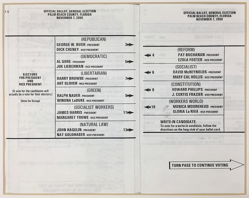
2000 Palm Beach County, Florida Ballot, AIGA Design Archives and Special Collections.
The Backstory
The 2000 U.S. Presidential election was a close call. By the final hours of election night, three states were too close to call in favor of one candidate over another—New Mexico, Oregon, and Florida. The first two were called for Democratic candidate Al Gore within days; after a recount the swing state of Florida went to Republican candidate George W. Bush by little more than 500 votes.
Democratic officials turned to an anomaly in voting patterns in one particular county to challenge the recount. That county—Palm Beach County, Florida—used this ballot. And this ballot caused confusion, misvotes, an attempted recount, and an evaluation of design choices that some say cost citizens a fair electoral process and the Democratic candidate, Al Gore, the election.
According to the Palm Beach Post, Palm Beach County Elections Supervisor Theresa LePore redesigned the county’s ballot that year and spread candidate names over two pages to allow for bigger type, with the punch holes used to cast votes between the two pages. The intention of the so-called “butterfly” ballot was to increase legibility for elderly voters, but many voters found the designed layout, which was not used in any other Florida county, confusing. This caused some to vote for candidate Pat Buchanan rather than Al Gore as intended, or to have their ballot thrown out because two holes were punched (called “overvoting”) or not punched all the way through. Remember dimples and hanging chads? It all had to do with how a vote was punched (or not punched).
The New York Times wrote at the time that “Democratic aides and lawyers said the 29,000 ballots that were thrown out—about 4 percent of the votes cast in the county—were compelling evidence that the ballot was too confusing and possibly illegal.” Ultimately, the Supreme Court rejected the hand recount advocated by Democrats, and thereby delivered Bush the electoral votes for that state and the Presidency.
As Michael Bierut said in 2001, design counts. How is it accounted for now?
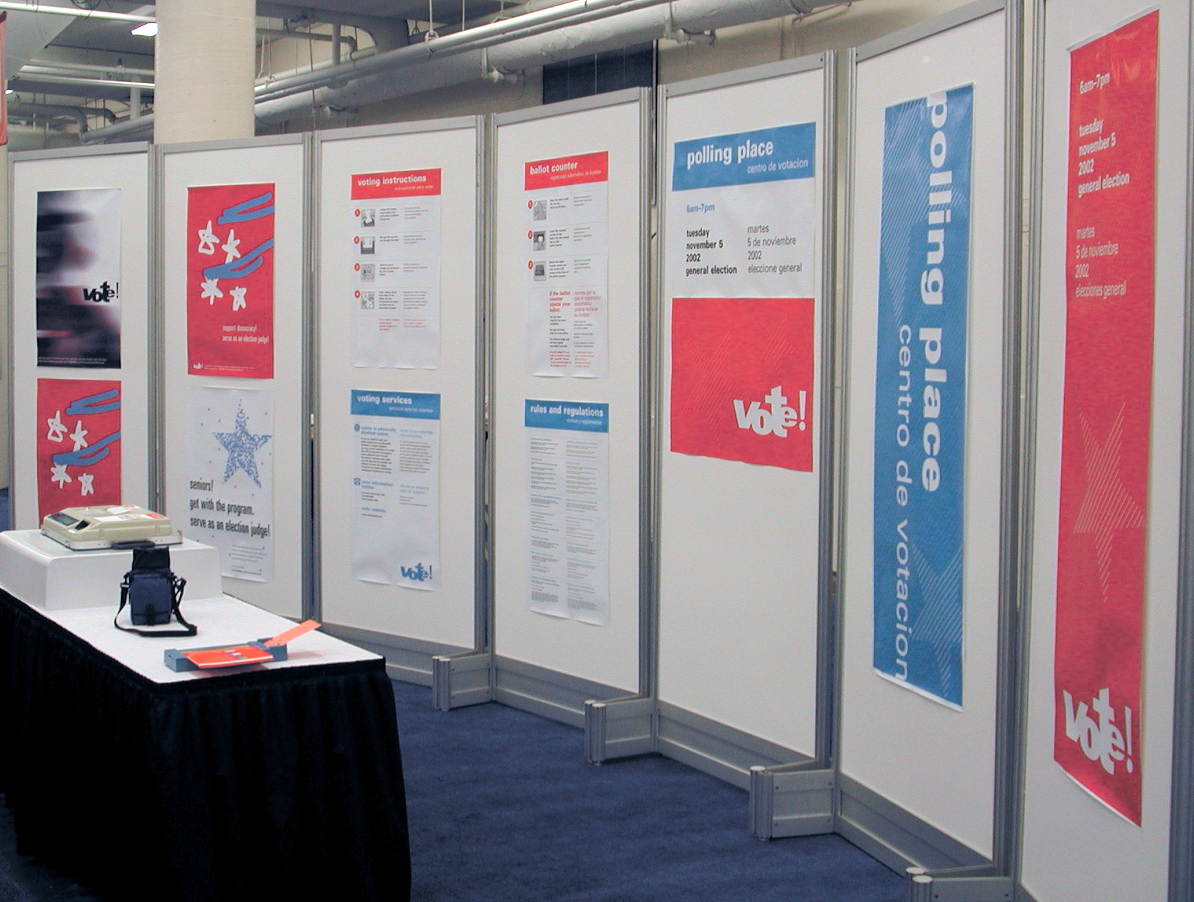
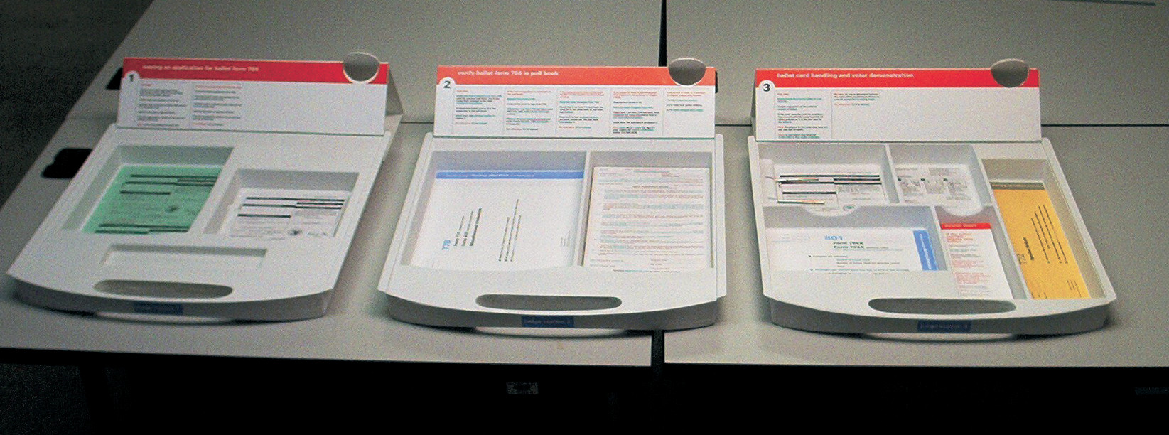
Voter experience system in Cook County, Illinois. Photo courtesy of University of Illinois at Chicago, AIGA Design for Democracy, Chicago, Illinois, 2002.
The Update
Lilly Smith: What did you make of that infamous Palm Beach Ballot when you saw it? Was it immediately obvious that there were design flaws?
Marcia Lausen: Yes. The way that I became involved with Design for Democracy was in reaction to that ballot design. In headlines all over the country were the words “ballot design.” The work of designers in presenting information clearly was not well understood. It was an opportunity to say, “this is what we do.” My reaction had to do with the opportunity.
LS: How does this artifact represent the time in which it was produced?
ML: It was standard ballot design practice at the time. I can’t say that it has changed much, namely because there were no designers involved, and often they’re still not today. Ballots are designed in a hurry by election officials and their teams; by election codes on a local level and by lawyers who ascribe what they should look like.
The guidelines we established [at UIC] are federal guidelines, and they’re not law. The way the ballot had to do with the time was that it was a butterfly ballot that used punch card technology. But punch cards weren’t really the issue. That was the technology available. It was the layout of the information that was the issue. I can’t say that design has infiltrated deeply in the design of ballots. But, the election world has a tendency to copy good examples, so things are improving.
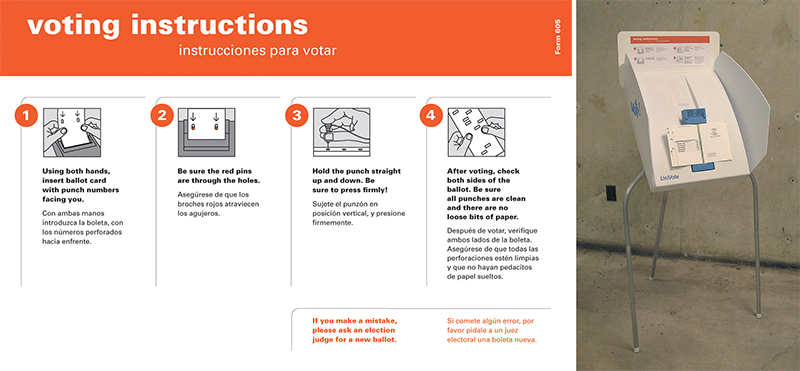
Cook County, Illinois, voter experience system. University of Illinois at Chicago, AIGA Design for Democracy, Chicago, Illinois, 2002.
LS: How was the work that you and your class produced at UIC a response to this? Were any of the concepts implemented in official election processes?
ML: Yes, in Cook County, Illinois. We produced materials that were used over four years there. We redesigned ballots, administrative materials, processes. We implemented a great deal of it—not all of it—because the supply side is quite complicated. But it was fabulous. They were really interested in improving things for voters.
LS: How did you measure impact?
ML: With statistical results: Impact was measured in judicial retention elections. Rather than voting for a candidate, these required a “yes” or “no” vote for office retention. [A Cook County official] had been tracking participation in these elections, and in the year of our redesign, participation increased greatly in those particular elections. So good design made things clearer and more people participated.
LS: The fact that the U.S. has no national voting system standard for ballots seems like it’d be an insurmountable challenge. How do you approach that bureaucratic system?
ML: We as designers like things to be systematized in ways that are not democratic. We’d like to impose guidelines about how things are designed, but that's not the democratic process. One thing you soon realize about doing this work is that design is a small part of it. It’s not something we can control—it’s a very messy process that involves lots of experts. Be open to working with experts, and teach election officials that design is an area of expertise that needs to be recognized.
We as designers would like to impose guidelines about how things are designed, but that's not the democratic process.
For example, the County with which we were working changed the final color red from our recommendation, and that’s ok. We shouldn’t want to change that reality necessarily. We as designers need to recognize that elections need to be run locally.
LS: Considering that infamous 2000 ballot, what are your thoughts regarding the election production process for the upcoming midterms?
ML: Designers need to advocate for what designers are good at advocating for: good communication. The basics of good information design don’t change. The work is the advocacy in and around the world of elections to make sure the design is a part of the equation. One thing that is heartening is that all of the election officials I met with were trying to do that right thing, and there are more that are aware and would be more welcoming of design. The issue is money, and that’s something we’ll always have to deal with. To keep ballot design strong, we have to keep getting the work out, share our principles, and look for opportunities to introduce officials to each other.
Designers new to this process shouldn’t think of [the 2000 election] as some other time; the issues are the very same for this midterm election. Be sure not to unlearn. These technologies do not move fast. Everything else moves fast around it. I was as arrogant as anyone else, but I realized the issues that need to be fixed—maybe fixed isn’t the right word; supported—are so much bigger than the information being presented.
Designers need to advocate for what designers are good at advocating for: good communication.Every four years, this giant machine has to be enacted to produce a one-day event. That’s remarkable. There’s going to be a scrappiness that goes on, and it carries baggage from the past. That’s the cycle of the change. To be clear, I’m not cynical about what design can do. When the ballot design we created [at UIC] was rejected because lowercase letters would require changing laws over years, we found we could still change the typeface. That created improvement, and that was a significant difference. We learn to be excited about significant difference.
