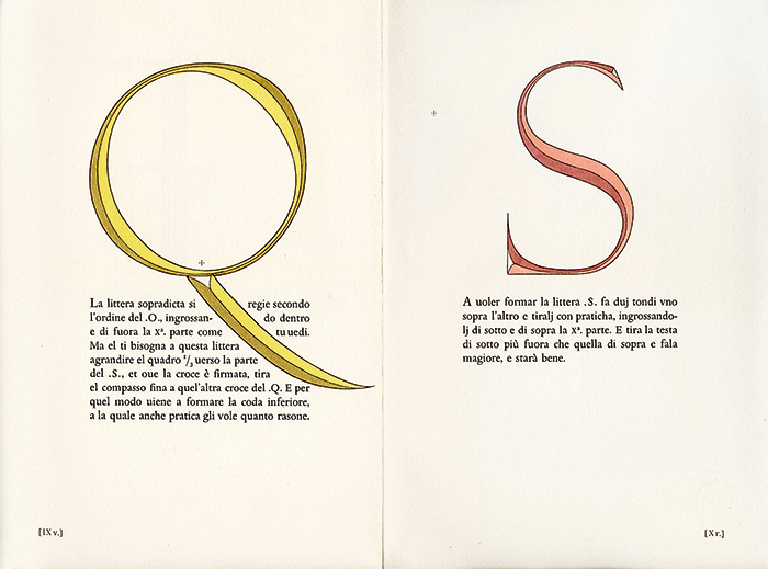
Alphabetum Romanum, a monumental Veronese letterform designed by Felice Feliciano in around 1460 on the basis of Roman inscriptions. Feliciano was a Roman writing master from Verona. Hand-colored contour drawings.
Typography is far more than type design and layout. It touches on key values of our society: the printed free word, and the democratic discourse. It is thanks to the power of typography that this discourse has assumed the form of a game of argument and counter-argument.
The new-media technology calls into question our accepted notion of typographic communication. Not since Gutenberg’s invention of moveable type in the fifteenth century has typographic communication undergone such a fundamental change as today. The typographic trade finds itself at a crossroads. Can typography still play a significant role when digitization and new media are shaking the foundations of the typographic craft? What direction will it take in its further development?
In The Triumph of Typography twenty-one international experts in the fields of typography and communication share their expertise with fascinating analyses and examples. This book not only dwells on what moves and inspires today’s typographer, but also elaborates on new developments in the field of typography.
Placing inscriptions on buildings is an age-old custom. Obviously the criteria involved in inscribing letters on edifices are quite different from those that apply to book typography. Outdoor lettering by its very nature has something monumental about it because its effect is meant to carry across fairly long distances. The letters on Roman monuments, the capitalis monumentalis and the capitalis rustica, are all capitals. During the Renaissance, the capitalis monumentalis was modernized and refined for use on monuments, but for added distinction it was also applied to humanistic book typography, which was derived from the Carolingian script of the eighth century and originally consisted solely of minuscules (lowercase letters).
The book Foto-Auge (Photo Eyes), which was designed by Jan Tschichold in 1929 and written by Tschichold and Franz Roh, made a case for lowercase letters and the exclusive use of Grotesk type. The lowercase Grotesk alphabet, the authors insisted, should replace all other existing alphabets. This radical demand immediately brings to mind the design world of the twenties, with the Bauhaus in Weimar and later in Dessau, De Stijl in the Netherlands and Russian Constructivism. We can see that sans serif letters have dominated outdoor lettering right up to the present day, but lowercase typography is barely in evidence. The Roman principle of the monumental inscription with majuscules (capitals) has dominated unabated, even after two thousand years.
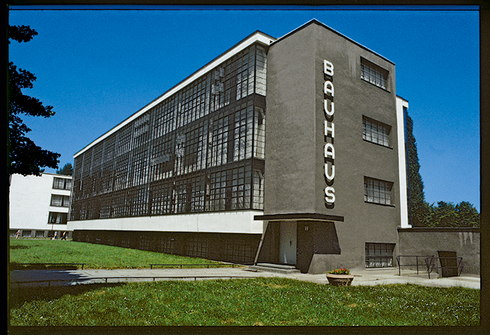
Herbert Bayer, lettering above the main entrance to the Bauhaus in Dessau, 1926
In the lettering that Herbert Bayer applied to the Bauhaus Building in Dessau in 1926, a structure designed by Walter Gropius, the strokes of each letter (ductus) follow those of Universal, the Grotesk typeface that Bayer had developed in about 1924 based on the Constructivist idea that Latin letters consist of straights and curves. Bayer eliminated the diagonal of the A so that the series of letters in BAUHAUS consists solely of verticals, horizontals and rounded parts. The phonetic arches that constitute the two AU sounds are reflected in the circular arch of the two As and Us, which complement each other in the full circles of the separate diphthongs. The typeface suits the sound: a full, round, glorious letter. This is only true for the vertical version on the studio building, however. Above the main entrance, the horizontal word image is compressed into a small space and loses all its charm.
The café-restaurant De Unie in Rotterdam, which was designed by J. J. P. Oud, built in 1924–25 and destroyed in the bombing of 1940, was rebuilt in another part of the city in 1985—the outside of it, that is, the impressive façade. The highly complex composition (it’s really a “painting”) using the colors of De Stijl—white, grey, black, yellow, red and blue—the two dominating angles in white and red that constitute the surface of the wall, and the extremely sharp capitals, was originally located between the façades of banal, late-nineteenth-century buildings. The uncompromising new façade could only have been a product of the De Stijl movement, however. The word image is different from everything we’ve been accustomed to seeing in this area. In Oud’s lettering, the diagonals have not been eliminated, as they were in Bayer’s, but the pointed angles are accentuated. The letter S, shortened to a flat festoon, as well as the A, the T and the I, leave real holes in the series of letters. Vertical lines of type with perpendicular letters are always barely readable, after all, but readability is not a criterion in this architectural letter image. Typography and architecture together form a beautiful, arresting emblem.
So far we have spoken almost entirely about lettering in majuscules. Now comes the urgent question concerning the aesthetic-optical problem of how the interior space of the letters relates to their distance from each other.
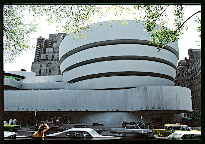
Frank Lloyd Wright, Guggenheim Museum, New York. The first designs for the lettering were made in 1943; the museum was built in the years 1956–59.
Two examples from modern times: the tight (but not too tight) placement of the letters in the open passage leading to the Salvation Army shelter in Paris, built by Le Corbusier in the years 1929–33, in a condensed type, red against the blue wall and yellow against the red, fits very well in the architectural space. The lettering for the Guggenheim Museum in New York is almost too widely spaced and takes up practically the entire long concrete band, so the lettering can be read from one point. Something of the uniqueness and greatness of this museum, an otherwise unassuming part of the urban landscape, is also expressed in the design of the lettering. The type had already been used in Frank Lloyd Wright’s first design in 1943, but here the letter assumes more of the character of the Futura light.
Architects, like typographers, speak in terms of grid systems. On a building’s façade, the three-dimensional architectural grid meets the two-dimensional typographic grid. The connection doesn’t always have to be as close as it is in the two La Défense skyscrapers in Paris, where the letters are inserted in vertical black strips. The broad Grotesk letter is out of place here, owing to the fact that the L, Y, T, and I have more black space surrounding them than the other letters, creating an irregular, not very attractive word image that cannot be balanced. A better choice would have been the linear Antiqua with accented serifs, in which the bold serifs lend a certain breadth and weight to the initial I, which in itself is narrow. In this example, by the way, the letters are substantially smaller: a good solution that does not conform to the size of the building but to human scale.
Condensed, demi bold Grotesk letters with almost forgotten names like Steinschrift, Commercial or Boekengrotesk were very popular among typographers until well into the fifties. But they were probably great favorites among architects as well, as we can see in the many existing logos and lettering on buildings from that period, some of them of very high quality.
The Studio 4 cinema, the present art cinema of Zürich, whose foyer and auditorium were designed in 1948–49 by Roman Clemens, a pupil of the Bauhaus, has extremely unusual outdoor lettering. The letters, which are rounded at the ends of the lines in the tradition of Bayer’s Universal condensed, and the rounded, trapezoidal frame, form an effective continuation of the architectural style of the interior, inspired by the kidney-shaped table architecture and design language of Hans Arp. The not very subtle addition of the word CINEMA, in a typeface related to Helvetica, is a jarring change in style and was probably added later on by another designer.
Modern technology makes it possible to create optically and electronically distorted letters (typographers speak euphemistically of modification), resulting in extremely extended or condensed versions. Unfortunately, in such cases the original movement and rhythm of the typeface is lost. With condensed letters we see a reversal of optical logic, which states that vertical (load-bearing) lines must be thicker than horizontal (outward-pressing) lines. In examples of extremely light lettering, the inter-letter spacing is also too tight.
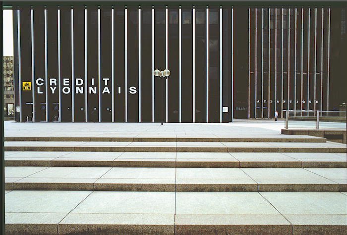
Office towers in the La Défense district of Paris, with façade lettering at eye level, thus meant for passers-by.
The lettering of the Museum für Kunsthandwerk in Frankfurt am Main is the work of American architect Richard Meier and consists of black letters on a grey background, and it’s a pleasure to see how much sensitivity and respect he had for the building’s white exterior. The handsome classical typography à la Bodoni and its placement on the side of a block of stone (not too high) are devoid of any forced or deliberately intended design.
In 1984 Achille Castiglione and Pierluigi Cerri organized an exhibition in the Lingotto Fiat Factory in Turin on the future use of the factory grounds and the architecturally interesting building. The factory had fallen into disuse and had been set aside for cultural purposes. With eccentric humor, as if the row of letters had fallen off the factory roof, the brightly-colored letters convey the feeling (by no means entirely positive) that the population must have felt about the industrial ruins. The aggressively tumbling letters, with their multicolored frivolity (they’re red, white, blue, yellow, grey, yellow-green, blue-green, and purple), suggest transience, not permanence.
The greenish-yellow outdoor lettering on the temporary quarters of the Museum für Gestaltung in Zürich that was put up during the renovation featured a special joke. You begin reading, but then you start to stutter; you notice that there are no vowels in the lowest row, that what you have here is a consonantal writing system analogous to Arabic or Hebrew. The surprising lesson is that the vowels “carry” the language, but that the consonants make the meaning possible (idea: Cornel Windlin, 1994). The typeface, which is Franklin Gothic, goes back to the early Grotesk letters of the nineteenth century. These faces have something robust about them that, given the many slick typeface designs we have today, strikes us as a great blessing.
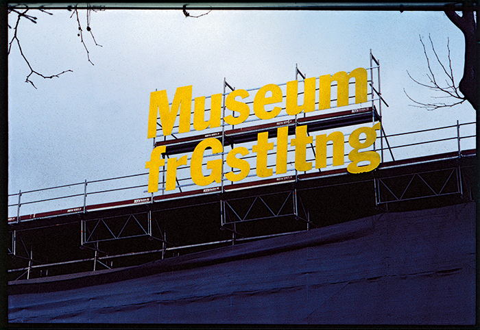
A puzzling word formation: linguistic joke with serious undertones, unfortunately only temporary. Outside lettering at the Museum für Gestaltung in Zürich during its renovation and restoration.
The Fondation Cartier in Paris is almost insubstantial in comparison. It’s a steel-and-glass composition designed by Jean Nouvel in 1994. The glass wall, eight stories high and without any interior or exterior, divides the building and park from the street. Just as uncomplicated is the lettering, which is at eye level and appears partly clear against a dark background and partly against a clear polished metal strip of the building lying behind it. It’s a glorious example of outdoor lettering that connects with the architecture – except that, unfortunately, it’s already been destroyed: because of the etching on the back, a rectangle of the glass surface that has no visible, formal relationship with the series of letters was made opaque in order to make the lettering more "readable." A horror!
++++
The Triumph of Typography is edited by publisher Henk Hoeks and design critic Ewan Lentjes, and includes contributions from: Peter Bil'ak, Petr van Blokland, Hans Rudolf Bosshard, Paul van Capelleveen, Roger Chartier, Paul Dijstelberge, Yuri Engelhardt, Willem Frijhoff, Christof Gassner, Michael Giesecke, Britt Grootes, Gerard Hadders, Henk Hoeks, Ralf de Jong, Ewan Lentjes, Ellen Lupton, Lev Manovich, Jack Post, Rick Poynor, José Teunissen, Wouter Weijers. The book is designed by Patrick Coppens, and published by TERRA with ArtEZ Press. It can be purchased here.
