This interview is part of an ongoing Design Observer series, Chain Letters, in which we ask leading design minds a few burning questions—and so do their peers, for a year-long conversation about the state of the industry.
In February, we celebrate Black History Month and examine how to better design for inclusivity.
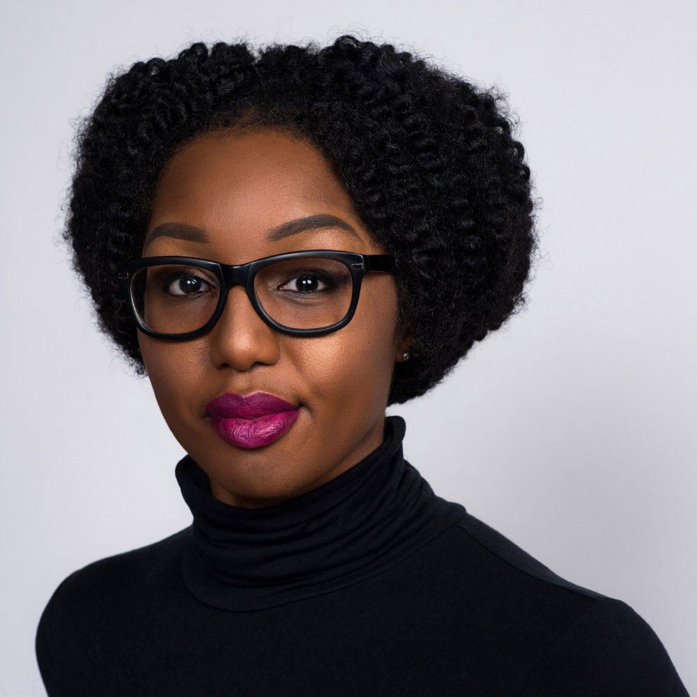
Dian Holton is deputy art director at AARP. The daughter of an Army Colonel, she grew up in the United States, Berlin, and Seoul. Her creative passion continues to be fueled by jaunts globally to discover new social initiatives and gather inspiration. Her body of work includes publishing, marketing, branding, and retail visual display. She is on AIGA’s Washington DC chapter board and serves on AIGA’s Diversity and Inclusion task force. Her passions include education, philanthropy, fashion, and pop culture. Dian received a BS in Graphic Design from Florida A&M University.
How does being an African American designer influence your work?
Being an African American designer influences my work in a multitude of ways, though it isn’t always apparent. For one, it affords me the innate opportunity to view work through the lens of an underrepresented demographic and specifically, as a woman of color. African Americans consistently influence the creative community and have been doing so for years without attribution. Pairing this knowledge with my own personal history, I’m inspired to create work that is meaningful and impactful. My background also helps me address people or brands that have attempted to culturally misappropriate others through design. But I digress.
In approaching nearly everything I do, I question how the work will be received. People want and need to see themselves reflected visually and editorially.
In approaching nearly everything I do, I question how the work will be received, and though I don’t always bring in historical references, I am aware of many symbols, imagery, and content that resonates within the African American community. I am also very cognizant of the fact that people want and need to see themselves reflected visually and editorially. Empathy shown this way acknowledges that I understand and care. I’ve always called out the need to showcase African Americans—and not always in the form of illustration, which can be an easy solve to a lack of diversity after the fact. Instead, I challenge others to be intentional from the beginning. Start the conversation and ideation with us in mind. Case-in-point, when art directing The Girlfriend, a weekly digital newsletter geared towards women age forty and above, I work with a photo editor to select imagery weeks in advance and particularly that which features black and brown people. I want to echo the words of Automattic’s John Maeda: “Diversity and inclusion is not a nice to have, it’s a need to have.”
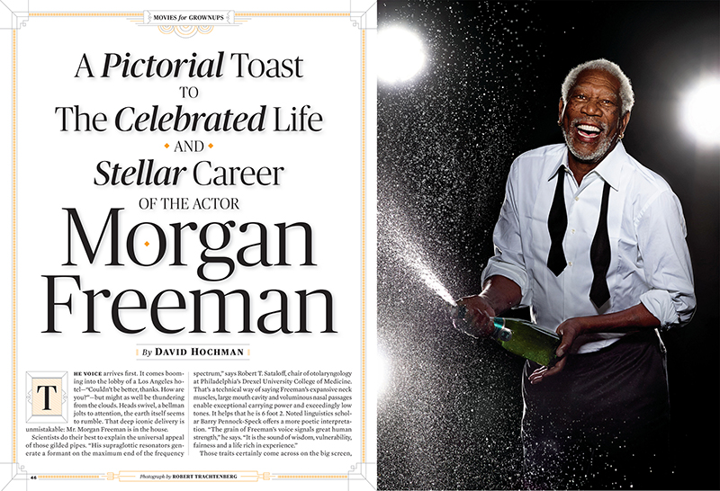
Cover story Holton designed for AARP The Magazine
How do you mentor others?
I start off with a conversation about a number of things: background, skills, inspiration, and goals. From there, I'm able to glean how I can work with them in an effective and efficient way. I ask specific questions related to the industry (key personalities, tools, platforms, publications, history) and challenge them to learn more. I’m patient and direct. I remind them that this is a business relationship and if, afterwards, we become friends, great. Until then, I’m their advisor, resource person, sounding board, champion, and devil’s advocate. I respect their individual style and try to nurture it.
Lastly and most importantly, I try to remember that my biggest role in this partnership is listening. I ask questions and give feedback based on what I’ve heard to ensure that we’re on the same page. Since launching the AIGA DC SHINE mentoring program seven years ago, I continue to preach that mentoring is a two-way street. I don’t claim to know everything. I’ve enjoyed learning from mentees as much as I hope they do with me.
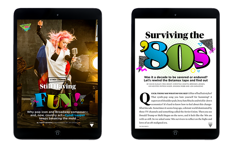
Holton art directed and designed this piece for print and mobile.
What’s the biggest cliché you hear when it comes to designing for inclusivity? Why?
I often hear that there wasn’t enough time to do the research to implement the image, language, or tool that would yield a more inclusive design. Saying that you didn’t have time tells me that you don’t care that much about the product or you don’t value the recipients’ interaction with it. As designers, we are problem-solvers, visionaries, and teachers. It’s important for us to be empathic and proactive in learning about our audience, so that we can provide meaningful experiences. This means getting to know the people who may not be like you.
It’s our job to minimize unconscious bias and focus on providing an experience that considers a variety of perspectives. We should build in the time to evaluate our designs and expand on the way it affects everyone. Let me point out, that even if a company doesn’t have the resources for focus groups, an individual can do their own research: poll friends, read articles, study case studies, and join meet-ups. Easier said than done, but by doing so, the opportunity to develop a new inclusive practice for a larger group is probable. As designer Elise Roy says, “When you design for the disabled, you design for all.” This theory can be applied across demographics and disciplines. In a nutshell, drop the excuses. Pledge to be better, do better.
We should build in the time to evaluate our designs and expand on the way it affects everyone. In a nutshell, drop the excuses. Pledge to be better, do better.How can design be used by disenfranchised groups to give themselves power?
Designers can help disenfranchised groups empower themselves by taking up the charge and committing to a plan that broadcasts, educates, and activates a group’s mission. As designer Maeg Keane stated, “find a political movement, and you've found design at work. Posters, websites, t-shirts, arm bands, murals—when people have something to say, they say it every way they can, including visually.” I agree with her 100%. Look back at the art that was spurred from the Dakota Access Pipeline battle and the indigenous community. Powerful. A test of resilience, which as Dr. Sharon Egretta Sutton states, “is the quality activist designers need to mobilize a social justice movement.”
Urban landscape designers can also have a major impact on marginalized groups. Their work not only communicates history and values, but re-shares it in a digestible, structural way. Hood Design Studio’s Walter Hood, who presented on this topic at Harvard’s Black In Design conference last year, focused on better understanding the spaces of people of color through memory and certain mnemonic devices in public spaces. He showcased work that involved the “instigation of semiotics” (the study of signs and symbols and their use or interpretation) to show “how transgressive actions in the design process could be used to let us not forget.” From the Witness Walls installation in Nashville, which features protest images embedded in concrete walls, to his landscape designs for the upcoming International African American Museum in South Carolina, where approximately 40% of African slaves landed, Hood re-shares the story of the thousands of voiceless souls through his work.
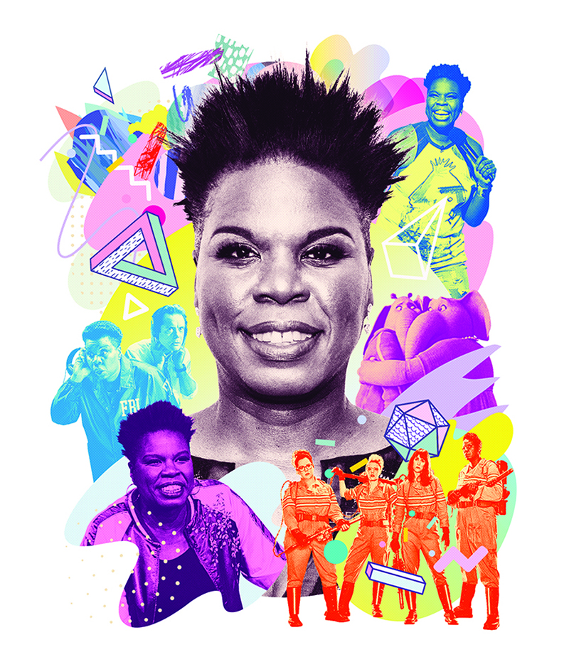
Illustration by Sean McCabe that Holton commissioned for the Big 50th section of AARP The Magazine
Which design moment from the past year do you see as a bellwether for change? Why?
One of the most evident and public moments from the past year that signaled change to me stemmed from the attack on women and their rights by the current administration. Women artists (and men) took pen, marker, and pixels to the streets to showcase and make their feelings known about the discriminatory, intolerable, and misogynistic acts facing the female population. I also noticed a plethora of women creatives teaming up to support each other with bigger and more visible platforms like Women Who Draw. More women and women of color have been celebrated and recommended for jobs, speaking engagements, and spotlights in the past year—and while I think this would have happened eventually, the ushering in of the new administration in January has helped to accelerate it.
From Briana Como: You mention on your website that you can concept 100+ solutions to solve a problem or visually tell a story, but have trouble editing down those solutions. How have you learned to overcome this, and what strategies have worked or not worked?
Over the years I’ve tried many approaches to narrow down my final option. It pertains mainly to my publication design work, but you could apply it to other genres. For one, I figure out the visual pacing for the section at hand and where the design piece I’m evaluating falls in the issue. Then, if it involves a personality, I look to see what other people are near and how they’re being showcased. Are they close up, or pulled back, photographed in an environment, or on a seamless? Are they male, female, a person of color? I take all of it into consideration.
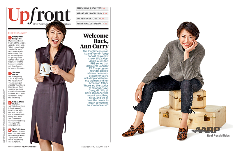
For instance, when I art directed the Upfront opener featuring Ann Curry for AARP magazine, I asked that we be given photos of her propped out in a variety of scenarios, because frankly, you can never have enough. Then I mocked up a few that could be swapped in as the Upfront section came together. From there I whittled down the composition before sharing it with upper management for final approval.
In other scenarios, I may poll someone outside the art department or office. This doesn’t speak to page pacing, but to visual appeal. Knowing the AARP Media brand aesthetic is important and while I've have had some success stories, I’ve had some that resulted in going back to the drawing board. But what can you say—you can’t knock it out of the park every time.
Next week Dian Holton asks creative director Ced Funches: Share a moment when you were realized the impact of your work on a community or specific demographic (this could be a negative or a positive) and how it changed you.
