Frank Ockenfels 3. All images courtesey Frank Ockenfels 3.
This interview is part of an ongoing Design Observer series, Chain Letters, in which we ask leading design minds a few burning questions—and so do their peers, for a year-long conversation about the state of the industry.
It‘s June, and you know what that means—the unofficial kick-off of summer concert season. This month, we examine design and music, and why fans everywhere benefit when these creative industries work in concert.
Frank Ockenfels 3 career started in the music industry in the late ‘80s shooting covers and features for Rolling Stone. At the same time he was working with a variety of labels, shooting album covers for artists such as Bruce Springsteen, Sting, Willie Nelson, Wilco, Busta Rhymes, Queen Latifa, Garbage, No Doubt, Soundgarden, and Tom Waits. He’s also had the pleasure of collaborating with David Bowie on fifteen photo shoots that stretched over a nine year period.
In the early ‘90’s, he started creating for the TV and movie industry, for shows such as Madmen, American Horror Story, X Files, The Walking Dead, Breaking Bad, The Americans, House of Cards, and The Defenders; and for movies such as Blade Runner 2049, Assassins Creed, Harry Potter, Jason Bourne, Tomb Raider, Thor, Concussion, and Pirates of the Caribbean. Frank is a member of the DGA and has directed music videos and commercials for clients such as Nike, Converse, and K Swiss. He has had several exhibitions of his work and is currently working on a book.
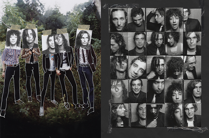
The Strokes shot for publicity for album.
First and foremost, music is an auditory experience. How do you assess the role visuals play in building the listener’s relationship with your client?
An album cover should reflect the feeling of what the artist has spent so much time creating. As album covers got smaller, the art has disappeared and been replaced by tight shots of faces. Of course now people don’t buy CDs or even records that much, and that’s changed how fans perceive an album. You open iTunes to listen to music, and the album art is two by two inches wide. I think that people just look for names and faces now, which makes sense in that there’s not a lot of room for much else. But if you think back on great album covers, like the ones Led Zeppelin did, a lot of them had really interesting graphics across them. The offense round of that would be the cover of The Who’s Who’s Next, shot by Ethan Russell. The four members of The Who are walking away from this huge piece of concrete and there are three spots where they just peed on the wall. Can you imagine today? People would freak out. It’s a very different time.
I approached the challenge of a smaller canvas size by trying to make interesting portraits that aren’t so cookie cutter. I’ve always been a portrait photographer so it wasn’t a big issue to have to step in on someone’s face and not worry about the space around them. I had the ability to do that. And when I work with an artist, I always ask to listen to a few songs before talking about the direction of the photos. But I also push for ideas that are more interesting than a face against the seamless staring back at you.
Take the David Bowie portrait. I met him when I was hired to shoot Tin Machine for a magazine back in the day. It was back when I was arrogant and kind of a silly kid. I knew I was the fourth photoshoot that day, and I wanted to do something different. I thought it’d be great to light paint him. When I said what I wanted to do, David looked at me and said, “Do one, show me a polaroid, and we’ll go from there.”
David Bowie was my gift. He saw something in me he appreciated and wanted to nurture. I was lucky enough to have that.So I did, and he laughed and said, “This is the most interesting thing that anyone has done in a while to me.” That started our relationship, which spanned fifteen photoshoots over nine years. David was unique in that whichever way you came to him creatively, he looked to you to answer the questions like “What would be the best approach to this?” He picked you to collaborate with because he knew that you’d bring something to the table and he was just going to refine the edges. That was a very rare thing for someone at his level.
I’ve had the pleasure of working with most people over the years. It was the same process for the Springsteen picture. I said, “Let’s go for a walk.” Springsteen never said he wanted to do the picture in a particular way; he hired me because he wanted to see what I came up with and how I saw him. Older artists, like Sting and Wilco and other bands—people that I’ve worked with for a long period of time—that’s what they do. Younger artists usually think they know what they want and they’ll bring you pictures to recreate. Working with David was my gift. He saw something in me he appreciated and wanted to nurture. I was lucky enough to have that.
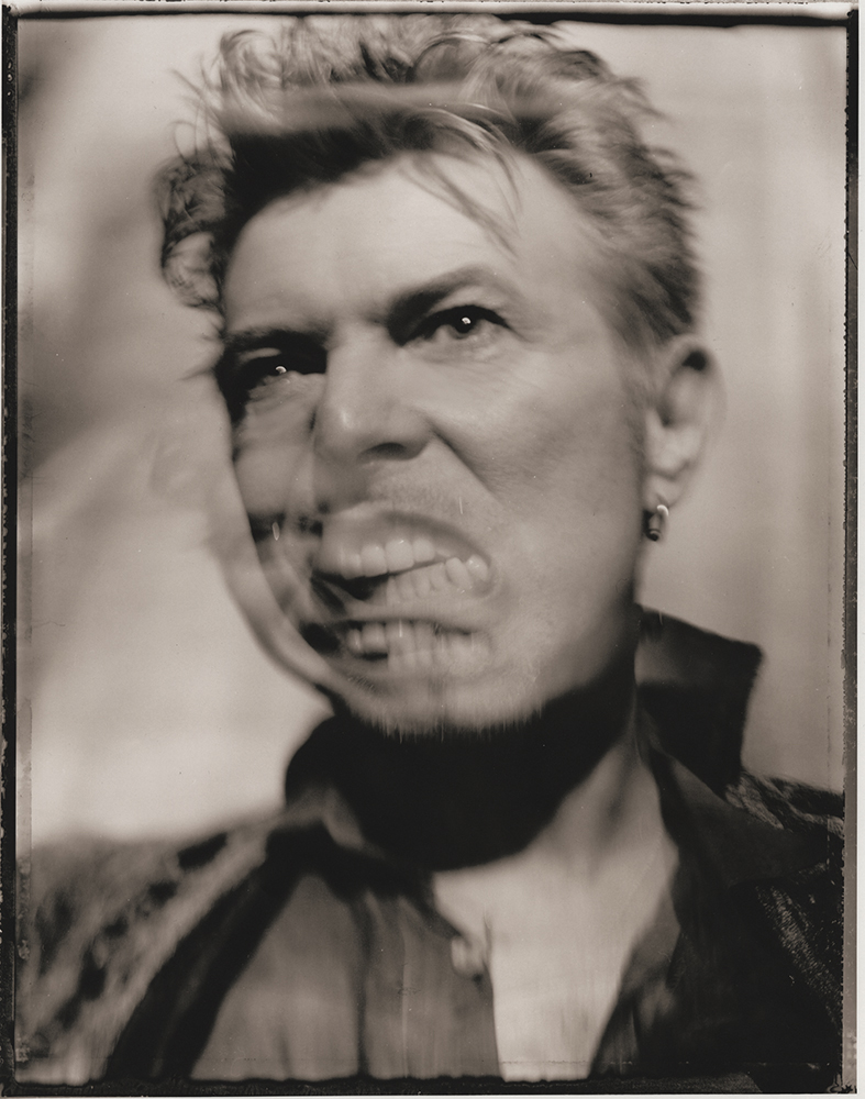
David Bowie Earthling album publicity.
There is as much written about the death of the music industry as there is about the death of print, yet neither is gone. What parallels do you see, or what differences are there?
Audiences have become used to everything being free. Content—either music, video, or photography—streams 24/7 without the need to pay for it. Music servers pay less than a penny to the artist in most cases to stream their music. If you don’t buy the music, the artist can’t afford to make the music you love. Magazines have lowered rates and are now trying to resell the images to make money back without compensation to the artist. In both cases, they say that they’re giving you exposure; a chance for people to hear or see your work.
‘Zine culture was very influential to the visuals of independent music in the 1980s and 90s. Is there fan-created content that influences you today?
We used to have college radio, which still exists if you search for it. I listen to BBC 6, the most eclectic programming of old and new music, DJ’d by musicians with great insight and conversation.
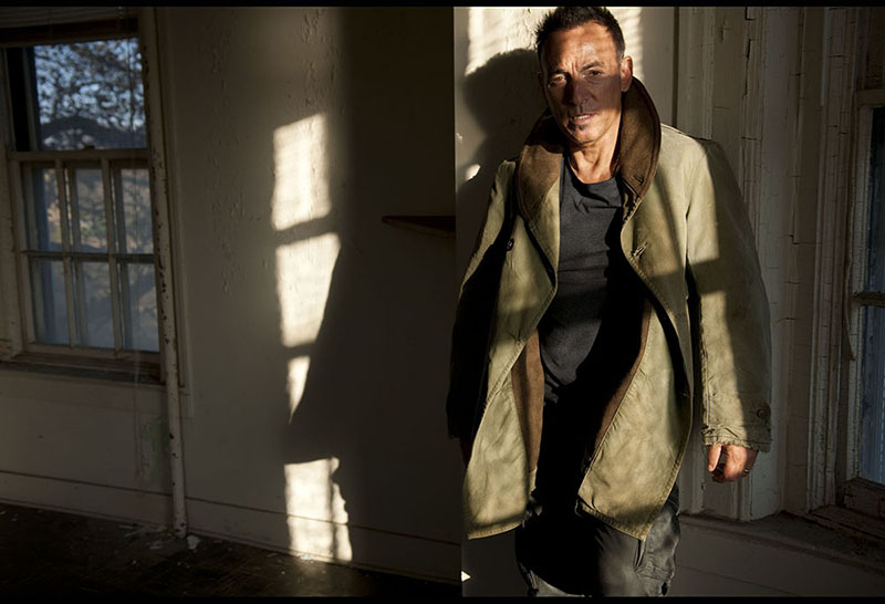
Bruce Springsteen shoot for album publicity.
Does music’s ongoing evolution into the digital present a visual opportunity or a design challenge? What’s missing, visually, in today’s music experience?
I like where photography for music is going on some levels and on some levels I don’t. There was a commitment to creating I don’t see anymore. The question is, what are you creating for? If you’re making commercial art and music, no one commits to saying “We’re going to shoot a black and white picture.” Everything is always, “We can always color it later,” or “I don’t want to commit to this right now.” When I was younger, you had to commit. If I put a roll of black and white film in the camera, you were getting a black and white picture, and you couldn’t go back on that.
At the end of Dave Grohl’s documentary Sound City, he talked about how musicians would come into the studio and put down their tape exactly as they’d record it. Now, everything is recorded in layers and they choose where to go with it afterward. Music and photography can now be made without commitment because, with digital, you can change a million things later: autotune voices, clean it up. Digital has allowed us to shoot in lower light, and it’s made recording music easier, but to see a band live and hear the raw beauty warts is still spiritual.
I am a true believer of creating in the moment. I still try to photograph like that, even with digital. If you shoot in a certain light at a certain time of day in a certain direction you can never recreate it because the lenses were messed up, or because any number of combined elements did something together that made that moment unique. I try to bring that spontaneity to most music shoots. The artist will bring references but I always try not to do what they bring to a shoot. They’ll say, “I want to do this picture,” and I’m like, “Ok, well I’ll get to that. In the meantime, we’re going to shoot other things.” And I’ll see if they bring it up again during the day. To me, that particular picture probably happened because of the person I was standing in front of. Now I’m standing in front of someone different and we can create something different together, that will be your picture and no one else’s.
I am a true believer of creating in the moment. I still try to photograph like that, even with digital.If video killed the radio star, what did streaming services kill?
It made us forget that the music we love is made by a person who needs to eat and pay rent. If you love the music, buy their album.
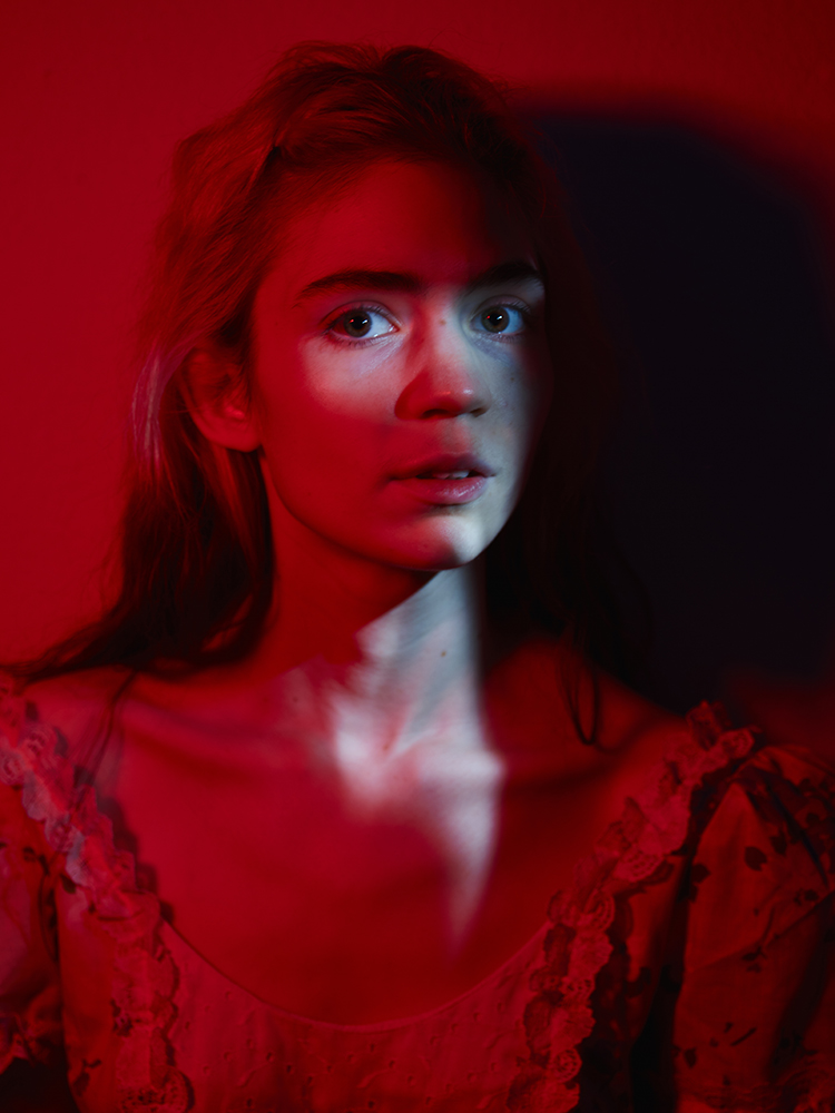
Grimes shot for WIRED magazine.
From Lawrence Azerrad, Grammy-winning graphic designer: Design for music can be a slow and challenging process. Lengthy dances around artist approval can go into describing music through design. Yet so many photographs capture the entire essence of an artist or an album in a single instant—Clarence Clemons and Bruce Springsteen on the cover of Born To Run for example. How do you prepare to capture an essence in an instant? How do you conjure the spirit of a song in a single day, shoot, image?
Sometimes during a shoot, a moment happens when you see the musician drop his or her guard. It could be as simple as a look or a piece of light that feel like what you heard when you listen to their music. I feel that each shoot is a journey; a collaboration to create an image together that reflects what they have worked so hard on. That image should be true.
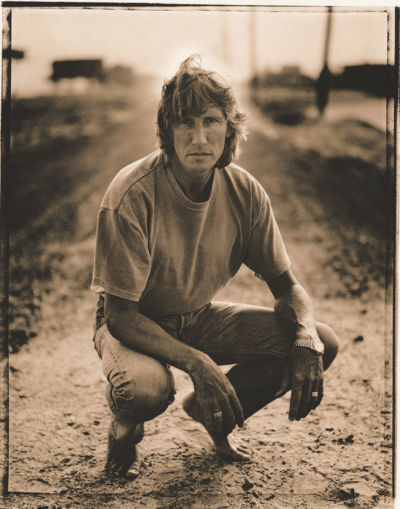
Roger Waters shot for Musician magazine.
Next week, Frank asks Emily Batson, costume designer and stylist for St. Vincent: Have you ever designed something and it just went too far? That you saw and that the St. Vincent team couldn’t see?
