This interview is part of an ongoing Design Observer series, Chain Letters, in which we ask leading design minds a few burning questions—and so do their peers, for a year-long conversation about the state of the industry.
As we gear up to our two-day fall conference on design + business, we're reaching out to some of our favorite guests on The Design of Business | The Business of Design podcast to discuss their thoughts on design as a management discipline.
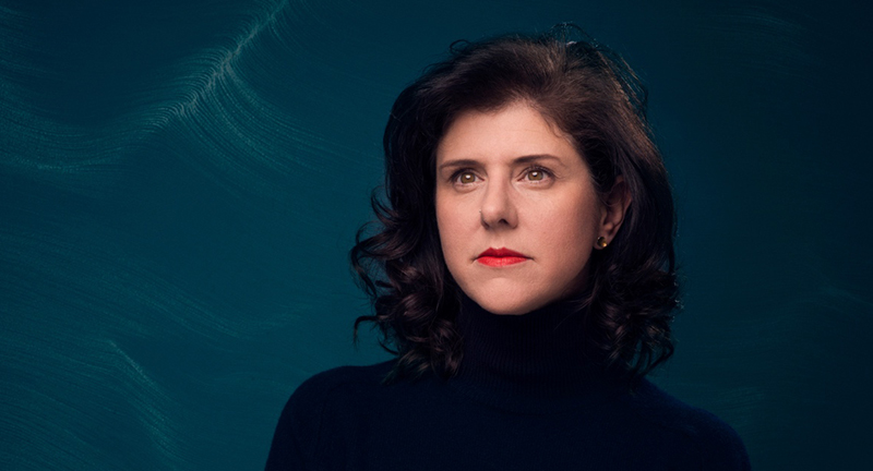
Margaret Gould Stewart is Vice-President of Product Design at Facebook where she leads a global team of product designers and researchers for teams such as Artificial Intelligence and Privacy & Data Use. She is a frequent speaker on the subjects of design leadership, ethics and the impact of technology on society.
Margaret has been a leader in the field of user experience design for over 20 years. After graduating from New York University's Interactive Telecommunications Program in 1995, she consulted with media companies such as the New York Times, Time-Warner, and Scholastic to develop many of their first web properties.
Before joining Facebook, Margaret served as Director of User Experience at YouTube, overseeing the design of all YouTube’s products globally. Prior to that role, she managed Google’s Search and Consumer Products User Experience team. Over the course of her 20-year career, Margaret has led design teams for six of the top ten most-visited digital properties in the world: Facebook, YouTube, Google, Lycos, Tripod, and Angelfire.
As part of the Google design team, she accepted the National Design Award for Corporate Achievement in 2008 and now serves as a member of the Board of Trustees for the Cooper Hewitt Smithsonian Design Museum. She is a regular speaker at conferences such as TED, CHI, and AIGA, and publishes her thoughts on design and leadership on Medium.
She lives in Palo Alto, California with her husband David and their three children.
Design and innovation have an intimate and irrefutable relationship, but it can be elusive to describe. Do you have an example of the two working in concert in your career?
I think it’s important to note that the term innovation gets used in a lot of different ways. For many people it speaks to invention; the application of new ideas, processes or technologies in ways that create value for people and/or businesses. As far as the relationship between the two concepts, I don’t think design has to be innovative to be good design. Sometimes, there’s a fairly obvious and excellent solution to a given problem! But there are times when a new approach, a new technology, or a new insight allows us to make a leap forward in the experience people have with what we’ve designed. People also often assume that innovation means a big, brash change, but sometimes, it comes in the form of small changes that make a big difference.
I remember back when I was working at YouTube, and we were looking for ways to improve the civility of the comments people left about videos. At the time, there was just a blank text box that you could type into, but we’d learned through research that people are more likely to be thoughtful about what they say if they see themselves directly attached to their own words. So we added the user profile picture right alongside the text box.
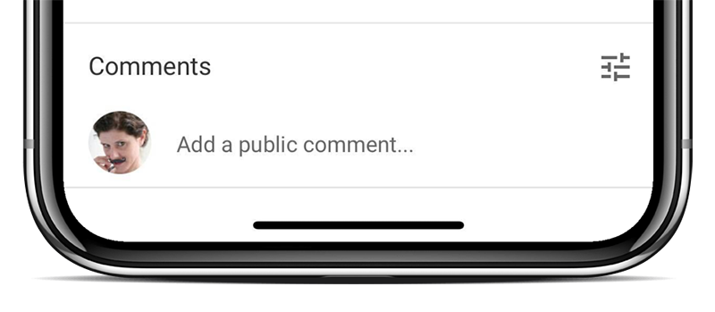
Seeing myself next to that text box makes me more likely to stop and think, “Do I want these words attributed to me?”
That simple, subtle addition, inspired by studying human psychology and behavior, made a meaningful difference in people taking greater responsibility for their words. At the time, this was a new design pattern, but it’s standard practice in online forums nowadays, including on the Design Observer blog comments interface ☺
Over the course of the past decade, design-driven companies have outperformed the S+P 500 by 228%. Businesses started by designers have created billions of dollars of value, are raising impressive rounds of funding, and are collectively demonstrating how design plays a central role across a range of industries. If design is critical to the success of the modern business enterprise, what are the core values and best practices that support that success?
Focusing on enduring human needs and putting technology in service of those needs are key not only to great design but to creating a sustainable business. It is easy to get caught up in tech for tech’s sake, but the products that have stood the test of time focus first and foremost on addressing a human or societal problem.
Increasingly, designers can help facilitate conversations about the responsibility businesses carry when building products for people and society. I’ve been thinking a lot about the evolving and expanding scope of responsibility for designers and have tried to capture some of these thoughts in this diagram—I call it the Four Quadrants of Design Responsibility. I wrote more extensively about this on Medium but here’s a shorter summary of the concept.
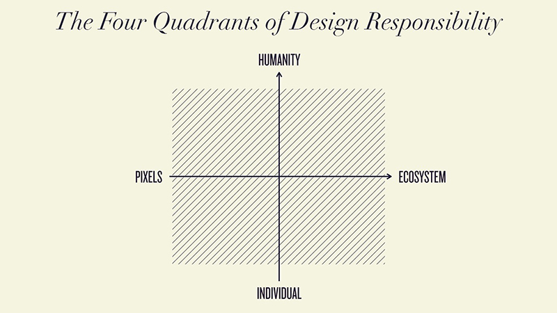
The Four Quadrants of Design Responsibility looks to illustrate the expanding scope of responsibility we have as designers, to not just design for people and products, but for systems and society.
On the X-Axis, you have, from left to right, what we build, at an increasing scale of things, from the pixel to the product to the whole ecosystem in which your product operates. As you move from pixel to ecosystem, constraints, inter-dependencies and complexities grow.
And on the Y-Axis, same idea, but the scale is the audience you’re designing for, starting with one individual human and working your way up to all of society. And as the scale grows, the less we can assume about who we are designing for, their motivations, their culture, their needs and wants.
As designers, we feel really comfortable in that bottom left quadrant: it’s where we can push our pixels and polish our work to make something really well crafted. And it’s where we can be human-centered, focusing on a particular audience of people that we are intentionally designing for, and a set of tasks that we believe is important to them and that we want to support. We feel like we can understand and control things there.
But at the extreme end of the X-axis, we may face unanticipated consequences from network effects. The systems we’re designing are sometimes difficult to model and sometimes we only really see what happens with them when they’re used at scale. Think of a cleaning product that might work exceptionally well for a particular task, but when released into the water system, might have unintended effects on plant and animal life.
When you go far out on the Y-axis, designing for the whole world, there’s a whole other set of problems that can arise. For instance, you see how differently Facebook works in different parts of the world, from the way people access the internet, and the kinds of devices they have, to their social norms, political contexts, economic conditions. And as the number of people using your product grows, so does the likelihood that people will use it in unintended ways, which can create both good and bad outcomes.
Designing for all four quadrants, thinking expansively about the impact of our inventions on people and society, that is the heart of ethically responsible design. In the digital realm there aren’t a lot of examples of products that do a great job of this…yet. It points to both a challenge and a huge opportunity for all of us, and is a crucial element to building sustainable businesses that serve people well.
Management and design seemed to come from two different worlds: the world of planning and organization versus the world of creativity. Do you see design as a management discipline? How can creative leaders collaborate with executives to catalyze ideas and to mobilize teams?
I would push back on the notion that it is “planning and organization versus the world of creativity.” Certainly, there’s a big difference in the day to day work of someone who is designing fulltime versus someone who is more of an operational leader. Over the years, I’ve gone from doing hands on design work fulltime to managing teams that at times have numbered in the hundreds. As my day to day has moved further away from producing the work, I’ve embraced the challenge of creating the conditions for others to excel. It’s a different set of challenges to be sure, but I find it endlessly stimulating and rewarding to develop creative confidence and capacity in my teams. It is, essentially, my design work. I need to understand the strengths and motivations of the individuals I support, internalize the needs of the organization, determine where my cross-functional partners in product management and engineering are in their understanding of how best to partner with design, and establish a compelling vision and narrative for our work to that we are all moving in the same direction together. I will always be a designer and think like a designer, but I’ve learned over time that there are many ways to apply design in the business context.
Currently, I’m working with the Facebook AI team to explore how design can be a force for humanizing AI and for ensuring it is harnessed to amplify human abilities and be a positive force in the world. That’s not a traditional design problem, and it’s not something where I have to produce a lot of traditional design deliverables. However, my point of view as a designer is uniquely valuable to increasing the cognitive diversity of those shaping these powerful technologies. AI will impact every area of our business and industry, as well as society as a whole. As a designer, I am grateful for the opportunity to shape our approach to these powerful technologies
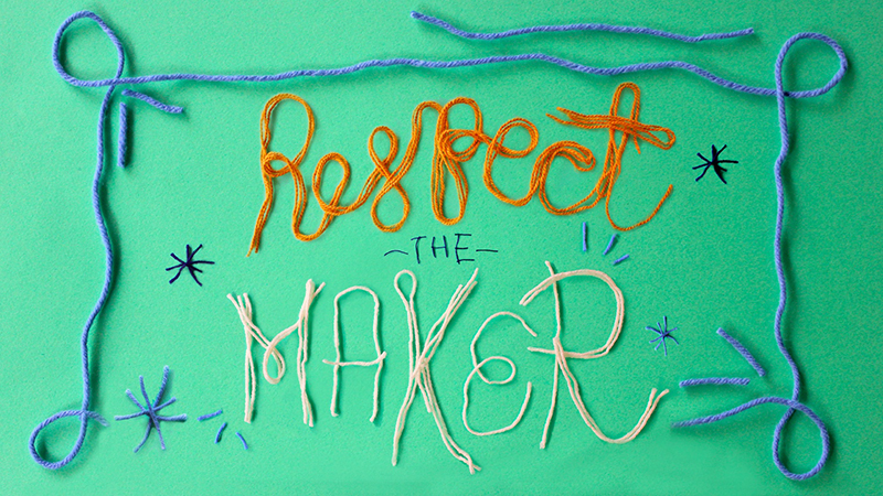
When our day to day work becomes more operational, we must seek out creative outlets for ourselves to stay in touch with our creative selves.
All that being said, sometimes I miss getting my hands dirty, and by that I don’t just mean doing hands on digital design. I mean actually making real, physical things with my hands. I spoke and wrote about this a while back and I think it’s an important reminder for those who work in digital design and those who have taken a path of more operational leadership. I don’t want to repeat all the messages in the post since you can read it on Medium but suffice it to say that we all must have regular, satisfying creative outlets to continue to feed our maker soul.
From Arthur Cohen: What can designers do to fight increasing levels of screen-time addiction, especially among younger generations?
As a mother of three teenagers, this issue is very important to me. I want the time they spend on the internet and on devices to be intentional and positive. Like most designers, I also feel a strong professional responsibility to ensure that the things I design are good for people and society. The area of well-being is an important focus for Facebook, and it is a responsibility that we take very seriously.
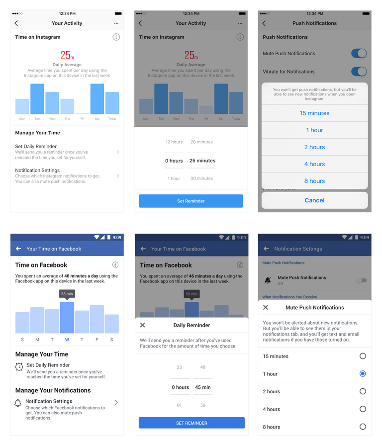
Facebook time management tools launched earlier this year.
Helping people gain visibility into their own usage is an important step in helping them be more in control of the time they spend using our products. Last month, we launched a new set of tools that are intended to give people more awareness and control over the time they spend on Facebook and Instagram. The tools include an activity dashboard, a daily reminder and a new way to limit notifications.
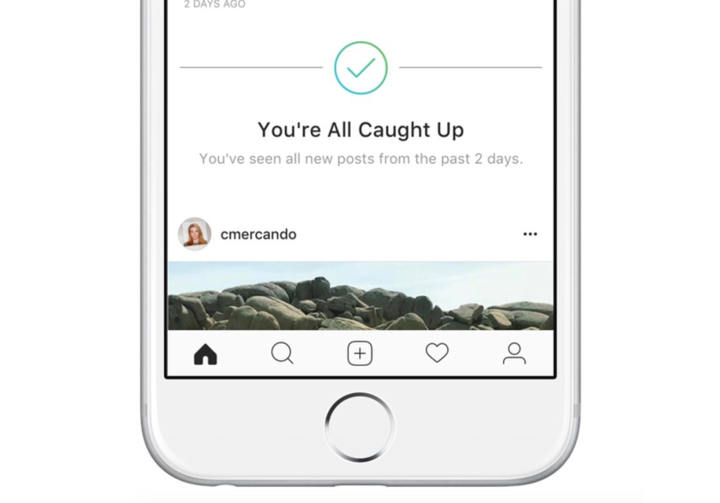
“You’re All Caught Up” messaging in the Instagram app.
In addition to these tools, we’ve developed several controls including an “You’re All Caught Up” feature in the Instagram app which helps people keep track of the posts they’ve seen.
We’ve developed these tools in collaboration with leading mental health experts, academics, our own extensive research, and feedback from our community. These tools aren’t a complete solution by any means, but they are a critical step in helping people to gain visibility and awareness of their usage.
Supporting people’s well-being as they experience and adopt new technologies is a complicated problem, but it’s one that’s critical to address. As designers, we have a critical responsibility to engage in these challenges so that together with leading experts, policy makers, and our community, we can work towards a better understanding of how technology influences our collective well-being.
Up next Margaret asks Sean Adams: Design can change the course of history. What are your picks for designs that altered events, in good and bad ways, and what can we learn from these examples?
