The grand medieval clocks, such as the Horologium Miracle Lundense in Lund or the Gros Horloge in Rouen, are mechanisms of incredible complexity. Their faces and hands are festooned with apostles, astrology, mythical beasts, planets and figures. As the clock ticks, their universes also turn, revolving around one another, banging bells, opening doors and so on.
These clocks not only describe time but set out a complete word view in such detail that it's hard for a modern eye at least to tell the time. Maybe that’s because we, in the early 21st century, look at time differently.
Time is an idea and the devices we make to measure it are like maps. They are machines that chart our position in an invisible dimension and their evolution tells a story about out changing understanding of the world and our place in it.
Now, of course, our clocks are unlikely to be steeped in religion and myth (though some still are). Today’s smart watches and trackers weld time to other cultural myths — of health, efficiency, information and lifestyle. Modern time, in other words, is just as strange and culturally nuanced as that depicted on medieval clocks.
The clock-as-object is almost redundant now. We don't need a specially designated thing dedicated to displaying the time when we can find it almost anywhere — hovering in the corners of almost every screen we see, in our pockets, on our wrists, buried in the objects that surround us. Time is stamped on every email, ticket, transaction. It is the abstract infrastructure of contemporary life, an electronic pulse that choreographs the modern world.
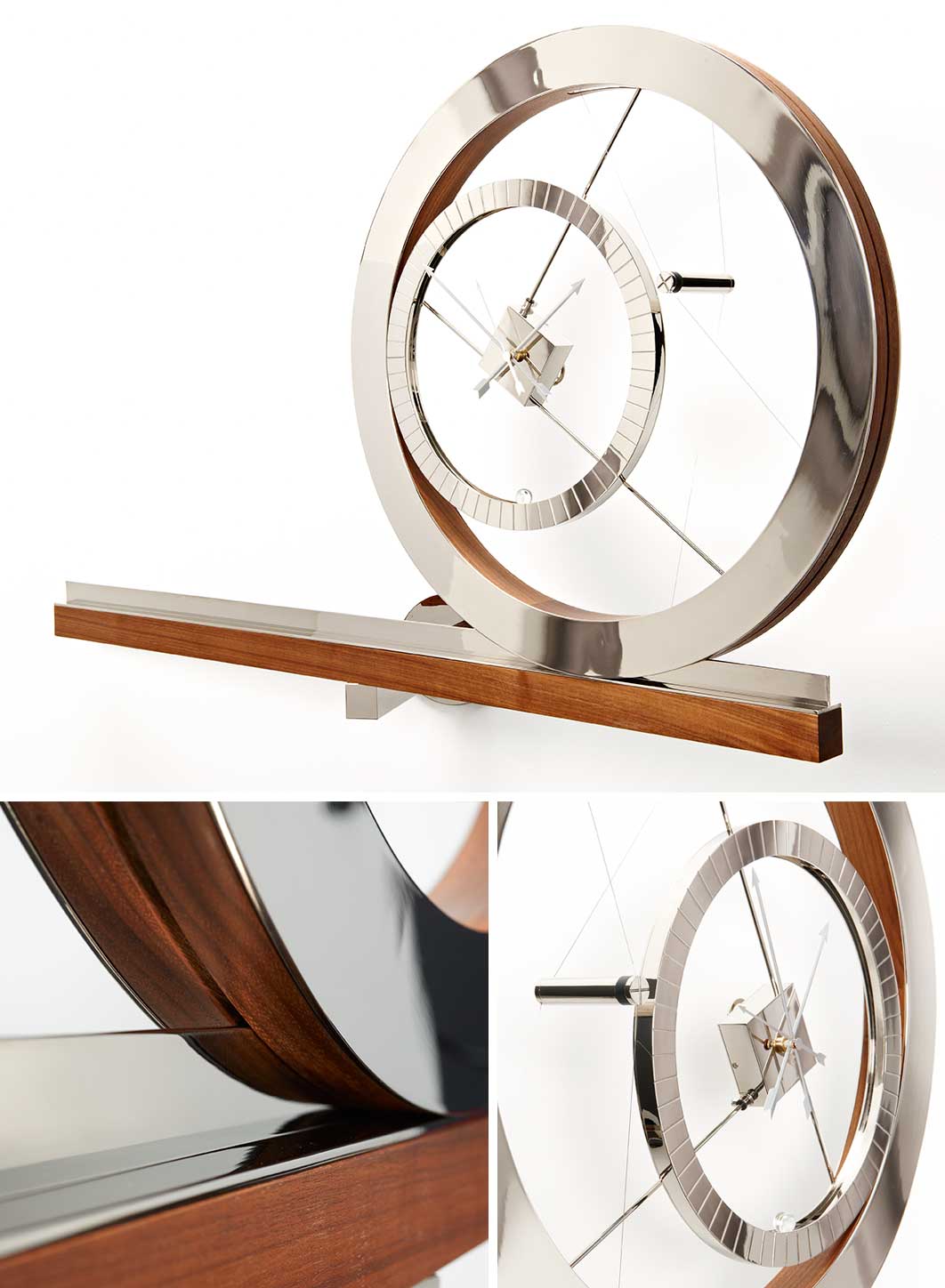
Clock For An Acrobat, 2011
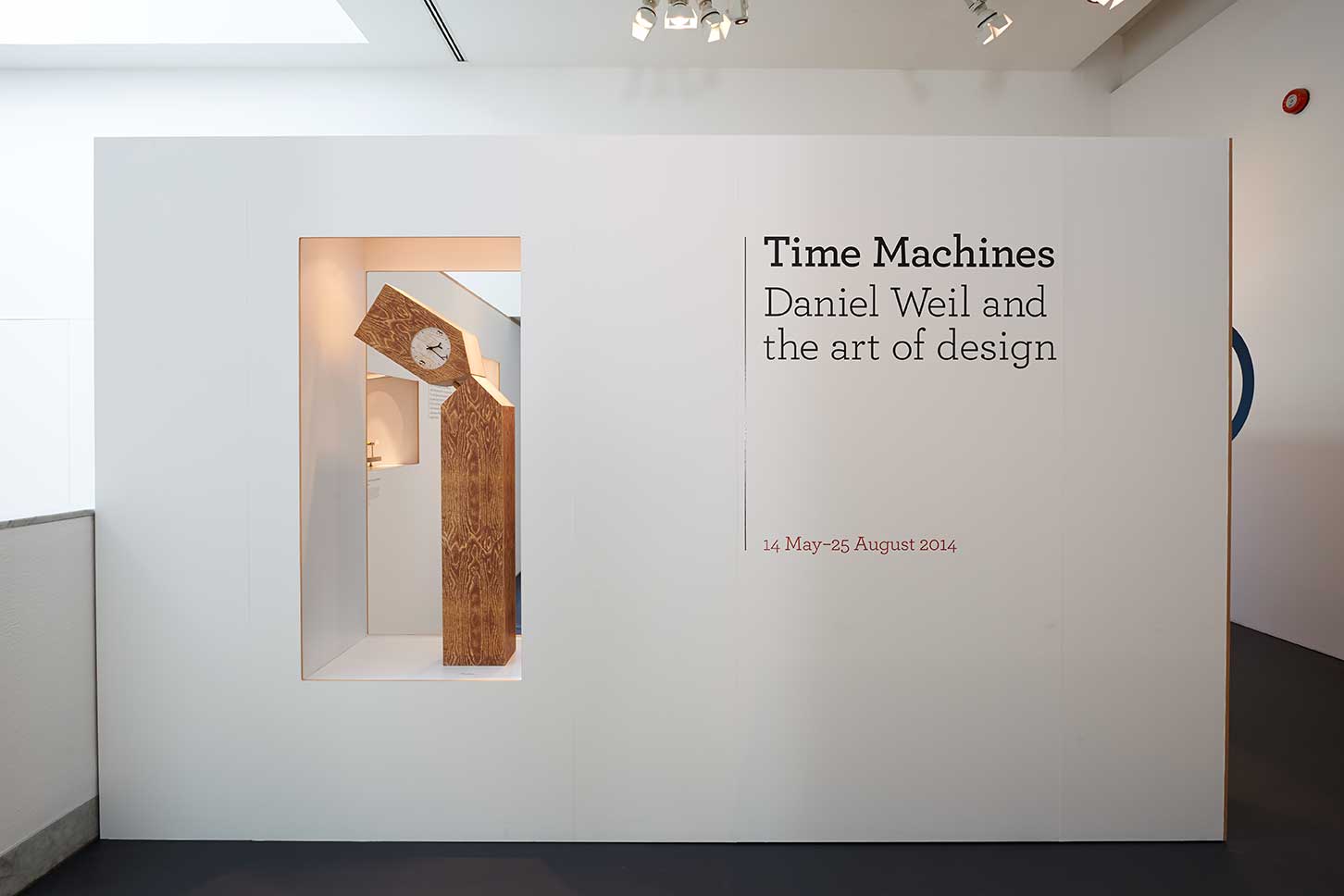
In a gallery at the top of London’s Design Museum clocks are exactly what we see. They are the main focus of Time Machines: Daniel Weil and the Art of Design, guest curated by Martina Margetts. His clocks might tell the time, but that’s not their real job. They are clocks as explorations of personality and character, mechanisms distorted by allegorical surrealism. Post-clocks in other words.
There’s a Clock For An Acrobat that revolves around itself, one for an architect that arranges the mechanism as though it were a site model with a chromed primitive of a house as the power source. There are clocks exploded like subatomic particles, clocks that half become musical instruments. In a world that no longer needs clocks this very redundancy that gives Weil the space to address out-of-time qualities.
Weil likes exploding things. There’s the seminal radio in a bag from the early 1980s, whose electronic components are loosely held in a see-through PVC packet. These explode the idea that a radio — or any tech product — is really a thing. Instead they reveal it as an assemblage of parts, a deconstruction of technological objects. All those slabs of aluminium and glass that surround us present themselves as monolithic, seamless things. Weil reminds us (with these early pieces) that their real composition is as tight agglomerations of chips, wires, screens, batteries and labor sourced from the global industrial diaspora.
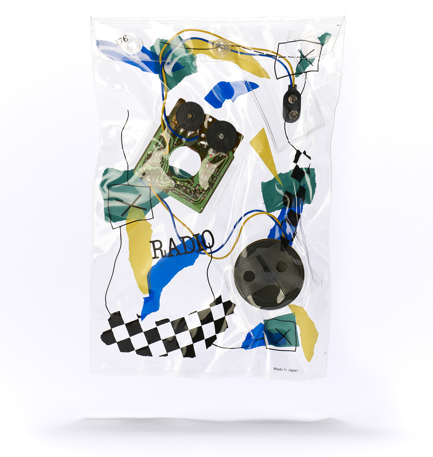
Bag Radio, Parenthesis, 1982
In the same vein is an adhocist vase that is little more than a wine glass with blocks of wood and wire to hold it — and the flower — together. It’s an object on the brink of not being anything, built on a principle of just-enough adjacency rather the designer's usual mode of form-making.
These forms of deconstruction are very different from the one that later came to characterize 3D (certainly architectural) design. Here, rather than abstract formal gestures of rupture, we see a real postmodern doubt in the possibility of objects that is turned into a way of making objects themselves. These kind of ideas provided (and still do) a rich vein in the world of fashion especially. But for the worlds of industrial, product and architectural design, characterized as they are by high theory or repressed machismo-engineering, there was little scope for design to talk about its own internal personality crisis. Similar visual tropes in High-Tech architecture or Dyson-transparent vacuum cleaners expose their components only to ramp up an aesthetic of engineering, a world being logically put together. Weil’s objects are, in contrast, on the verge of falling apart.
This part of the show is dedicated to highly personal projects. Things about things, explorations of how objects, ideas and personality inform one another. But the other half of the show sees Weil putting it together as well as breaking it apart in his role at Pentagram, the global design consultancy where Weil has worked for 22 years.
Pentagram has a huge roster of clients. Many of them big corporations. Clients who, one assumes, would be a little confused if presented with a bag full of components or object-poetry. And in the products we see here designed for a range of clients we see how Weil’s ideas are expressed to a public rather than personal world.
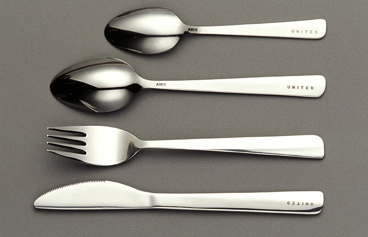
Cutlery for United Airlines, 1998
Brand personality rather than personal psychology is the basis for a more subtle way to shape the makeup of objects. The tail fin of a United Airline plane is mimicked in the shape of in-flight cutlery. The act of drinking as a social performance helps form a new beaker for Mothercare. And the particular boring-interestingness of the Pet Shop Boys is the origin of Weil’s design for the CD case for their 1993 release Very. Here — perhaps this reviewer has more invested in the PSB project than he does in Krug or Swatch — is a real moment of clarity. The moment that the plastic CD case suddenly showed that it could take on the physical object-hood that old LPs once had, that a CD could become a real thing rather than a representation of what an LP would have looked like.
Very remakes the traditional plastic square of a CD jewel case as an all-orange thing with its surface embossed with a field of raised dots. It's nothing less than a 1990s answer to the Beatles high concept White Album designed by Richard Hamilton with an all-white sleeve.
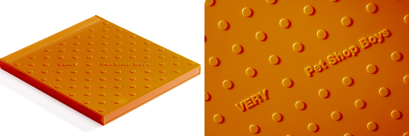
Packaging for Very, Pet Shop Boys, 1993
Weil’s design is a pop art object that feels as generically perfect as a material sample you might find in a designer's library and as surreal as a Duchamp readymade simultaneously. It’s still (all these years later) the perfect objectification of the Pet Shop Boys aesthetic. And in its joyful plastic emptiness we find something as descriptive of our era of late consumerism as any of those complex medieval clocks were of theirs.
Time Machines is a show about Weil, about his particular vision of the world of things (something we see too in the strange, ordinary objects that he’s collected over the years also on display here). It’s about his dialogue with things — shown through a sample of his sketchbooks and drawings. It's a show about how a designer's attitude can transform the worlds beyond the museum or studio. And it's also a show about Weil’s context, about how Pentagram as an institution through its internal culture of personal exploration, recognises the need to explode preconceptions about the nature of design from within.
Time Machines: Daniel Weil and the Art of Design is on view at the Design Museum through August 24.
