Photo by loungerie
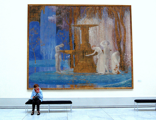
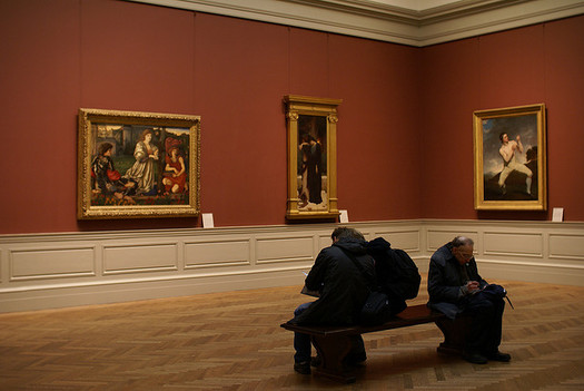
In basketball, the bench is for the scrubs. In a courtroom, the bench is for the judge. In parks and subways, benches remain a common amenity. But after twenty years spent leaning against elegant vitrines or austere display cases, I’ve learned the hard way that in design exhibitions, benches are banished. It’s still easy enough to find a padded bench in the Metropolitan Museum’s Classical sculpture or Old Master paintings galleries, at the Museum of Natural History, or almost any exhibition space that’s not dedicated to design. But why, when it comes to public seating areas, do museums and galleries of design exhibit this kind of blind spot?

Photo via MoMA
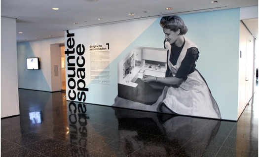
People seek benches in museums as a form of simple physical relief. But seats also allow us to slow our pace, to reflect and ponder what we see. Without adequate seating, design exhibitions discourage us from doing both. After wondering for many years why I found exhibitions devoted to design so exhausting, I had a revelation in stifling crush of a Friday night crowd at MoMA’s “Counter Space: Design and the Modern Kitchen.” When I looked for a place to sit down, there were none. Indeed, that night I found two benches in the entire museum — one in a fifth floor hallway adjacent to the restrooms and another in the foyer of Café 2, on the second floor. Was this because the museum temporarily removed its seating to accommodate the bigger nighttime crowds? Perhaps. But I encountered the same problem at a very different show, the Cooper-Hewitt’s “Graphic Design: Now in Production” on New York’s Governor’s Island. Housed in Building 110, an airy space in a building converted from a US Coast Guard post, the exhibit included recent work by the likes of Jonathan Barnbrook and Aesthetic Apparatus. On the sweltering July afternoon of my visit, however, the virtually empty gallery space offered but a single seat — in the foyer entrance, across from the building’s main door. Barely able to complete a full lap through the extensive gallery spaces, I spent most of my time sitting there while the rest of my party toured the show. The Cooper-Hewitt’s last triennial exhibition “Why Design Now?”, meanwhile, practically pulsed with sensitivity to inequality and disability, including a prototype of a baby incubator cobbled together from used auto parts and a modular prosthetic limb system. Yet there was not a single seat to be found in the main exhibition galleries; visitors who needed physical rest could do so in the museum’s entry lobby, the conservatory, or its cafe.
For me, public seating is not just an amenity but a necessity. Born with mild cerebral palsy, I need to rest frequently, and finding someplace to sit is crucial to my navigating any public space. Surely I am not alone in this. Elderly visitors, anyone ill, infirm, or simply tired, needs and appreciates a place to sit. I am not saying that they are utterly ignored; what surprises me is how low of a priority they are. Taken at face value, one might assume that design galleries and museums would be the least likely to ignore such a basic human need. Design culture urges us to embrace our various frailties and acknowledge the “human” side of design; as Dan Formosa of the New York based design consultancy Smart Design puts it, “What we really need to do to design is look at the extremes — the weakest, with arthritis, the athlete, the strongest, the fastest — because if we understand what the extremes are, the middle will take care of itself.”[1] From OXO’s good grips kitchen equipment to IDEO’s rethinking of hospitals and clinics, creating effective service design, that is design intended to enhance user experience, is the mission of an entire generation. At the same time, providing adequate seating and increasing audiences’ physical access to museums and galleries is a clear mandate of contemporary exhibition design: over the last thirty years, “visitor access issues” have been regarded as essential to “all stages of exhibition development.”[2] The Smithsonian’s own Guidelines for Accessible Exhibition Design specify that “seating must be provided in each exhibition . . . single-gallery exhibitions must have seating in a nearby corridor or in an adjacent gallery space.”[3] And yet, on the day I was there, the museum’s installation at Governor’s Island was as seatless as it was spacious.

Photo by palindrome6996
Finding a bench in a museum wasn’t always this difficult, of course. Paintings of nineteenth-century museums show halls filled with conversational chairs, overstuffed Ottomans, and even heavy oak benches resembling church pews. At that time, seats were seen as part of a larger experience; they were included in exhibitions to slow viewers’ pace, encouraging physical rest, but also fostering close observation, and contemplation. Indeed, seats were crucial tools meant to foster a form of aesthetic experience, what Germain Bazin called “momentary cultural epiphanies.” These revelations, he argued, might occur only when museum visitors “step back from the practical concerns and social relations of everyday life and look at themselves and their world.”[4]
While this approach may seem passé in the moment of ambivalent objecthood and relational aesthetics, museums still deliberately employ space, light, and exacting material finishes, not to mention typography, to create what Bazin described as a space where “Time seems suspended” and allow for undistracted attention on the objects on display. Exhibitions of design do engage in such tactics, often isolating manufactured objects on pedestals or against wide, blank walls. But the distinct lack of seating effectively prohibits not only the opportunity to sit but the invitation to reflect. Is there something wrong with the idea of sitting in contemplation of design? Or is there an implicit suggestion that design is not worth the close inspection and mental reflection that we might bring to works of art? We are ready, I know, to break down the walls in design exhibitions, to suspend helicopters from ceilings and reconstruct kitchens within gallery spaces. But if we’re not looking to encourage patient observation and contemplation of design in exhibitions, then what is it that we want design exhibitions to do? Or perhaps more importantly, how long do we have to stand around waiting for that to happen?
1. Dan Formosa, Objectified (2009)
2. Tiina Roppola, Designing for the Museum Visitor Experience, Routledge: 2012, p. 27
3. http://accessible.si.edu/pdf/Smithsonian%20Guidelines%20for%20accessible%20design.pdf, accessed 5/01/2013
4. Germain Bazin, The Museum Age, Universe Books: 1966, p.7
2. Tiina Roppola, Designing for the Museum Visitor Experience, Routledge: 2012, p. 27
3. http://accessible.si.edu/pdf/Smithsonian%20Guidelines%20for%20accessible%20design.pdf, accessed 5/01/2013
4. Germain Bazin, The Museum Age, Universe Books: 1966, p.7
