"The Classical Body," from "Schiaparelli and Prada: Impossible Coversations" (courtesy of The Metropolitan Museum of Art)
When I walked in to the Metropolitan Museum of Art's latest fashion exhibit, "Schiaparelli and Prada: Impossible Conversations", I wasn't expecting architecture. The first room features an expanse of shiny black lacquer, and Judy Davis, playing Schiaparelli, speaking with five-foot red lips. I ignored all that.
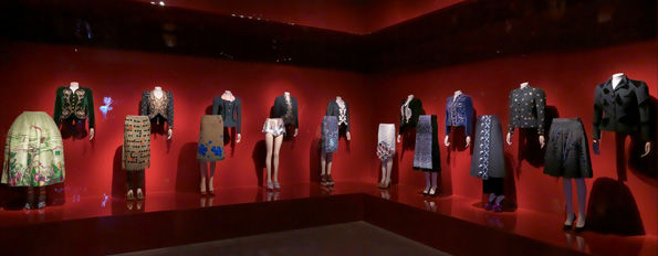
In the second room, also black, I found curators Harold Koda and Andrew Bolton had divided the body up into skyscraper-like parts. "Waist Up/Waist Down" (clothes) and "Neck Up/Knees Down" (accessories) put Schiaparelli on top and Prada below, the former focusing on the spire and the trunk, the better to be seen in Cafe Society, the latter on the entrance and the lobby, the better to be seen in the city. So we get a parade of Schiaparelli's shapely black jackets, intricately beaded, above a parade of Prada's straight skirts. It's hard to say who looks more modern, as Schiaparelli seems to have absorbed the figure and integrated pattern and ornament, while Prada ignores it, plopping panels of wool over the legs, and running oversized plastic parts on top.

"Waist Up/ Waist Down," from "Schiaparelli and Prada: Impossible Coversations" (courtesy of The Metropolitan Museum of Art)
I loved the wool skirt, third from the left in the installation image above, from autumn/winter 1999-2000. The dreary matte fabric was clearly just a ground on which iridescent plastic blue leaves could be scattered, and leather insects chew at the waistband. Both Prada and Schiaparelli were interested in upsetting the decorative (across the room there's a Schiaparelli necklace from 1938 in Rhodoid, an early clear acetate, with similar shiny insects) and I thought I saw in these plastics, and some opaque gray Prada gems nearby (second from right) an industrial designer's interest in new materials, or an architect's eye for the building in the landscape. That first wool skirt really just looks like mud, and those leaves, were they are little more abstract, an overhead view of some new fractal blob.

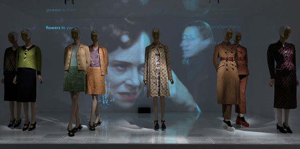
"Ugly Chic,: from "Schiaparelli and Prada" (courtesy of The Metropolitan Museum of Art)
I began looking for more references to unfashion materials and spaces. Two ensembles from spring/summer 1996 feature an oversize linen print, fibers of irregular thickness rendered as blotchy lines, and the still recognizable grid placed square on the even weave of the boxy jackets and straight skirts. (Second from left in the image above.) A rope of plastic links connects one pair of lapels like a built-in pearl necklace. The print initially seems like a clever commentary on the ladylike summer suit. Linen would have kept you cool, but the maintenance! Keeping your bracelet sleeves crisp would have been serious women's work.
One of the aspects of Prada clothes I have always admired is their stiffness, and the idea, as with Marimekko, that you could put an outfit on and be done (the built-in accessory on the "linen" suit supports this idea). As I looked at that short, squarish jacket I realized the print reminded me of something else. Another print, another update on homespun homemaking materials, but one that never needed ironing: Formica's own Linen pattern, introduced in the 1940s, and used to glamorous effect in red at SOM's Terrace Plaza Hotel in Cincinnati.

Vintage Formica samples
SOM, Terrace Plaza Hotel, Cincinnati (1948) ( via Ezra Stoller/ESTO)
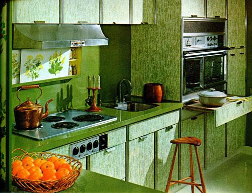
Is it a leap to think that Prada was commenting not only on ladies who lunch, but on the kitchens in which they might fix a lunch? That her "linen" and Formica's Linen were both postmodern commentaries on our desire for the look of handmade in a better, cheaper, faster (and no cigarette burn) world? The stiffness of those suits suggest a countertop turned into a sarong, and Prada's choice of colors also hark back to midcentury: one ensemble is definitely harvest gold, the other avocado, the color scheme of Formica's 1964 World's Fair House kitchen.

Formica 1964 World's Fair House, from the souvenir book, p33 (via nywf64.com)
Another trompe l'oeil pattern, this one courtesy Elsa Schiaparelli, also reminded me of some ultiltarian plastics. Schiaparelli's silk dress of 1938, in a black-and-white faux bois pattern, is cut on the bias, so it slithers around the wearer's body, turning her into a slim trunk. The same-pattern blouse, peeking out from the jacket closed with a leather leaf, suggests the inner bark of a scarred tree. Faux bois had a long history in home decor, and by the 1930s it had also been translated into a laminate. Schiaparelli's dress shape suggests a more natural origin for its inspiration than Prada's, but there is still something of the decorator, turning the client into an inanimate supporting object, or just another landscape feature, about the ensemble.
Schaiparelli ensemble, 1938 (via Everything Just So)
The final element of my imagined domestic drama was the drapes. The last dress in the exhibition, installed in a dated acrylic Hall of Mirrors, was Prada's purplish dress, from autumn/winter 2004-2005, shown buried under a frumpy tan cardigan of the type Miuccia seems always to wear. (Top image.) This dress, which falls in rare soft folds, is also printed with a pattern of pleats, offering a built-in mirrored effect. Just as faux bois or linen were supposed to dress up a utilitarian kitchen, here the printed pleats make a day dress look like something far more intricate. I couldn't quite tell on the mannequin, but the cut and pattern looked like they would give anyone an hourglass figure -- the opposite of the tree trunk effect. In a photograph behind the Prada dress we see Schiaparelli in her own trompe L'oeil pleats, drawn suggestively from the waist down. Can't get more commentary on women and interiors than that!

Schiaparelli Rhodoid necklace, 1938 (courtesy Metropolitan Museum of Art)
Much of the ugliness and oddity in the exhibition (well explicated by Judith Thurman in her catalog essay, reprinted in the New Yorker) seemed to be located in these ensembles that adopted the language and materials of interior decoration and design to fashion, ignoring shape by and large for a more graphic effect. Marimekko's oversize patterns do the same thing, making you into a walking billboard, but also freeing you from the aesthetics of sexy. Why don't you ... treat your outfit like a skyscraper, or like a room.
