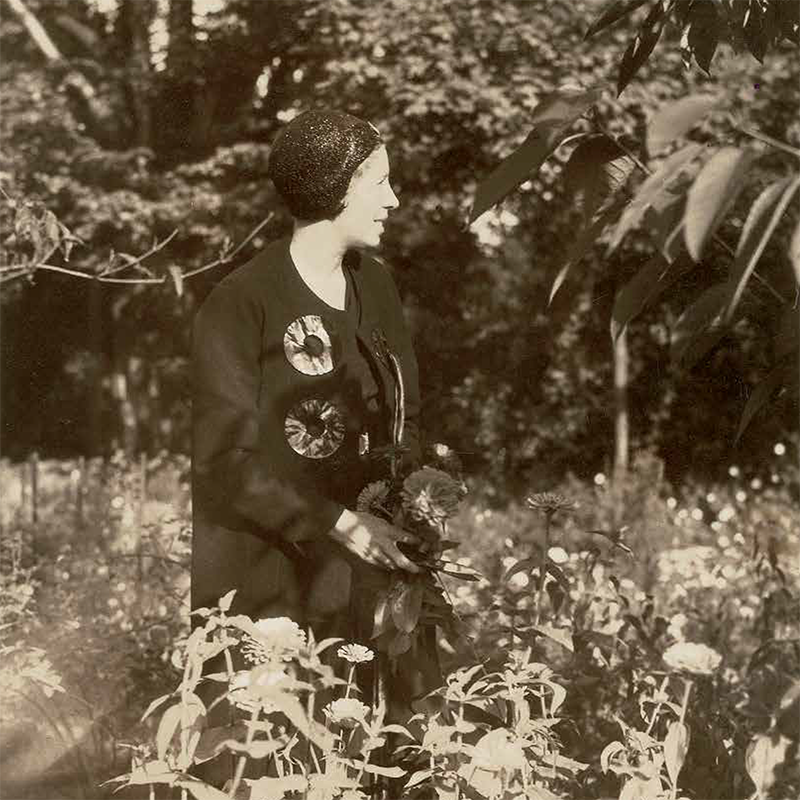
Marguerita Mergentime. 1930s
While researching a book project online, I came across a group of fascinating textiles by Marguerita Mergentime. Several used text in their designs. I was drawn to these typographic cloths especially because they were conceived with a slant toward communication rather than just decoration.
Mergentime turned out to be unknown to many in the decorative arts, including Donna Ghelerter, our editor and a textile historian, since, like a large number of successful twentieth-century designers, Mergentime had been largely forgotten. We were able to trace the textile collection to Virginia Bayer, Mergentime’s granddaughter, and soon viewed these illustrative cloths at Bayer’s home. We were struck by their boldness, beauty, and modernist characteristics.
Over several months, we learned more about Mergentime as Bayer shared her knowledge and interest in her grandmother’s life and work. A book was proposed. Bayer and Ghelerter conducted research for over a year, while I conceived the book’s design, photography, and layout. Marguerita Mergentime: American Textiles, Modern Ideas is the result of our collaboration. —Linda Florio
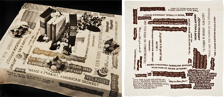
"Food Quiz" tablecloth and table setting. 1939
As you take your seat at a dinner party, your eyes quickly move past the plates and cutlery, the flowers and wine glasses, even the food. Instead, they settle on an engagingly graphic tablecloth. Text—arranged in various type styles and sizes, uppercase and lowercase, italic and cursive—is displayed like random headlines clipped and collaged from newspapers. Culled from great moments in American history and politics, the phrases range from the vernacular to the provocative. Slogans move around the table and cascade over the sides, including along four narrow strips at the corners. Words form the design. Curiosity insists you read them and ask a few questions. The other guests, opposite and at your sides, see yet more phrases. No two are alike. The words prompt a response as every good graphic communication does. Guests compare comments. They interact. Conversation is born. Marguerita Mergentime creates the spark.
* * * * *
Titled “Food for Thought,“ this tablecloth of political slogans was designed by Marguerita Mergentime in 1936. Known as a textile designer, Mergentime was, in effect, also a graphic designer, but instead of paper, she used cloth. Her compositions with words rouse the mind, excite the eye, and, applied to linen, appeal to the fingertips. With her designs, Mergentime was stirring up conversation, provoking human interaction, and providing a visually compelling backdrop to socializing long before today’s concept of user experience had evolved. By putting words on table linens in the manner that she did, Mergentime envisioned her textiles to be read, enjoyed, deconstructed, and debated while dining, lunching, and coffee-klatsching.
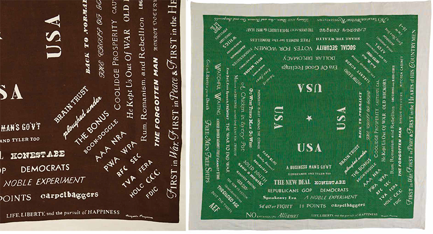
"Food for Thought" detail and tablecloth. 1936
In Mergentime’s textile design practice, personal interests and research inspired creative efforts. The decision to use text as a primary element—and to communicate with it, rather than decorate—set her apart from others in her field. In a 1940 lecture, she told a group of art students: “I like type and the printed word for design.” Mergentime’s pieces composed of text beckon the viewer to look at them slowly, and closely—to delight in their humor and to decipher the meaning of their textual components.
Early in her design career, Mergentime showed an interest in letterforms. In 1935, she placed an oversized “W” as a single motif on a shower curtain and towel. The individual sans serif letter with a drop shadow made a statement very different from more demure monograms typically offered for linens. Soon after, Mergentime extended her use of typography. Both “Food for Thought,” which was part of the “100 Years of American Design” series Mergentime produced for Lord & Taylor in 1936, and the “Here’s How” cocktail napkins exclaiming “salud,” “cheerio,” and “skaal,” also in that series, are entirely text-based, combining several typefaces and graphic layouts. In 1939, Mergentime began referencing decorative scripts found in folk art—particularly Pennsylvania German frakturs. Her “American Folk Art” series depicts both pictorial and typographic flourishes, a form of penmanship that was disseminated in nineteenth-century books such as Hill’s Manual of Social and Business Forms. Discussing her research into these past decorative writing styles, Mergentime stated that “copy book flourishes of eagles, birds and heads gave inspiration to a new group of designs. . . . I learned it was of great importance socially and commercially to write an elegant hand, do pen drawing, flourishes and all kinds of beautiful ornamental scrolls.” In the “American Folk Art” series, a copybook alphabet specimen fills a square napkin, and a calligraphic eagle—accompanied by the text “Off Hand Capitals”—shares space on a tablecloth with birds in the same style.
It is possible that Mergentime’s early artistic pursuit of letterforms was motivated by studying calligraphy, as formal typography classes would have been limited in New York in the 1920s and 1930s. This deficit was compensated for by New York’s active design community at the time. Mergentime was a member of several professional organizations, most notably the American Union of Decorative Artists and Craftsmen (AUDAC) whose members included modernist architects, industrial designers, advertising and packaging artists, theorists, and photographers. Typography and layout would have been integral parts of their work, and Mergentime was probably exposed to these practices as a result of her involvement with colleagues. From the early 1930s until her death, Mergentime was also a member of the Fashion Group, which was comprised of women executives working in the fashion and interiors industries.
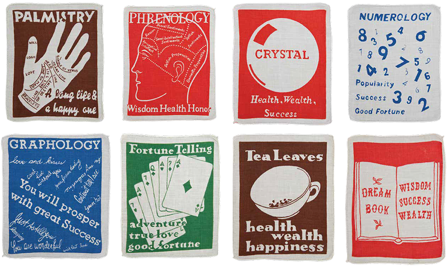
"Wish Fulfillment" cocktail napkins. 1939
One known overlap of these two important entities occurred in 1932 when Egmont Arens, an impassioned industrial and packaging designer who served as the president of AUDAC in 1929, chaired a roundtable discussion titled “Fashion in Typography” at a Fashion Group event. The roundtable’s lively debate focused on social and economic forces that contributed to typographic fashion in the early 1930s, especially “fast reading,” a phrase used by Arens to indicate how the design of certain typefaces causes the eye to quickly scan and read words. In “Streamlining the Printed Word,” another lecture Arens delivered in 1933, he again focused on this idea of tempo in typography, discussing the need for fast-reading typefaces and emphasizing “that speed and economy have been the determining factors in the development of the written and printed symbol.” According to Arens, the frenetic pace of city life “rules out all that is too slow, or too cumbersome, and . . . favors every change in type design that makes for increased tempo.”
Arens incorporated discussion of leading design professionals and their ideas into his lectures, for instance, introducing Alfred Tolmer’s Mise En Page: The Theory and Practice of Layout (1931) to his audience. This book granted permission to exercise inventiveness and playfulness as part of the practice of page layout, offering a softer counterpoint to modernism. Tolmer showed that dynamic compositions, the poetic placement of design elements, bold uses of color, and typographic novelty could enliven even the dullest content. In her typographic table linens, Mergentime did just that.
While Mergentime was aware of the importance of the design of the printed word, achieving speed or austerity from viewers was not her preference. Mergentime favored “slow reading” and intimacy, joy and good fun, conversation and human interaction. Her typographic compositions on cloth, while modern, bold, and richly colored, mix styles of type: historic and contemporary, sans serif and serif faces, Spencerian penmanship, decorative and utilitarian display typefaces, and, in one case, nautical symbols that spell a message—a mixture at odds with the “fast reading” trend of the day that favored the use of a single font. Even Mergentime’s ever-evolving designer signature is a version of Futura, the preferred modernist font, yet it is whimsically arranged.
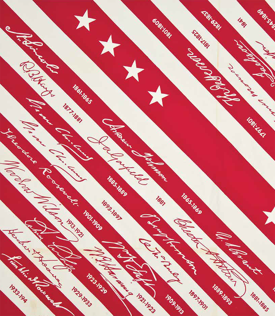
Detail of "Presidents' Signatures" tablecloth. 1940
But what made Mergentime a graphic designer? Mergentime chose fonts that were often funky and unrelated, and fitted them to suit the shape of the cloth when it was draped on a table. This approach can be seen in “Food Quiz,“ a tablecloth printed with questions and answers about American politics and popular food. For this design, Mergentime mixed a variety of texts using different typefaces, mostly capital letters, and scattered them haphazardly on a square cloth. She employed symbols—hearts, stars, squares, diamonds—to key the Q’s to the A’s. The layout consists of stacking the texts and breaking lines to fit the cloth, using a variety of alignments: centered, flush left, and a combination of the two. Adjusting the leading (spaces between the lines of text) creates further movement and scale. Mergentime does not rely on balance for this composition, nor does she adhere to typographic rules; instead, she has fun with the textual meaning of words and textural shapes of the typefaces, engaging both positive and negative areas. It is possible that the original compositions were made by tracing commercially available letterforms and alphabets. With the texts most likely generated on white paper with black ink, the negative form was achieved by making a reverse print of selected texts (the answers). When assembled, the wavy outer shapes inherent in the process of cutting and pasting up type remained. Mergentime used these hand-cut edges advantageously to enliven the design and add texture and decoration. True to her mission to communicate through her designs, Mergentime strategically placed questions opposite answers. With this interaction in mind, conversation was the natural outcome.
Another of Mergentime’s all-type work is the Americana hanging, which she designed for the Golden Gate International Exposition in San Francisco in 1939. Mergentime composed each of the 360 phrases separately and set them line for line, adjusting the spacing to create near-justified left and right margins. Mergentime’s design is bold and architectural in nature and well suited for a long length of cloth meant to hang on a wall. Rows of capitals alternating with rows of lowercase cursive break the monotony of a massive block of text. The overall arrangement employs pattern, textural variety, and rhythmic color. In this piece, Mergentime replaces the intimacy and tactility of her table linens with a straightforward rendering of the “Americanisms,” as she called the names, ideas, places, and organizations that appear on this piece. But she never tired of encouraging viewers’ responses and considered this work a success when she saw “groups of people in front of ‘Americana’ laughing, chuckling and pointing, amused by the idea.”
Mergentime’s typographic cloths illustrate the unique ways a textile artist situated herself within the field of graphic design. Using the same elements and techniques as a graphic designer, Mergentime composed imaginative text layouts infused with her distinct brand of whim, warmth, and meaning—she placed them on a tablecloth and waited for the entertainment to begin.
* * * * *
THE DINNER PARTY WAS SPLENDID. You leave feeling inspired, witty, smart. You made new connections and friends. You also know that you need to brush up on your history! How wonderful for a tablecloth to be so spirited and provocative. And yes, that tablecloth was designed by Marguerita Mergentime.
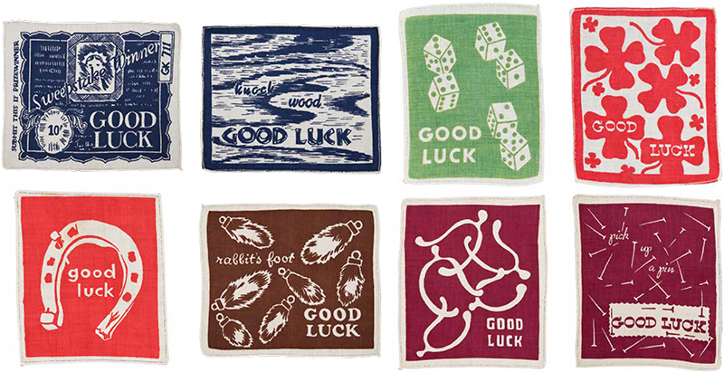
"Good Luck" cocktail napkins. 1939
Editor's Note: The preceding text is excerpted from Linda Florio, “The Typographic Cloth” in Marguerita Mergentime: American Textiles, Modern Ideas, ed. Donna Ghelerter (New York: West Madison Press, 2017). Text and images are copyright the publisher.
