This election day, the presidential elections from a year ago—and midterm elections a year ahead—are on everyone’s mind. But what are designers doing right now to make citizens more civically engaged? We’ll be exploring that question the first Tuesday of each month in coordination with AIGA’s program, Design for Democracy: Building Community Power.
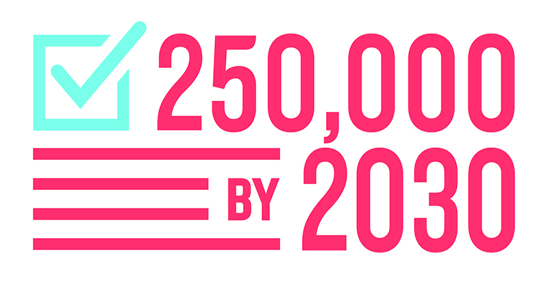
This time, we spoke with Lesley Stordahl, Creative Director at CBX, about how the brand and design agency worked with non-profit group She Should Run to develop their brand, set strategies to meet lofty goals (like getting 250,000 women to run for elected office by 2030), and what, in the face of upcoming midterm elections in 2018, modern activist design looks like today.
What is She Should Run from your perspective as Creative Director, and how is it different from typical grassroots activism movements?
She Should Run is an organization that I have been helping, whether through CBX or my own time, from the get go. It’s an amazing organization mainly because it started from an insight that a lot of women didn’t run for office because they didn’t feel comfortable nominating themselves. So, it started out to get women to nominate other women. That was the first step of She Should Run—to encourage your friends to run for office.
They learned this interesting fact that while women were very flattered that their friends, family members, or coworkers, through She Should Run, had nominated them to run for office, they thought, “That’s interesting, but no thank you.” It wasn’t enough to have someone nominate them. They needed to understand how to get into it.
We wanted to work with She Should Run because as creatives and as women in creative industries, there’s a similar vulnerability. You constantly have people judging your work and judging whether you’re good enough at something. Women in politics go through that as well. We aligned with She Should Run and found that all of us are working toward the same thing: to get women to feel confident, to understand how to handle the criticism, and how to push things forward in a way that felt right for them.
How did you determine women didn’t feel comfortable nominating themselves?
She Should Run had done that research earlier. She Should Run was originally part of a larger organization and [became] the breakoff initiative specifically asking women to run for office. So it started there. But we helped them expand their mission and purpose to go beyond nominating another woman to run to be about encourag[ing] women all the way until the point where they do run. There’s a lot of [organizations] out there—Emily’s List, for example—where once you decide to run, there’s support to get you there. But there’s not a lot of support in that weird, imposter-syndrome confidence-gap area where a woman goes from “God I wish there was better leadership” to “That better leadership is going to be me and I’m going to put my hat in the ring.”
Among more traditional brands in CBX’s wheelhouse—Sotheby’s, Chex, WaWa, U by Kotex, Dr. Scholl’s—She Should Run doesn’t seem like a typical CBX client. What was the decision making process for taking this non-profit on as a client?
It does seem a bit random on paper but there was a natural evolution. U by Kotex was a big initiative and an interesting project, because that was one where we shifted perception about what femininity should look like. Before, it was all pastels on the shelf. Our executive creative director, Allison Koller, did a Ted talk around this notion of design toward women and how codes are evolving from a visual standpoint. So we have been actively reaching out toward different organizations and She Should Run was the perfect evolution.

How did you visually communicate the messages that She Should Run was trying to convey through logo, site, and identity, and what was that initial collaborative process like?
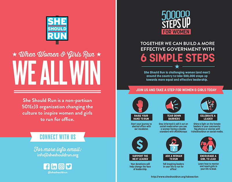
To clarify, we didn’t do the logo for them. The stacked letters on the placard was something that they came to us with and said, “We really love this.” She Should Run works with a smaller D.C. digital agency that caters to nonprofit and political clients. They still manage She Should Run’s digital platform but CBX took over design for all new brand endeavors.
As they moved away from just asking a woman to run toward reaching women ready to play the political field, and as they grew as an organization, they realized they needed to open up who they were. So we met with them to modify their mission statement and put together key messages that they could continually push against, and then helped them evolve from a design standpoint to conceptualize initiatives as we reacted to the crazy political climate that we’re in.

Can you walk me through some design decisions you made specifically to get women to take action?
We’re living in this world of amazing new breakthrough political design and also—I hate to say “terrible”—staid design. Compare the Hillary [Clinton] identity with “Make America Great Again” and there’s a clear line around political parties, innovation, and young and old. She Should Run is bipartisan and they were very clear about the need to appeal to both sides. How do we bring a modernity to the visual but still make it feel bipartisan? For us, it was softening the red a little bit—not going with a really harsh, traditional red—giving it almost a slight coral. It was using more of a cyan than a navy or an overly masculine dark blue. And to make sure that we’re showing women and there’s representation, because there’s so much reflection [from their audience] that “this is for me.” We have to be inclusive to all ages, races, backgrounds. That’s something that we try to keep in mind as we develop with them.
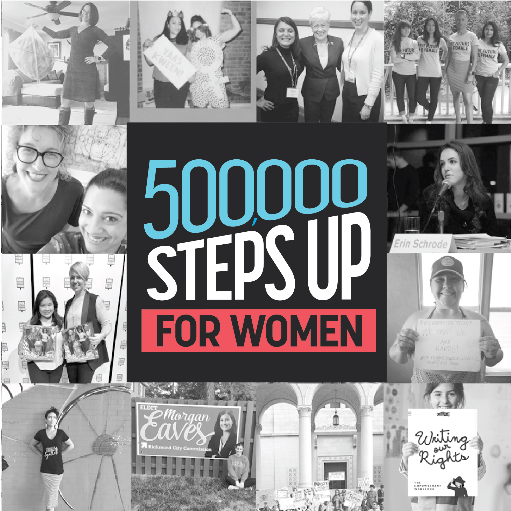
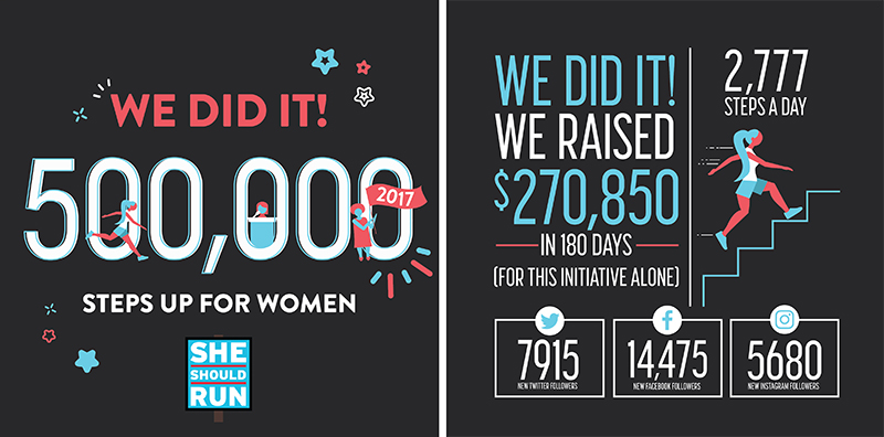
We also built an icon system that can be updated and evolved as we go. There’s an icon for each action that we want people to represent. And it’s a free enough system that we can add new things and use those graphics. Like for the 500,000 Steps campaign. When we reached those goals there was an illustration with icons that made it fun. So having a system that we can update and change that still feels very inclusive was one way we did that.

How do you define “modern activist design”?
Obama was the first time that a modern design sensibility really hit the political world. I think it’s constantly looking toward where design has evolved from a political standpoint. Clean lines and using the standard red, white, and blue, but finding variations of that. When you strip things back toward a simplistic color palette it makes it feel real and a bit more attainable. When you add in design in general—when you bring in scripts and multiple colors and make things more elaborate—it feels unattainable or more emotional. That can be great and there’s plenty of opportunity for that. But when you talk about political and activist design, it needs to feel attainable. It needs to feel like “I’m standing up and I can be part of this.” I think that simplicity of design gives you that strength.
(W)hen you talk about political and activist design, it needs to feel attainable
How is design and its relationship to political activism changing today?
You have to figure out your brand better. It’s not just about who you are and what you’ve done; it’s about the brand. We’ve moved beyond the paper sign in the front lawn with the full name and “Republican” underneath it. Those things are still there, but a lot of what She Should Run is doing right now with their online incubator is asking women to think about themselves as a brand. What is it that you stand for? I think that’s an interesting mesh of worlds right now. Even the Hilary “H” became a brand. That was an identifiable piece that you looked at and knew who you were for and where you stood. “Make America Great Again,” same thing, branding. In my opinion, it wasn’t the most beautiful—but it was still branding. That red cap with those white letters were very powerful in terms of an icon. I think that’s going to continue to happen.
Designers and design agencies have a lot to contribute to politics and to non-profit organizations in terms of helping people find their brand and showcase it in a way to make it very appealing. There’s going to be a chapter in design books about this in five, ten years. This is a really interesting time that designers are going to look back on, and it’s exciting to be a part of it.
How did CBX work with She Should Run so that your agency wasn’t just brought in to execute strategy at the end, but was also there in the early stages to help develop it?
We have a great relationship with them in that they’re all ears. When we have ideas, we’ll just call them up. We worked on purpose and voice prior to the election. That was an interesting point because at that time, we still had a lot of confidence that Hillary [Clinton] was going to be our President. And so, we came in thinking, “How do we keep people engaged? How do we keep people excited in this time that’s going to change everything?” But instead, everything changed in a different way.
They went from having roughly an average of 150 women per month (1800 per year) to having more than 15,000 women raise their hands since election day in November 2016. So they grew at such an alarming rate in terms of people engaging with them that they looked to us to be more than just the doers and to be the strategists. We had to get campaigns out there to feel like they were starting something. So immediately we went into the 500,000 Steps Up campaign and then transitioned into the 250 by 2030 campaign. That was their initiative; they put that goal out there and came to us and said, “We’re going to go full on. What do you think?’ And we said, “Let’s do it. Put the huge number out there. Go for it.”
(T)he more that design reflects what popular culture looks like; the more we put design in places that surprise people—the better off we’ll be.
Is strategy a space designers should step into? Why?
Yes. It’s funny, I actually don’t have a traditional design background. I was a copywriter and now I’m a Creative Director at a design agency. For that very reason, I think it’s not enough to be a designer. You have to be a thinker. You have to be an idea person. When you start talking about non-profits or [organizations] within the political world, you’re donating your brain. You have to think about a lot of different things... It’s not just “How do we appeal to this consumer and get them to go to this store and put down money on your product?” We’re trying to inspire people and create designs that move them. Yes, the cause is part of it, but so is the message and how it comes to [your audience] so it feels like a brand. We need participation. I think designers... have to weigh “Can I speak to a 45 year-old woman in the Midwest and a 23 year-old in New York City in the same way, and have them feel like this is still something for them?” and “Is this something that will move them to act?”
What’s your hope for design’s ability to 1., combat apathy and encourage civic engagement, and 2., make electoral processes more democratic in the future?
Toward the first part of that—We’re creating brands as much as we’re supporting a candidate or a person. The more that politics understands how design has evolved in popular culture, and the more that design reflects what popular culture looks like; the more we put design in places that surprise people—the better off we’ll be. Apathy is everywhere. The good news about this last election is that it woke people up to think “I can’t assume that everything is going to be ok.”
While it’s unfortunate that that’s what it took, I think that it is our role as designers is to find modern and inclusive designs that keep people engaged and to find places that are surprising for them. For women, we need to continually design knowing that a woman needs to see herself reflected there—see that it’s not just a man’s game. And so, that’s my personal passion toward this: moving away from the red trucker hat and moving toward things that [make] my daughter feel like “I can be a part of this game just as much as anybody else.”
