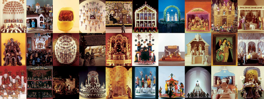
 Nativities. All images from Alexander Girard by Todd Oldham & Kiera Coffee © 2011 www.ammobooks.com (Nativity poster at Reference Library)
The bulk of Alexander Girard’s work exists in a nameless field that synthesizes architecture, interior design, decoration and display. This adaptability and lack of snobbery put him at the center of the mid-century design world, working for the best clients and with the best colleagues. He used the same techniques and structures to organize the interior of J. Irwin Miller’s Eero Saarinen-designed home (1955) as he did to launch Herman Miller’s first and only retail shop, Textiles and Objects (1961). It was this self-effacement, personal and architectural, that allowed items as diverse as Eames chairs and Mexican ceramics, Indian rugs and early threshers all to look at home, and like objects of high design, in a Girard display. Girard was interested in important areas many architects eschew: texture, shape, tiny accessories, while simultaneously being a master of layered, gridded orthogonal space.
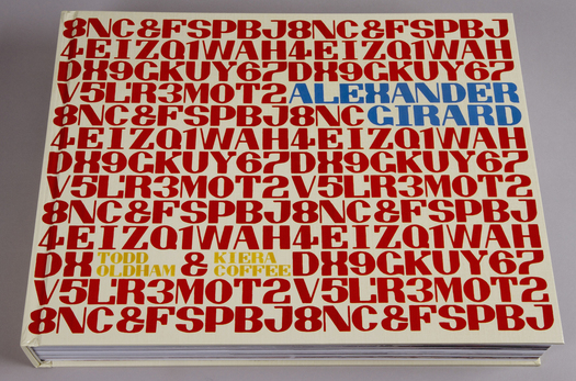
This diversity, which seemed strange at the time, now seems like a virtue, and makes the recent publication of the first career-spanning monograph on Girard all the more timely. And what a monograph it is! Fifteen pounds of full-color, full-bleed display, with creches and farm equipment, bright prints and textured wooden walls laid end to end. Creators Todd Oldham and Kiera Coffee have been to all the archives and brought back deep troves of images of Girard greatest hits like La Fonda del Sol, the haute Mexican restaurant that opened in the Time & Life Building in 1960; his Technicolor rebranding of Braniff Airlines in 1965; and his many, many gorgeous patterns, prints and weaves for the Herman Miller Textile Division. Peering at these projects on a screen would not do them justice, and neither would a less back-breaking trim size. This is not a book for reading in bed, or reading at all. It is for looking.
There's also room for several lesser-known projects: an amazing mural made of reclaimed wood for the Unitarian Church of Albuquerque (1965); gum-drop colored china for George Jensen 91956); the bold, Op-Art Environmental Enrichment panels for Herman Miller (1972) that, if they had found a wider audience, might have radically transformed our idea of the cubicle. I could spend all day in the section on Girard's own Santa Fe house, where the garden was divided into a grid, the squares filled with different-shaped succulents and stones. In the kitchen, the cabinets were covered in geometric figures made of dried beans, and he painted a visual conversion chart above the shelves. On the endpapers, Girard's own filing system, book boxes covered in Florentine papers, labeled "Cards Antique," "Venezuela," "Needlework."
Faithful readers will remember that I was planning a book on Girard until the Girard estate decided to grant Oldham exclusive rights to the archive in order to produce this book. Because of that, you probably need to take the following criticisms with a grain of salt. But I can tell you honestly that seeing this book has freed me of any lingering disappointment. I could never have done this. I would never have had the time, the money, the staff, to photograph and process this amount of visual material. No publisher would ever have backed a book like this from an unknown like me on a not-so-well-known designer like him. And Girard deserves it. His work holds up at this scale, and across the design disciplines. Unlike last year's double Eames monograph, this holds the coffee table. If you can't afford its $200 cover price, you might look for a copy of the petite Petit Glam No. 7.
For most people, Alexander Girard will be the be-all and end-all of their Girard studies. But for the few that want to know more, I wish the book offered more, and deeper, information. There's no bibliography, when it would have taken all of an afternoon to copy the reasonable one from Leslie Pina's Alexander Girard Designs for Herman Miller and add a few articles from the 2000s (not that I am advocating this approach). There aren't even any sources listed: the book liberally quotes from contemporary articles in Interiors and the like, but omits the year of publication, making the originals difficult to track down. There's a visual index, necessary because there are no on-page captions, but no name index. (Geeks like me might spend more time with the labeled thumbnails than with the big pictures.)
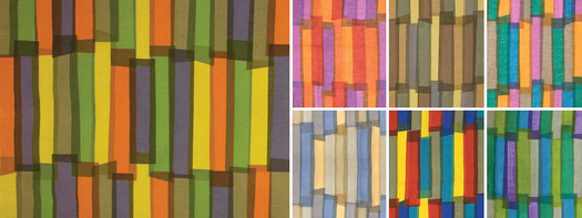 'Ribbons,' Herman Miller (1957).
 There's a multipage timeline at the back that seems surprisingly sparse for such a prolific designer. Surely he did other things besides creating the first of his spectacular Nativity shows in 1962? The book's introduction provides a brief Girard biography, and calls the contents "a sampling," an unrigorous term that allows Oldham and Coffee to include, essentially, whatever they like. But I think the timeline, like the book itself, should come with a fuller explanation about why these projects made the cut.
Not to get too Paul Shaw on you, but I also spotted a few errors in those sparse entries. Girard couldn't have designed a "Good Design" show at the Museum of Modern Art in 1966, because the program ended in 1956. It isn't Charles Eames who would have hired Girard as director of Herman Miller's brand-new Textile (not Fabric) Division, but George Nelson, as director of design for Herman Miller, or company chairman D.J. DePree. The Miller Vacation Home, completed in Ontario, Canada in 1952, had interiors by Girard but architecture by Eero Saarinen. And it seems odd to include it only in model form, when there are period images in color available. Several of these seem like opportunities to discuss Girard's collaboration, and sometimes unwritten competition, with better-known mid-century figures like Eames, Nelson and Saarinen.
Even within the parameters of providing a sumptuous, visual catalogue of Girard's work, I don't understand all the choices. I like my pictures to make an argument, while Oldham and Coffee are, I believe, on a mission to celebrate a more diffuse idea about creativity. There's an airiness to all the text that is frustrating. What should we honor Girard for? As a colorist? As the creator of theme restaurants? As the creator of the conversation pit? The answer seems to be everything. As Oldham writes in an afterword:
Mr. Girard is an astonishing artist who danced effortlessly across any medium that interested him, which was thankfully almost everything. All that he touched feels like you've never seen it before, much less anything like it. His work proves him an authentic design oracle with most efforts decades ahead of their time.
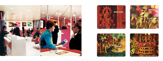
Ticket counters and South American posters, Braniff (1965). (Much more at braniffpages)
If it were my book, I would have grouped Girard's 1930s work together, and looked at it as a very international mix of the end of Deco and the beginning of American modern. I would have put all the projects for J. Irwin and Xenia Miller together, from the celebrated house to the offices and the (unpictured) redesign of Columbus, Indiana's Washington Street, a rare urban intervention. I would have put all the folk-art influenced projects together, from the artifacts to the posters, textile prints and three-dimensional installations. Girard's rare pieces of architecture, particularly the Rieveschl House (1951) in Grosse Pointe, are shown in full but not discussed in the context of other modern houses. Girard's photography, in comparison, seems only so-so, and could have been a single spread.
Many people will just wallow in the gorgeous, not minding the chronology or geography. But to me, the book still feels like raw material. It has 2000 photographs, and Oldham says his team created 30,000 digital files. Where are they now? At Vitra, which holds the uncatalogued Girard archive? With the Girard family? With AMMO? I asked whether they would be available to the public or to researchers online, but haven't gotten an answer yet. That would be an impressive and useful legacy for mid-century scholarship.
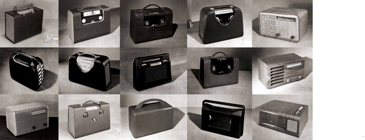
Radio cases, Detrola (1940s). (More Detrola images at Reference Library)
I've been having an online conversation with interactive book designer Derrick Schultz about the future of the art book in the digital age, and I was very taken by his idea of the iterative book.
The “book as software” means a book can be shared, expanded, contracted, or split (imagine an art book that spends on images incrementally—accepting payments to pay the way for future editions and rewarding early adopters with updated books). Here we need writers who can create iterative arguments, plan for obsolescence or upgrades. There are whole secondary markets that books can use to economic advantage that were not previously available to the artifacted book (and no, not just advertisements). Let’s not forget paper costs, printing costs, and warehouse costs as hinderances of the printed book.Now that Oldham and AMMO have made 2000 Girard images available to the public, why can't I write a book on Girard without the 150 or so I would be able to afford (if the Graham Foundation were good enough to give me a grant)? Why can't I raise money for my own work, and just refer to this book's page numbers? My book would be cheap, and possibly digital. It would take Alexander Girard and offer a remix, with commentary, historical context, design analysis, of all this bursting creativity. That's why this book frees me up. My book doesn't have to be this gorgeous.
