Police cars of the past used to display little more than a star on the side of the vehicle. The usual look for the car was black, with reversed white door panels and the official city emblem or star was emblazoned on the side. Today, the look of police cars range from friendly and approachable "community peacekeepers" to intimidating “SWAT-style enforcers,” to low profile “stealth” vehicles.
This week I explored the police car graphics from just one company, ranging from quiet "stealthy" looks to bold super swooshes, colors and mostly san serif italicized fonts. There is the occasional serif font, the rogue Brush Script, and so far no examples of Comic Sans (but still looking). Bearing in mind that fast moving emergency vehicles need to be noticed, and seen — here is a cross section of what I found in police car graphics — or should I say, grafix. In a shoppe… even.
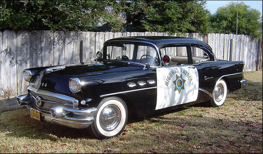
A look back: Vintage police car, 1950s
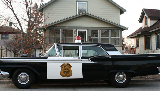
A look back: Vintage police car, 1950s
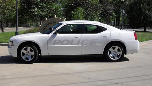
Stealth Vehicle, Leavenworth, KS
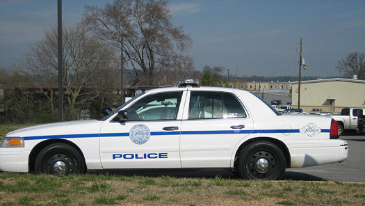
Crown Victoria, Pelham, AL
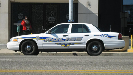
Crown Victoria, Birmingham, AL
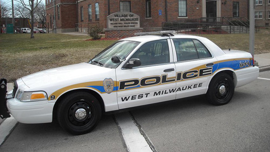
Crown Victoria, West Milwaukee, WI
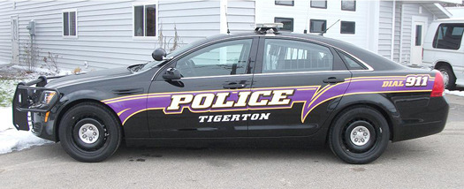
Chevy Caprice, Tigerton, WI
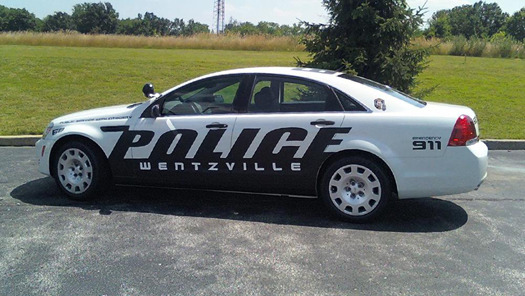
Chevy Caprice, Wentzville, MO
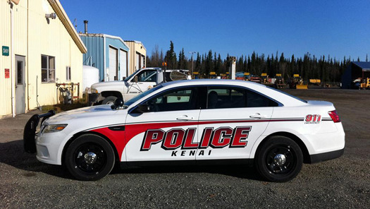
Ford Taurus Interceptor, Kenai, AK
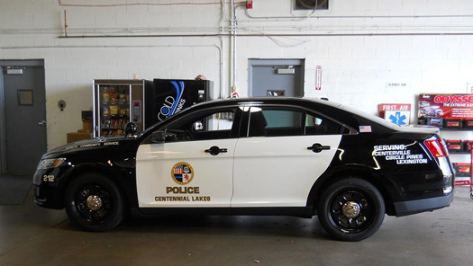
Ford Taurus Interceptor, Centennial Lakes, MN
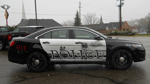
Ford Taurus Interceptor, Stillwater, MN
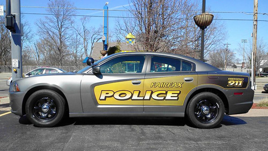
Dodge Charger, Fairfax, VA
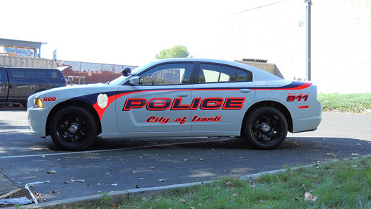
Dodge Charger, Isanti, MN
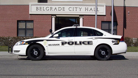
Chevy Impala, Belgrade, MT
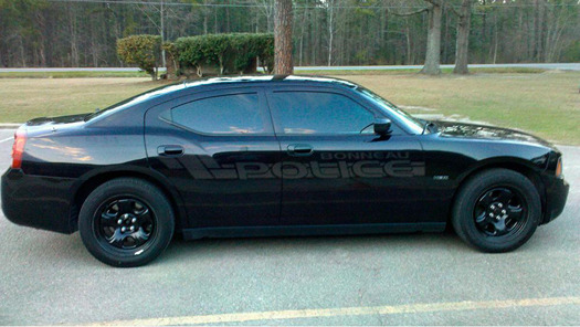
Stealth Vehicle, Bonneau, SC
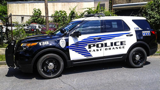
Ford Explorer Interceptor, East Orange, NJ
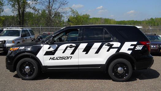
Ford Explorer Interceptor, Hudson, WI
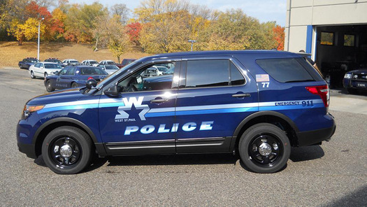
Ford Explorer Interceptor, West St. Paul, MN
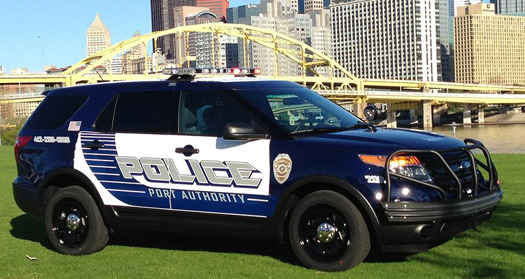
Ford Explorer Interceptor, Port Authority, Pittsburgh
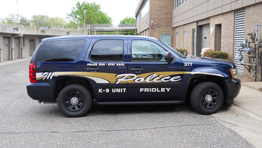
SUV K-9 Police Car, Fridley, MN
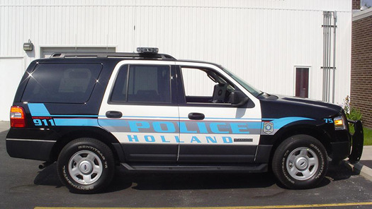
SUV Police Car, Holland, MI
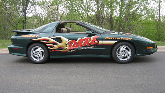
Specialty Police Car, DARE Program, Beltrami County, MI
