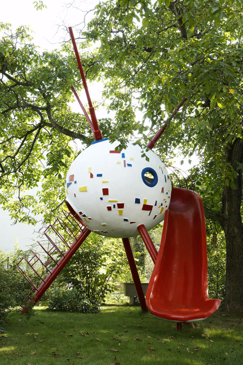
Zdeněk Němeček. Sputnik play sculpture (1959). All images from the exhibition's must-follow Tumblr, 100 Objects from Century of the Child.
Over the weekend, the Los Angeles Review of Books published a longish essay I wrote on the Museum of Modern Art's enornous, fascinating exhibition "Century of the Child: Growing By Design, 1900-2000," curated by Juliet Kinchin and Aidan O'Connor. The exhibition, which includes over 500 objects from all fields of design, and is accompanied by a film series, runs through November 5. I had a rare struggle with the essay, torn between trying to discuss the themes of the exhibition, which are legion, and the trouble I had with its mode of presentation, which made those themes hard to surface. In the end, since most of the readers of LARB will not make it to MoMA, I decided to make a path through those 500 objects, highlighting about 20 that I thought told a story. That story was a melencholy one.
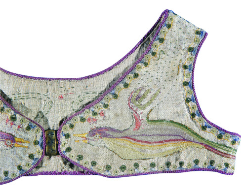
Laura Kriesch. Child’s embroidered bodice (1903).
Despite the utopian bent of the exhibition’s opening galleries, where building blocks and linen smocks rule, as one moves through Century of the Child, there is a certain melancholic undertow. Toys, schools, books, films, and playgrounds reveal themselves in turn as vehicles of adult propaganda or coping mechanisms to paper over trauma. The show makes clear that design responds to needs, but it also fills different kinds of voids. Many of the artifacts on display seem to have been designed as much to save adults from the workaday, violent, consumerist realities of the twentieth century as they were for child’s play...
One sees a great continuity in these first decades of the 20th century between design for children and design for adults, and the creative work done by children and by adults. The exhibition presents the sense that early modernists even looked enviously on children’s ability to create without preconception, and their potential to live their whole lives as modern beings (it is with that same wistfulness that adult tech writers look today on their “digital native” children). This romantic vision, however, is countered by Kinchin’s bleaker observation about the early 1900s that “children were both the targets of an expanding consumer culture and exploited as a source of cheap industrial labor.” Future children would be free-thinking, but first they would have to be liberated from the factories. In this vein, block sets like Josef Hoffmann’s Factory (c.1920) or Czech designer Ladislav Sutnar’s Factory Town (1926) have a double edge: they acknowledge that the contemporary built environment is industrial rather than rural, while simultaneously offering a sense of agency in it.
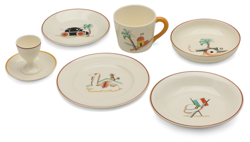
Figli della Lupa (Sons of the Wolf) tableware set (1930s). Children’s plates, cups, and saucers that celebrated Italy’s conquests in North and East Africa.
You can read the rest of that essay here. The rest of this post is in the form of outtakes from the essay, focusing on curatorial and exhibition design choices.
The exhibition is organized loosely chronologically, so from the kindergartens and playrooms of the early 1900s and 1910, we move to the more recognizably modernist names and forms of the 1920s. Who designs for children? And how seriously is that work taken? Around the second gallery we see more men whose interest in children has been previously under-remarked: a suite of furniture (1918) by Futurist painter Giacomo Balla, German architect Bruno Taut’s stunning Fairy Palace glass bricks (1907), his ever-unclassifiable contemporary Hermann Finsterlin’s colorful play shapes (1919). Kinchin and O’Connor also reveal what we always suspected, that many pioneering female architects and designers were shunted, willingly or not, toward design for the home, for schools, and for children. Austrian architect Grete Lihotsky, best known for the 1926 Frankfurt Kitchen, went on to design standardized children’s clubs, kindergartens and nursery schools for the Soviet Union and Turkey in the 1930s, and Bulgaria in the 1940s. A history of design for children could read as an alternate modernism, with heroes and heroines focused on the little things rather than the large gesture.
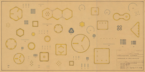
Aldo van Eyck. Drawing of sandpits, somersault frames, climbing frames, play tables, and climbing mountains (1960).
“Century of the Child” could stop right there, theme-wise. The cyclical nature of creativity, taking children seriously, modernism in the nursery and classroom. But it doesn’t. We are on the threshold of the third gallery, which will introduce health, war, consumerism, reconstruction. The fourth contains the space race, Disney, Pop-inspired toys, video games. The fifth, design for the disabled, humanitarian design, therapeutic design. The artifacts are fascinating, and the profusion of ideas is exhilarating, but the exhibition as a whole is too much to take in comfortably. One loses track of the common ground across the century, and across cultures, in the atomized nature of the material.
Underlining, highlighting, editing: “Century of the Child” needs all three. The exhibit feels as if the curators were so seduced by the richness of their material that they couldn’t bear to leave anything out. Embedded in the section on “Light, Air, Health” is terrific little survey of modernist school design, with work by Richard Neutra, Eliel and Eero Saarinen, Erno Goldfinger and Mary Crowley and Kaj Gottlob. These American, British and Danish architects were all working to pair the educational ideals of the early 20th century with appropriate spaces, adding fresh air, natural light, and open plans to the blocks and blackboards. But each school in the line is represented by just one object and a photograph: a drawing, a chair, sometimes a plan and sometimes not.
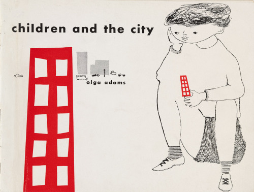 Frankie Faruzza. Cover of the book Children and the City, by Olga Adams (1952).
 In the catalog, O’Connor calls the Saarinens’ Crow Island School (1940) “perhaps the most important modern school of this period in the United States.” Why not show Crow Island in all its glory: the L-shaped classrooms, each with their own outdoor courtyard; the scaled down details, including the displayed Charles Eames and Eero Saarinen-design bentwood chair, Lily Swann Saarinen’s textiles and animal tiles? It would have provided a focal point and a center for the century-long discussion of education spaces, started in the first gallery and continued, in fits and starts, with Aldo Van Eyck’s Municipal Orphanage in Amsterdam (1955-60) and UNICEF’s School-in-a-Box (1994). Even more basically, why not write “Education” in big letters on the wall above the schools, “Playrooms” on the one opposite, just to let the visitor know what to expect. The wall text is so graphically unemphatic as to make it difficult to know which cases go together, and where to go next.
The curators’ fear of simplification feels connected to their fear that the toys might take over. Consider: if you heard the Museum of Modern Art was doing an exhibition of design for children, what are the first likely inclusions that come to mind? (Because I am an architecture nerd, I actually thought of Aldo Van Eyck.) But a normal person might think of LEGO (1954-58), or the wonderful Eames film “Toccata for Toy Trains” (1957). They are both in the exhibition but oddly obscured. Why play “Toccata” on a tiny screen? There is wall space enough for the Eameses, and the terrific “Story of the Asterisk” too. The exhibition does not differentiate between the popular-at-MoMA and the popular-in-the-marketplace. Iit offers up an oversize Andreas Gursky photograph of a bleak big-box Toys R Us on an anonymous American strip as a sort of killjoy commentary: it gives us the toys, but it takes away our pleasure in them. I felt guilty about how much I wanted to buy Fredun Shapur’s 1967 Play Sacks.
 Ladislav Sutnar. Prototype for Build the Town Building Blocks (1940–43).
As I moved forward through the exhibition, I came to question even the loose chronology. It is very MoMA to periodize, and that first gallery, with its Froebel blocks and dark blue walls, is a model of the type. But a better use of the timeline would have been to break out a few key types for their own three-dimensional march through time. What about building toys, for example? Froebel blocks, Josef Hoffmann’s 1920 wooden factory, Ladislav Sutnar’s 1940-43 Build the Town, forward to LEGO, and on to Tetris and SimCity. That would have been a more organic way to include digital play, about which the curators obviously have mixed feelings, in the ongoing narrative, rather than inserting a few games in isolation.
It is a testament to how much wonderful stuff is on display (and how many mini-histories are told in the catalog) that I have quite so many curatorial suggestions. Ultimately I felt, as I wrote for LARB,
Century of the Child is inspiring in its willingness to upend old value systems and take play seriously, to engage with the paradoxes of a design century that, in so many ways, has not succeeded in protecting children from terror, but as an exhibition it fails to take some of its own advice.
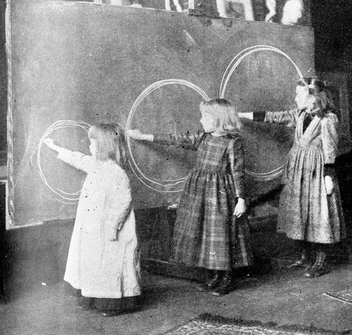
Freehand drawing exercise (1899).
The exhibition closes on a high note, with one of my favorite pieces of interactive art ever: Philip Worthington’s Shadow Monsters (2004). What looks at first like an illuminated wall quickly reveals itself as a blank canvas for shadow play. Wave a hand, make a mouth, and your gesture is over-written with animated spines, teeth, eyes and growls. It's catchy, engaging, and were it not for the very adult "No photos" sign on the wall next door, would surely have gone viral.
