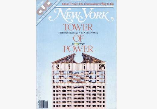
Lately I've been thinking a lot about the Sony (nee AT&T) Building, as I research my Philip Johnson bio. It's also been on the minds of the curators of the Victoria & Albert Museum, which recently purchased a presentation drawing of the project for a forthcoming show on Postmodernism. In an insightful post on the building and the controversy it engendered, the V&A's Glenn Adamson quotes Michael Sorkin's acid review of it: "The so-called 'post-modern' styling in which AT&T has been tarted up is simply a graceless attempt to disguise what is really just the same old building by cloaking it in this week's drag, and by trying to hide behind the reputations of the blameless dead."
Alexandra Lange, on her blog, quotes this quote from Adamson. (Sorkin, as ever, makes great copy.) I'm going to save my bullets for later, but I just thought I'd point out that AT&T, love it or hate it, was hardly the "same old building"; that is, a generic office tower of stacked floor plates — what my friend Philip Nobel calls a "lasagna" building. (Or how about "Saltine"?) The AT&T was hardly standard. This is a thirty-eight story building, after all, that rises to sixty stories (check out the grand staircase connecting the three executive levels, above), a building with a "sky lobby" and an attached museum (which, by the way, is now operational as the Sony Wonder Technology Lab — seriously — with free admission). Which is merely to say, this is no ordinary building.
