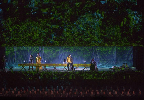
I wrote a review of Attila—music by Verdi, sets by Herzog & de Meuron, costumes by Miuccia Prada—for Icon Magazine’s April issue. My first foray into set design critique.
At the Metropolitan Opera’s new production of Attila, the applause starts before the curtain rises. The story here is conductor Riccardo Muti’s long-delayed debut at the Met (he’s 69), not necessarily the new production of a little-performed opera by Giuseppe Verdi, with sets by Swiss architects Herzog & de Meuron, costumes by Italian designer Miuccia Prada, production by Pierre Audi. But rise it must, and when it does, there is a moment of stunned silence, then more applause. Herzog & de Meuron’s set for the Prologue is a mountain of concrete, slabs above, smaller pieces below, that rises toward the top of the stage, backed by a gray sky. Pieces of rebar stick up here and there like curlicues. The chorus lies twisted and tossed at the base of the unsteady edifice, dressed in rumpled work clothing, their bodies echoing the broken material. The music is lyrical and robust, matching the scale and simplicity of the visual.
Attila, King of the Huns (Ildar Abdrazakov) enters from the left at the top of the pile carrying a glittering helmet, plumed with black feathers. He wears a black leather cape and brown leather jerkin. He has just invaded Italy, and he and the chorus dedicate their victory to Odin. Odabella (Violeta Urmana), daughter of the defeated and deceased King of Aquileia, enters with a set of waifish handmaidens. It is a measure of the conservatism of the typical Met opera-goer that when I chatted with my neighbor during intermission, he felt that Odabella, decked out in a floor-length brown leather dress that set off both her bosoms and blonde beehive, did not look warrior-like enough. All the costumes were strictly neutral, leather, leopard, fur, with sparkly highlights for the nobles: Attila’s helmet, Odabella’s silver headband, Roman general Ezio’s (Giovanni Meoni) hip-length silver streamers. More difference in the cut and color of the costumes of the Huns versus the Romans would have made sense, since the music emphasizes the war between pagan Odin and the Christian God.
The textile quality of Herzog & de Meuron’s work—the ornament they embed in forms initially rectilinear—comes front and center in the Attila sets. That mountain of rubble relates directly to the gabion walls of their 1997 Dominus Winery in California (as well as to the news of the day, one cannot help but think of earthquakes as well as war). There, the stacked stainless steel baskets organize rock into a long, lean, doomy cave. Here, the slabs are organized into a rough peak, their diagonals reminiscent of the angles of a tiered staircase. It is an extremely artful mess, one that also references traditional opera scenography, where Wagner necessitates a mountain set.
When the curtain rises on Act I, there was another moment of awed silence. We are now in the forest outside Rome, one constructed as a stage-high bas relief of greenery. As the curtain disappears the forest rises slightly too, its dense undergrowth stretching toward the top of the stage, where trunks lift out of the thick band of leaves, extending toward the rafters. Flickering lights on the leaves create the optical illusion of a rustling breeze and sunspots.
The forest set reminded me simultaneously of Herzog & de Meuron’s 1993 Ricola packing and distribution facility, which has a 60-meter polycarbonate façade printed with a Karl Blossfeldt image of a leaf, and photographer Thomas Demand’s 2003 “Clearing,” with its 270,000 freakishly realistic paper leaves. Building, photograph and set heighten and flatten the experience of being in the woods, turning a three-dimensional space into a dense fabric pattern.
I imagined the first forest scene, with Odabella standing before the leaves, was a sort of tease, and the next time the curtain rose Attila would be standing among the tree trunks above, master of all Italian verdure. But that never happened. No one ever got to inhabit the forest, only to sing variously from oval lunettes cut into the leaves, from a banquet table set in a horizontal split, and from the stage below. By the last act, the fourth scene with the same set, I felt frustrated and a little bored by it. I wanted to return to the rubble, or to some third powerful visual. The magic had dissipated, and the audience was left with four opera singers with nowhere to go. They moved their leather, fur and foil-clad bodies into different pairings and triumvirates, but without level changes there was little hope of enhancing the drama of betrayal or heightening the shifts in power, as had been possible in the first scene. Surprisingly for architects, Herzog & de Meuron seemed to have paid little attention to experience—the set could just as well have been printed on polycarbonate, or cloth.
