For years, there has been a disparity in the understanding between the medical community and the general population. Despite the fact that every single individual possesses a body, most of us are not aware of how they work and how we can take care of them better. There are many reasons for this — firstly, medical science is incredibly complex and constantly evolving, treatments that were commonplace 10 years ago can be rendered archaic overnight in the face of new physiological discoveries and it can be hard to keep up. Secondly, every human body is different, and with no dearth of medical information readily available on the internet, it has become increasingly harder for an individual to determine what information is relevant to them specifically and what they can ignore. Lastly, it is not the primary responsibility of the medical community to present medical information in an easy-to-understand way to the general population which leaves many complexities untouched, nuances ignored and jargon abound. Instead, this job falls on those of us committed to information design.
The disparity of knowledge between the medical community and general population creates a unique problem for designers. Despite the fact that our bodies, organs, and processes are the most universal thing we as humans tangibly share, the language and fluency in understanding how they work and how we care for them is lacking. What do we do when there is a large amount of information available but very few people with the training to interpret it correctly? In other words, how do we make this information more accessible without necessarily having medical expertise? Moreso, how can the use of visual language assist us to bridge the gap in fluency? These questions are especially relevant now, as we face a global pandemic.
A recent editorial published in the Lancet states that “we are not only in a ‘pandemic’ but also an ‘infodemic.’ This global epidemic of misinformation—spreading rapidly through social media platforms and other outlets has already had devastating consequences to public health, wellbeing, and economies across the world. Different mitigation methods across the world make finding reliable information even more problematic. Health literacy becomes even more challenging when knowledge on the subject is incomplete, changing and context dependent.” Collaboration between providers and information designers is key in decreasing confusion and offering valuable information that drives action.
Tia is a women’s healthcare company based out of New York City providing primary care, gynaecology behavioural health and wellness services to women. At Tia, we kick off our projects with medical professionals in order to accurately transfer data to the communication team. The communication team breaks down the hard data as causes, facts, risks, recommendations, terminology, methods, the hows and whys, rearranging the information in an effort to create a clear and succinct narrative. We approach the information from the perspective of someone who doesn’t regularly engage with medical information and we aim to anticipate the obvious questions. For example, females have multiple options when it comes to birth control, it should be easy for any female to understand the attributes of each birth control method (what it looks like, how often it has to be replaced, and so on). Additionally, seeing each birth control method in comparison with one another makes that choice a little easier. With this strategy, we liaise with care providers, operations and relevant team members to gather their opinions and vet information before translating it into design.
To strategize, we often ask: How might we provide clarity to understand this offering better? Are the benefits and risks clear? What are the different circumstances that exist for patients currently? How might we explain which choice is valuable to a specific circumstance? How might we composite the details and streamline action? What is the call to immediate action?
Tia delivers personalized and preventative care to women — this means providing options for females in their individual healthcare journeys. Translating information in relation to these options offers autonomy and empowers decision-making. Conveying what a Well-Woman Exam is, what it can entail, how long it takes and how (and why) it can be personalised enables informed decision-making and offers thes patient agency, confidence, and support.
The use of visual design in translating and communicating this data directly correlates to the patient’s wellbeing.
Taxonomy and Terminology
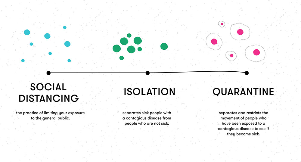
With the exception of medical professionals and students, public understanding of medical terminology is limited. In service of providing autonomy, design should create the space for context and meaning for someone who is otherwise unfamiliar with these concepts. For example, a personal health record (PHR) is a tool that uses technology to access, track and share up-to-date information related to one's health, maintained by both patients and caregivers. PHRs provide centralized management of complex personal health information, and allow individuals to play a more active role in their personal healthcare, enabling higher self-control, independence and better decision support. Clarifying meaning and context makes procedures like IUD insertion less intimidating. The potential presence of two simultaneous diseases can drive patients to seek preventative care early on.

Numeracy
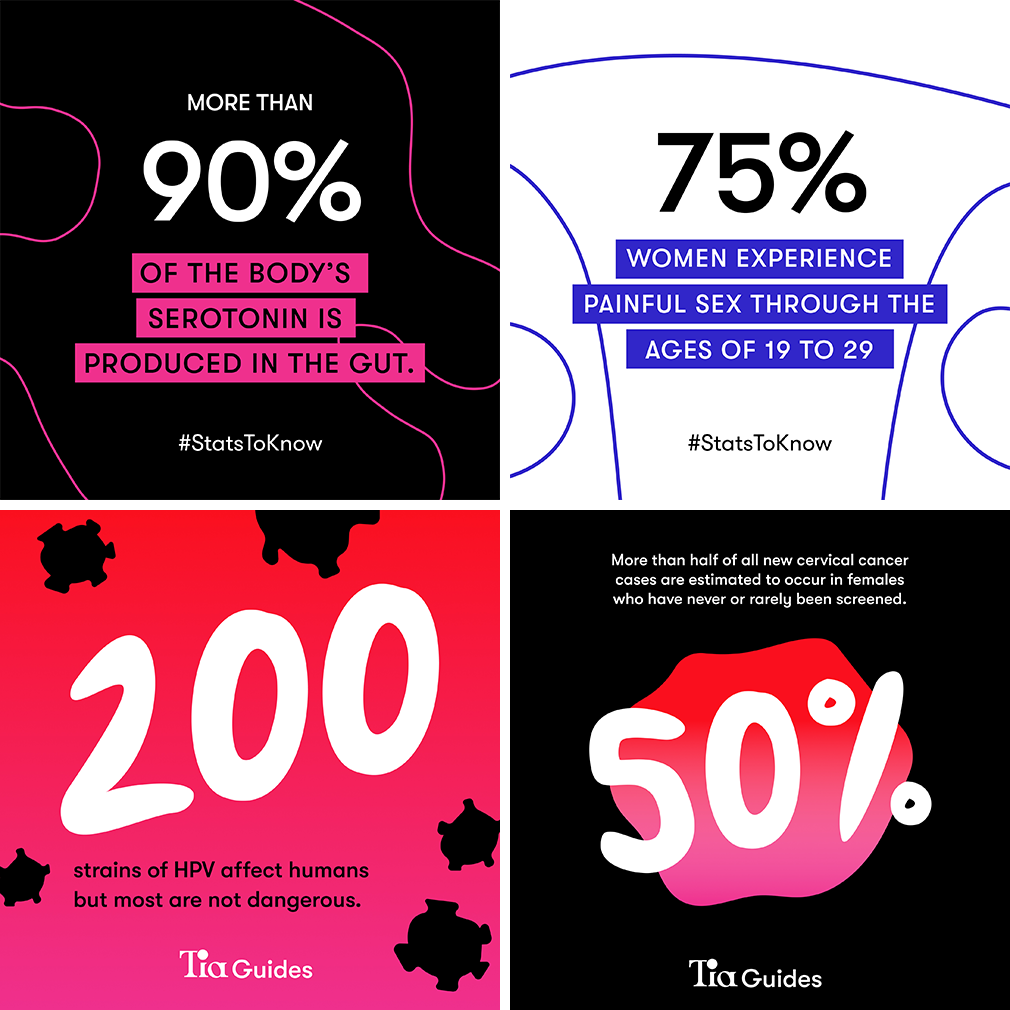
Chronic news stories involving large, shifting COVID-19 statistics, including actual and projected counts of confirmed infections and deaths every day can become overwhelming for people. The idea of translating statistics and restating data into a meaningful context by experts and advocates for public health action, also known as “social math”, can support health literacy and numeracy. Using typographic hierarchy and making numbers glanceable can convey this information swiftly and drive action.
Data visualization
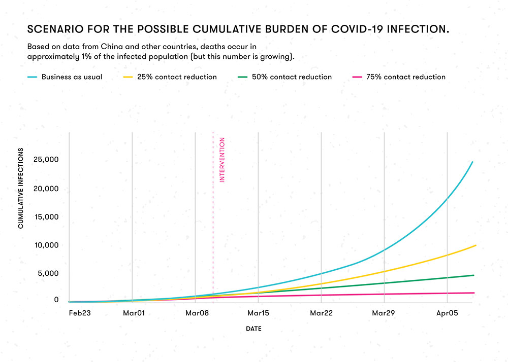
Infographics and graphs can provide a meaningful way to present medical data that impacts decision-making on a collective and individual level. This can involve breaking down the data points in terms of time, place, elements people are familiar with, or personalizing/localizing numbers to make them more digestible and meaningful. Storytelling with data through simple graphs, comparative charts and representational icons makes the implicit explicit and can help people to see themselves as responsible for the community’s health at large.
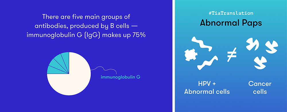
Storytelling
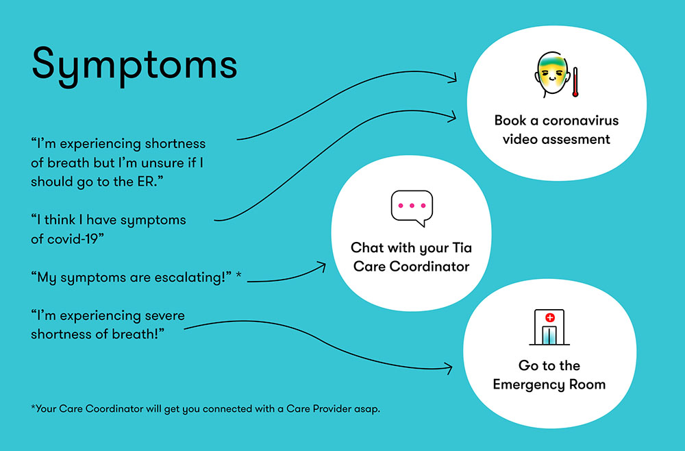
In order to further build individual and community health, design should use storytelling to compliment this data for succinct public messaging and to explain to those unfamiliar with the nuances of charts, statistics, and graphs. Visual communication has the potential to reflect compassion and familiarity through meaningful framing, local or global context, and personal anecdotes to influence valuable decision-making. Through personal stories and visual narrative, we allow people to relate and empathize with circumstances outside their own fostering community-driven behaviour. With the launch of virtual care services at Tia — we familiarize patients to providers’ faces to provide continuity in their care delivery.

Diagrams and Illustration
“Pictures have been proven to have a positive impact on people's attention to health materials, comprehension and recall of health information, and the likelihood of adherence to medical instructions.” A study in the Patient Education and Counseling states. The use of diagrams and illustration enables easier learning and activates recall at a time relevant to the patient. These outcomes can facilitate the exchange of a wide variety of health information between the care coordinators or medical providers and patients, ranging from screening questions to treatment instructions. We witness this in our everyday environments through aesthetic homogeneity in signage, maps, diagrams, airline safety cards, assembly manuals, and thus we are more or less trained to recognize visual information in these styles. Diagramatic representations using simplified forms and shapes can further utilize visual cues such as colors, dimension, depth, symbols and letters to facilitate graphical communication strategies (such as realism, simplification, exaggeration and symbolism).
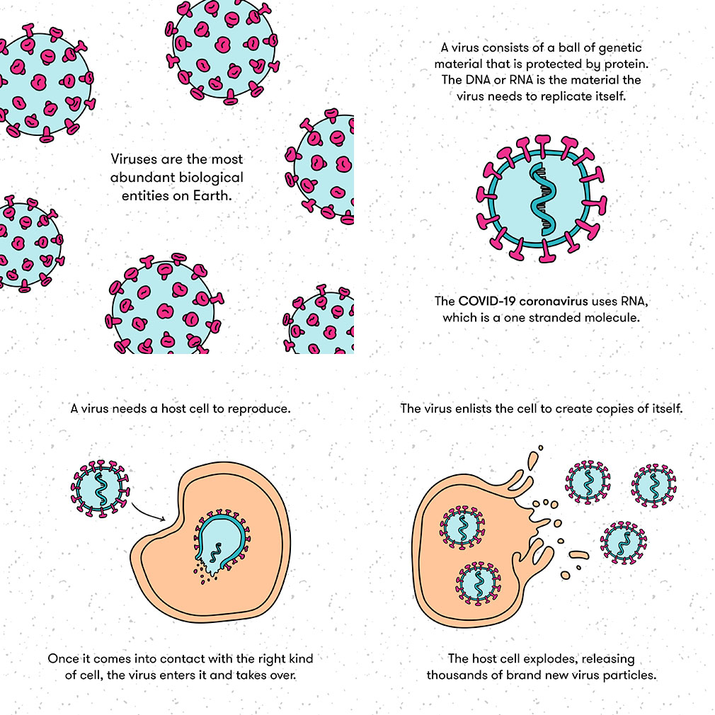

Being a designer at a healthcare company presents challenges such as striking the balance between clarification and over simplification, making data glanceable and designing for urgency / emergency while not overwhelming the patient. Often we find that, storytelling as a strategy reduces impact as it fails to keep the reader engaged until the end. In other instances, important details about a service can get lost in an effort to condense information. It is important to ensure that we make this communication easily accessible across channels and formats — to meet patients no matter where they are. Gradually, the intention is to identify what practices best communicate and effectively empower patients to make decisions early on in their healthcare journey.
Health literacy is important to everyone because everyone has a body — now more than ever, we have come to a collective realisation that immediate action and preventive health influence our environments, economy and well-being. People with the higher care needs — older people, people with low income, minorities, immigrants and people with chronic diseases or compromised immune systems often have a lower health literacy level. This may result in failure to follow medication dosage and instructions, lack of urgency in seeking care, and make the patient less likely to track information.
Limited evidence exists about what design features are the most significant and effective to illustrate health information, given the diversity in people's visual literacy. This presents a design opportunity. Designers should be unrelenting about using their skills and compassion to test, fail and evolve communication to meet the needs of effective health literacy. The role of design is not only to simplify, but evolve as rapidly as healthcare does, and to present solutions that are iterative in nature. When successful, communication design can enable patients to stay well-informed about health risks, resources, and recommendations and to take action to achieve individual and public health.
We talk about the healthcare industry as a system, but thoughtfully designed information can pave the way for us to understand the systems that live within us. Giving a level of care to design can extend the level of care given to the patient.
