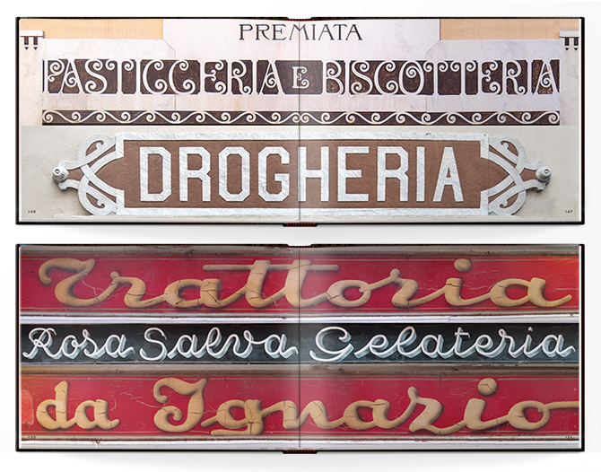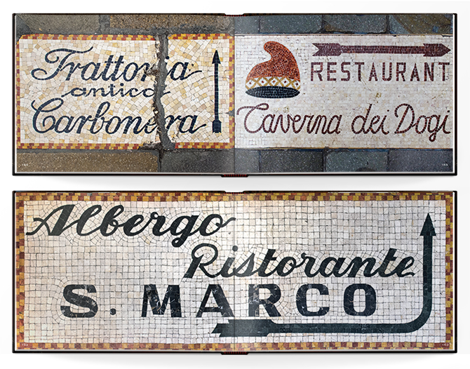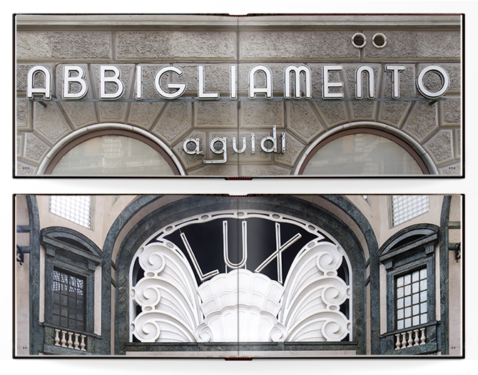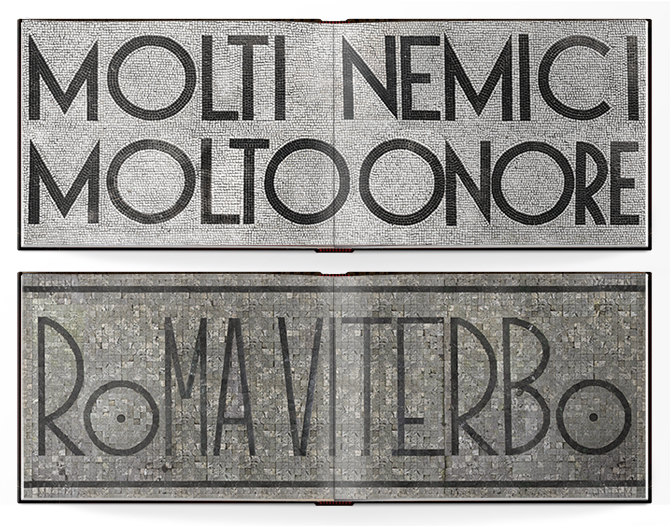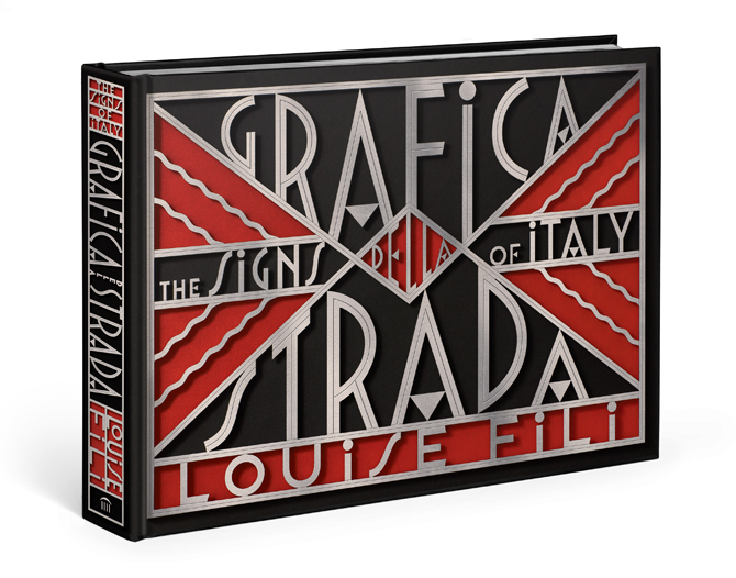
That Louise Fili is a designer of spectacular talent is, of course, well-known: from packaging to postage stamps, her visual orchestrations are at turns dreamy and delightful, with color palettes lifted from another era, and typography that is so fine-tuned, so deftly detailed and flawlessly executed that it seems to exist in its own design stratosphere. For most people, this would be reason enough to rejoice. Or, for that matter, to retire.
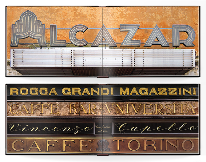
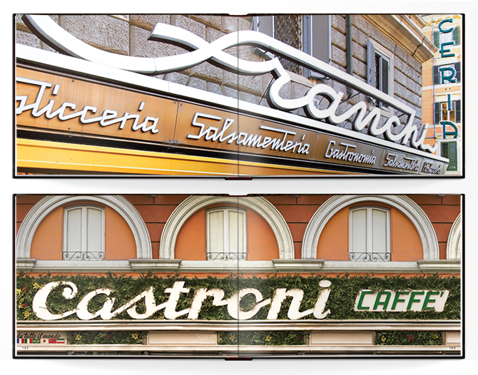
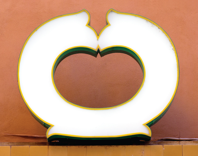
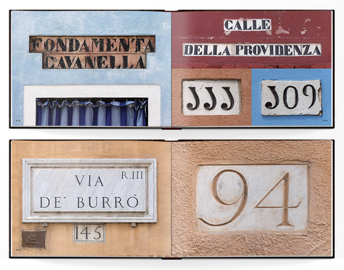
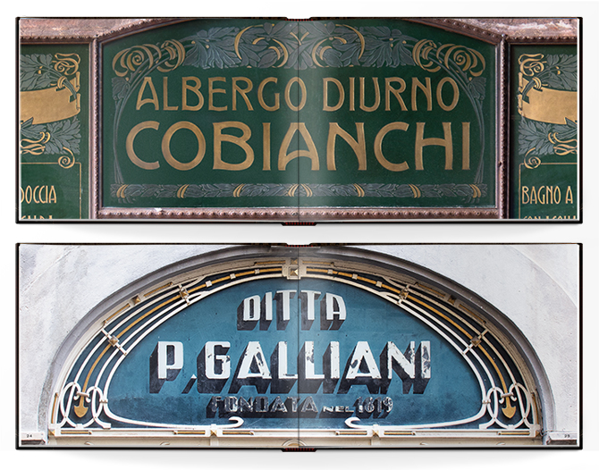
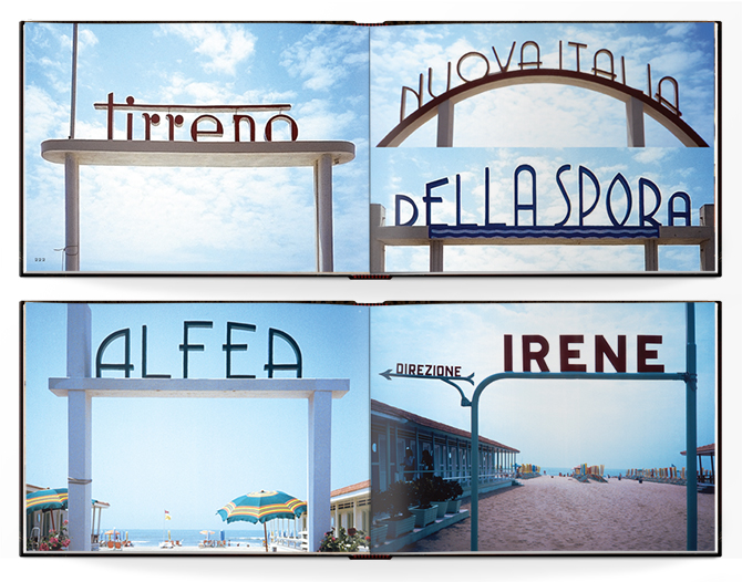
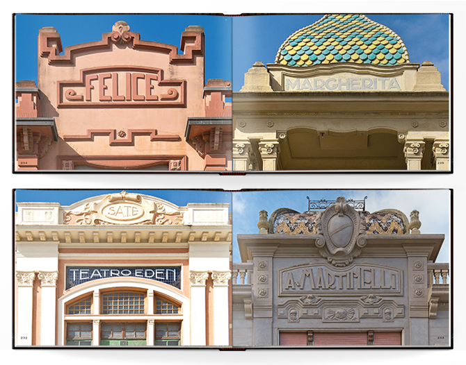
Not so for Fili, whose new book — a visual cornucopia of typographic signs photographed in her beloved Italy — is a reminder that design skill is not only a function of what we make, but manifests, too, in what we mindfully choose to record. Street signs, shop signs, numbers and ampersands, lit-up letters and loopy ligatures, neon and glass, metal and brass — these are markers from another time, but there is nothing falsely nostalgic about their presentation here. They’re remnants of architectural history, fragments of a culture that, remarkably, come together on paper as a record of Fili’s urban meanderings but more importantly, as a consequence of her skilled art direction. The result is a symphonic collection of mesmerizing images: for lovers of letterforms, the effect is nothing short of hallucinatory.
Naturally, the book’s editorial design benefits, too, from Fili’s razor-sharp eye, but it is the photographs themselves — beautifully chosen, sequenced and printed — that so powerfully convey the author’s love for typography and, for that matter, for her native Italy. Typography is, of course, her lingua franca: and who better than to write this book than Louise Fili? Be glad she did, and buy it. Her new book is a gem.
