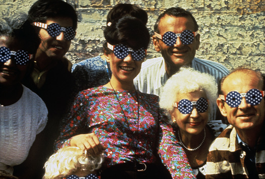
Deborah Sussman with fellow members of the Eames Office wearing July 4th glasses she designed (c. 1965)
This December, Woodbury University’s WUHO Gallery will host the first retrospective of designer Deborah Sussman’s early work, which ranges from games for the Eames Office to the 1984 Olympic Games. The exhibition, co-curated by Catherine Gudis, Barbara Bestor, Thomas Kracauer, and Shannon Starkey, will include objects, images and sketches. In light of the renewed interest in Los Angeles’s contributions to the visual arts, headlined by the city-wide and Getty-funded Pacific Standard Time and PST Presents exhibitions of the last two years, this seems like an ideal moment to take a closer look at a career that spans many scales and movements. The curators need help to make the show an immersive experience worthy of Sussman, and have launched a Kickstarter to fund mounting, screenprinting and associated programming. It ends November 24.
To add context to the Kickstarter pitch, I asked two of the organizers, architect Barbara Bestor and curator Shannon Starkey, to put Sussman in context. Why does L.A. love her?
Why now for an exhibition on Deborah Sussman?
Barbara Bestor: We are finally starting to recognize, curate and celebrate the women who made U.S. and specifically L.A. design so important in the postwar and postmodern era. From the renewed interest in Greta Grossman — who is now recognized as one of the great furniture designers in mid-century L.A. (and even has a desk re-issued by DWR) — to the many designing women in the MOCAD/Autry show last year, the time has come to recognize, document and be inspired by these great designers.
Deborah's work looks particularly fresh at a moment when designers are revisiting the post-postwar era and finding all sorts of inspiration in the explosions of color and supergraphics that Deborah and some of her kin brought to architecture and environments.
Within the discipline, the outcry about the exclusion of Denise Scott Brown from the Pritzker earlier this year was a real wake-up call, proving that women won't be recognized without serious documentation and exhibition of their work and authorship. We are happy to use the WUHO gallery in Hollywood to celebrate Deborah's work and to expose a new generation of students and design-consumer civilians to her work.
Shannon Starkey: I would add, in addition to new attention paid toward female designers, shows like Sylvia Lavin’s “Everything Loose Will Land” have complicated the common L.A. story of the autochthonous male genius architect or artist, and raised the profile and prominence for the team of individuals and disciplines needed to produce these projects. The current show builds on that idea by focusing specifically on an otherwise somewhat 'marginal' figure — according to the history books.
What is the concept for the show?
BB: We are planning a three-part show. The first part deals with Deborah's time at the Eames Office, soon after school. While there she did a lot of work with them for Herman Miller, games like House of Cards and the coloring book, Griffith Park Railway, and the exhibitions on mathematics and Nehru. The second part is her work on her own which included collaborating with Frank Gehry on the J. Magnin stores, a European episode including Galeries Lafayette, the Rolling Stones tour, the California City proposal and other retail ventures. The third part is about the 1980s — the 1984 Summer Olympics in particular — which made her a superstar, and a lot of work for Hasbro. This third part is where the color and graphics become architecturalized — full-scale and into the realm of immersive environments.
SS: We can see her starting with the design for the House of Cards — which we might call architecture reduced to the size of a product — and ending with giant sonotubes — a graphic expanded to overwhelm.

Standard Shoes, designed by Sussman in collaboration (c. late 1960s - early 1970s)
How is Sussman’s L.A. story different from those told in this year’s Pacific Standard Time Presents exhibitions? How/where did she appear in those narratives?
BB: Deborah’s project for the Olymipcs showed up in the Getty survey of the wartime and postwar eras in LA. She was also in the California design show at LACMA, represented by a single publication: a catalog for a show at LACMA. That piece is what caught my eye. It was one of my favorite design items in the show and it led to my contacting her and getting to know more about the greater body of work. In general the PST shows, especially the two great ones that focused on the avant-garde movements in architecture and art (at the MAK Center and SCI-Arc, respectively) had pretty much no women in them at all. And indeed, in the post-Eames design landscape, there weren’t a lot of women making a name for themselves in architecture. However, at offices like Gruen and in the design realm there was a lot of action and the L.A. chapter of AIGA was actually founded by a group of women including Deborah, April Greiman, Ray Eames — a FIERCE group of ladies, not afraid of color or new design, all trying to move beyond the strictures of high modernism. They are one of the least conservative design gangs I have ever come across.

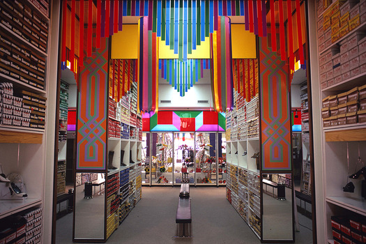
J. Magnin department store, designed by Sussman in collaboration with Frank Gehry (c. late 1960s)
Obviously the first thing that strikes one about her work is the color: bright, graphic, lots of it. How did her use of color evolve? Was it influenced by the Eames Office? By California?
BB: I am sure the Eameses had a lot to do with it in the beginning but I think she and her peers such as Ed Ruscha and other L.A. artists had a common cause in celebrating the intense color palettes of southern California skies. Deborah brought on the color palette that we think of as the 1980s—maybe one of the major design exports of our city.
SS: The color definitely evolved over the decades, from the muted, toned-down colors of mid-century modern to the bold and bright colors of postmodernism. By the time of the Olympics, color becomes the primary focus.
On the flip side, what’s striking about her work that isn’t related to color?
BB: The incredible shift in scale, from her early years as an illustrator and paste-up designer doing ad layouts to eventually doing whole buildings that are in fact graphics or filling the interior of the (massive) L.A. Coliseum with paper and shapes for the Rolling Stones.

1984 Los Angeles Summer Olympics, environmental graphics by Sussman/Prejza with Jerde Partnership
How do her environmental graphics change space? Can you talk about a particularly powerful example?
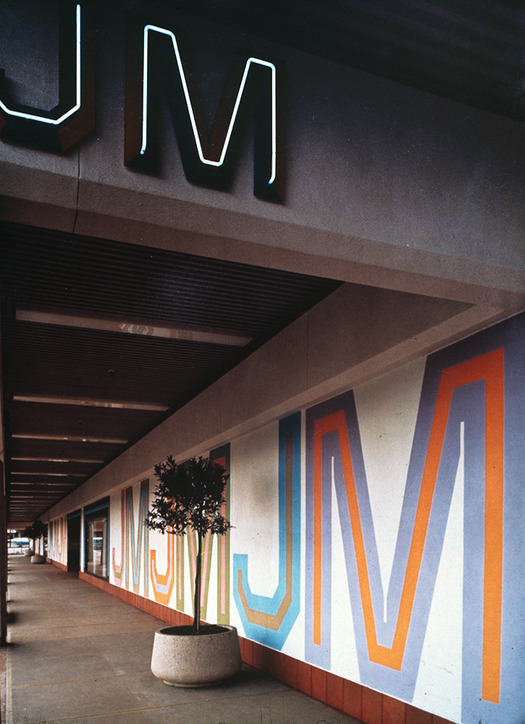
BB: In the J. Magnin stores you start to see the graphics vocalize an agenda that is beyond what the architecture can do. The store was a progressive force like the Design Research store in Cambridge, though less focused on furniture and Europe. I love the photos of the sun-struck stucco California-ish facades with these radical graphics of the name of store rendered in five-color letters in an innovative font, pushing the building envelope to say more. In the Autry show they reconstructed a wall she did for the store, a piece that went inside and outside, with the doors in black, green and red, and it was startling and exciting. The changing rooms also got turned into this numbers game, with highlighted numbers marching down the dressing area.
SS: In the case of her work with sonotubes, the graphic itself has been wrapped to become self-supporting. Gehry and some artists of the period like Robert Irwin used cardboard and even the same sonotubes for their qualities of temporality and immediacy. The sonotube became a meeting ground between architecture and graphic design, arrived at from both sides by Gehry and Sussman.

Sussman/Prejza signage for Pioneer Place, Portland, OR (1984)
What's relevant about her mode of practice to contemporary discussions?
BB: The Sussman/Prejza office has combined an ability to create new logotypes with an interest in architecturalizing them that made them the leading from for environmental graphics for many years. It is an area often overlooked by architecture as an additional platform for expression and contemporaneity. Contemporary offices such as 2x4 also exploit this area to enhance and sometimes overpower buildings. All of the work comes out of collaboration. There isn’t the same, You do this [public art project] and I’ll locate it in my plaza, that seems to happen with public art generally. Instead, the architects and environmental designers are on the same team, seeking to communicate ideas and ways of living and experiencing spaces.

Environmental graphics for Fortaleza Hall, designed by Foster + Partners for S.C. Johnson in Racine, WI (2011)
How has Sussman’s work influenced your own?
BB: I am most intrigued by the proposal for California City. This piece of pop architecture, followed by another proposal soon after by Venturi Scott Brown, proposes a sort of lo-architecture of signage and creates an urban environment that is a sort of Times Square in the desert. I think the dovetail with Reyner Banham's interest in California at around the same time is a very important resource for us California designers interested in urban conditions in a landscape formerly disregarded for its urban progressivism.
