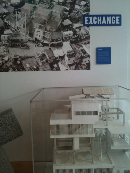
Kibera Public Space Projects, Nairobi, Kenya, 2006–10. Photo: Kounkuey Design Initiative, courtesy Cooper-Hewitt National Design Museum
Last week, after putting my name to an online petition in support of the movement, I spent a morning down in Zuccotti Park with the Occupy Wall Street crowd. I will admit that I felt like more of a tourist than a genuine protestor, but I was happy to at least register myself among the crowd and contribute something to its collective momentum. The next day, across the globe, Muammar Qaddafi was finally dispatched from this Earth by rebel forces in Libya.
With these events in mind, I rode up to see the Cooper-Hewitt’s survey of (mostly) Third World urban projects, “Design with the Other 90 Percent: Cities,” now installed at the United Nations and organized by Cynthia E. Smith, the museum’s curator of socially responsible design. As the world’s headquarters of good intentions, the UN would seem an ideal venue for this show, at least thematically.
To walk into the General Assembly Building, even with the horrendous ad-hoc security tent that ruins its entry plaza, is an edifying, hopeful experience. That it is not always effective in achieving its ideals is, of course, an unfortunate reality. This seems an apt metaphor for “Design with the Other 90 Percent.” (Is it possible to be less than fully enthusiastic about an exhibition for socially responsible design and still be a good person? I hope so.) Certainly, the intentions here cannot be faulted. For those who have not been paying close attention to the design world over the last couple of years, and even for those who have, many of the exhibited projects will be inspiring. A crowd-sourced map of services in Kibera, an impoverished and heavily populated (to say the least) community in Nairobi, Kenya, is a good example. The credits for the project are a paragraph long, not counting the citizens who actually contributed the information, which says something admirable about the democratic, collaborative nature of the socially responsible design movement.
Much of the exhibited material, however, seemed awfully familiar, either from magazines, the internet, or — more critically, I think — other exhibitions. Alejandro Aravena’s Quinta Munroy Housing in Chile? I saw that earlier this year at MoMA’s "Small Scale, Big Change" show. Same for Urban Think Tank’s cable-car system for Caracas. Haas & Hahn’s Favela Painting Project? That was at the Storefront for Art and Architecture (I wrote about it on this very site). A slum housing project for Pune? That was at the Architecture Center’s "Jugaad Urbanism" show. One could go on.
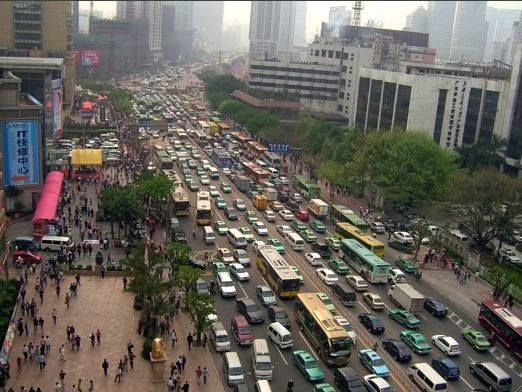
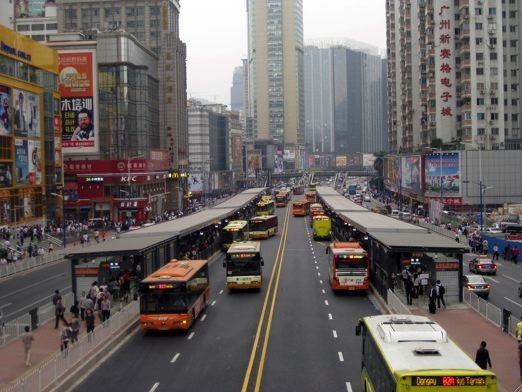
What was not there I also found curious. There is something vaguely paternalistic about a show organized by an American museum about design solutions for urban spaces in foreign nations occupied by individuals with dark skin. Things are pretty bad here in the United States. That’s what the Occupy movement is about. So why does a rapid bus transit program in Guangzhou, China, qualify, but not one in New York? Are the urban poor here better off?


Guangzhou Bus Rapid-Transit System, before and after. Photos: Karl Fjellstrom
In any case, it’s hard to generate a great deal of excitement about material that you’ve already seen. To the extent that the intended audience is outside the design crowd that is the typical audience for such shows, this is okay, and the UN venue suggests that this is indeed the idea. If it inspires some bureaucrat to throw support at one of the exhibited projects, or develop a new one along similar lines, that’s great. But during my visit I didn’t notice any credentialed delegates lurking around the displays, and the tourists working their guided way through the place were a lot more interested in the wall of General Secretary portraits, across the hall.

Steps away from the Cooper-Hewitt exhibition, tourists ogle a permanent display of portraits of UN Secretaries General. Photo: Mark Lamster
Part of the problem is a fairly generic installation, by Moorehead + Moorehead, of flat materials on panels and ephemera in cases. Admittedly, it is hard to make much of the material on display sexy, and in fairness this kind of work should not be aestheticized. But it seems to me there’s a creative middle ground to be mined, and either way there’s no excuse for a text block placed on a wall behind a display case, where it can’t be read. As for those text blocks, there’s a certain academicism and bureaucratic inclusiveness to the proceedings that tends to drain the energy from the room.

Installation heresy: text panel behind display case. Photo: Mark Lamster
The breadth of the exhibition is also an issue. Cities is a pretty broad topic to attack in a relatively small space — on this subject, see Alexandra Lange’s review of Urbanized — and here we jump from continent to continent, shifting in scale, shifting in focus, without a clear narrative through-line. It could have used an editor. I can’t help but compare this show with the aforementioned Jugaad exhibition. That, too, was a survey of socially progressive projects, but it was both more focused (all were in India) and had something very concrete to say about how the spirit that informed that work might infuse our own. The Cooper-Hewitt’s show lacks that cohesion.
I left, finally, thinking not about the threads connecting the Occupy Movement and the Arab Spring with this show — that individuals, when galvanized to action, still have some collective power to effect change in our society — but with the wide gulf separating them in ambition. There was a time, of course, when designers convinced themselves that they alone could reform and reshape society. Many still believe that design thinking is the solution to any problem. “Design with the Other 90 Percent: Cities” would not seem to harbor such grand beliefs. Its ambitions are smaller, more practicable, more democratic. That’s not a bad thing. Anyway, the world can use all the help it can get.
