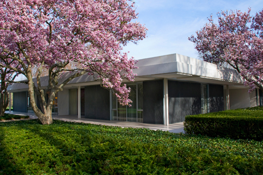
Exterior of Miller House and Garden, Columbus, Ind. Courtesy of the Indianapolis Museum of Art
For many American architects, their first commission is a house. Even if they go on to fame and fortune and skyscrapers, what people think of first, when they hear the name, is that house. Eero Saarinen grew up in two houses designed by his father Eliel, first Hvittrask (1901-03) in Finland, then the Saarinen House (1928-30) at Cranbrook. The Saarinen House became, like the Cranbrook and Kingswood school buildings, a family project. Mother Loja Saarinen created fabrics and rugs and collaborated on the garden. Eero designed furniture for his parents’ bedroom. Sister Pipsan designed motifs for the family’s bedroom doors. Eero himself has never been identified with a house. But that might be about to change.
On May 10, the J. Irwin and Xenia Miller House in Columbus, IN opens to the public for the first time since it was completed in 1958 (Video here). Designed by Saarinen and Kevin Roche, with interiors by Alexander Girard and gardens by Daniel Urban Kiley, the Miller House has been largely out of sight to the design world since its single publication in House & Garden in 1959. Xenia Miller lived there until her death in 2008, so what will be on display is the house as lived in and impeccably maintained by the Millers and their caretakers, a father and his son. Curators at the Indianapolis Museum of Art have cleaned, repaired and replaced, but dedicated themselves to working with what the Millers had left there, rather than trying to return it to 1958. Adding the Miller House to the list of iconic American modern houses suggests some new ideas about Saarinen and his collaborators, but also about for whom modern houses are designed. That Saarinen’s first homes were family affairs turns out not to be just a footnote.
In a speech he gave in Munich in 1960, Eero Saarinen began to describe his ideal home. He told his audience he had picked a house site in Connecticut, “a densely wooded rocky side of a stream. This wild nature suggests an informal, dark, romantic structure.” But such a structure would not suit his taste. He glossed over the exterior and headed inside. Inspired by the simplicity of Japanese houses — “I would solve the problem of furniture, with its inevitable ‘slum of legs,’ by eliminating it completely from the living room. Instead I would create a sunken area more or less in the middle of the living room, consisting of two large steps, carpeted like the rest of the room in neutral color.” He admitted that such conversation pits had become cliché, but noted that he had “more or less” invented the cliché twenty years earlier in the 1942-43 PAC Housing competition.
Outside the pit, little furniture would be needed but end tables and some pedestals for sculpture. The house’s center would be the work room, where his wife, writer Aline Saarinen, would have her typewriter, and he his drafting table. Climate controlled, carpeted, and book-lined, this room would be freed from distractions by the use of a skylight, perhaps one “that ran around the perimeter of the room so that books were lightened by it by day and by artificial light shining through it by night.” By its end, Saarinen’s speech gathered all the major elements he would include in his domestic designs (18 total, including renovations): the plain façade that hides an open, multi-level living area; built-in storage walls, controlled lighting, and a few curved elements punctuating a gridded plan.

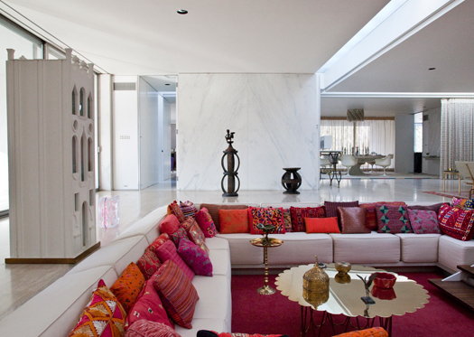
The sunken living room. Courtesy of the Indianapolis Museum of Art
Saarinen met J. Irwin Miller in 1939, when Eero accompanied his father to Columbus for meetings about Eliel’s design for the First Christian Church. The two men, both Yale graduates and scions of leading families in architecture and industry, respectively, became close friends. Miller ran the Cummins Engine Company from 1934 until his retirement as CEO in 1977, building it into a Fortune 500 company. In 1954, in response to the postwar baby and manufacturing boom, Miller formed the Cummins Engine Foundation in an attempt to improve the architecture of the new schools being built in Columbus; the foundation’s Architecture Program, which continues today, pays the architect’s fees for local public buildings, and eventually led to Columbus itself being designated a National Historic Landmark in 2000. (A visit to the Miller House would not be complete without a tour of some of Columbus’s other amazing modern landmarks).
In 1953, Irwin Miller selected a 13.5-acre site on the edge of town. That extensive landscape served as a buffer. Despite (or perhaps because of) Miller’s public role in business and banking, religion, education, politics, and the arts, he actively guarded his family’s privacy. The house was set back from the street, and the driveway was tucked in among other residences. Short hedges in two staggered rows provided a visual barrier without creating an un-neighborly wall. One side of the house faces a flood plain of the Flatrock River, and on the other, landscape architect Dan Kiley created a series of outdoor rooms, including a locust-lined allée that echoes the house’s 5-foot grid.
Miller also restricted the house’s appearance in publications and forbade any mention of his name, the house’s specific location, or its cost. But it can now be seen as a link in the chain of glass houses that announced the arrival of modernism in America, and remain the icons of their respective architects’ work. Examples include Philip Johnson’s Glass House (1949), Mies van der Rohe’s 1951 Farnsworth House, the Eameses’ Pacific Palisades home (1949), and the family version built by Eliot Noyes down the road from Johnson in New Canaan (1954). All of these houses have glass walls and verdant settings. They sit flat upon the ground, with furniture resting in the rooms like so many backlit sculptures. One understands why Saarinen was so sensitive to “the slum of legs” because, in the modern interior, there was truly nowhere for some ungainly antique to hide.
In the Miller house, the public spaces are enclosed by four slate-sided pavilions, one at each corner, containing private quarters — a master suite, children’s bedrooms, the kitchen/laundry, and an area containing a guest room, servants quarters and carport. The spaces between them also serve clear and separate functions: entryway, dining room, den, with the fourth side left open as a bridge between living room and outdoors. Although photographs of the Miller House can make it look as chilly as a vault, the Miller children remember it as a welcoming and comfortable space — but for the need to cross the living room to travel from bedroom to kitchen.
To ensure the house’s livability, Irwin and especially Xenia Miller hired a secret weapon: Alexander Girard. Girard’s contributions show up as spots of color, populating the minimalist architecture with texture and whimsy. The public saw the Miller House (albeit not named as such) on the cover of House & Garden’s February 1959 issue. The cover featured a close-up of the storage wall designed by Girard, which ran from entrance hall to den and held books, sculpture, folk art, and engravings, set against a backing of black-and-gold and red tea paper. Hidden behind rosewood doors were a television, bar, stereo system, and storage for camera equipment. Such built-ins were relatively commonplace in the domestic landscapes of Girard, Nelson, Saarinen, and the Eameses as a way of organizing, and often hiding, the necessary stuff of life.
Girard’s wall differs from many of its predecessors in that it is meant to draw attention to itself. It can be considered a three-dimensional version of his Herman Miller fabrics, with real objects instead of flattened cut-outs. The net effect is of a massive art object, a “three-dimensional mural” similar to those Girard would create for corporate clients like Hallmark and Deere & Company using their archives to make an exhibition and a pattern at the same time. At Christmas, Xenia Miller would make exhibitions of her own, filling the shelves with crèches from around the world. A few of those Herman Miller fabrics were used as draperies in the house; most notably "Eden" in the kitchen. Girard also designed several rugs for the house; an abstract design for the dining room and another for the family quarters with heraldic symbols representing family history and interests.
Perhaps influenced by Girard and Xenia Miller’s choices, the H&G article emphasized the vernacular aspect of the Miller House rather than its modern elements. “The great center area is a big, handsome, festive meeting room for activities and entertainment. Inspired by old Mid-West farmhouses where all rooms opened on a common room, it has the same magnetic effect, expresses the common unity of the family.” Another reading would be that H&G felt it had to sell the livability of modernism hard, making a formal house seem homey.

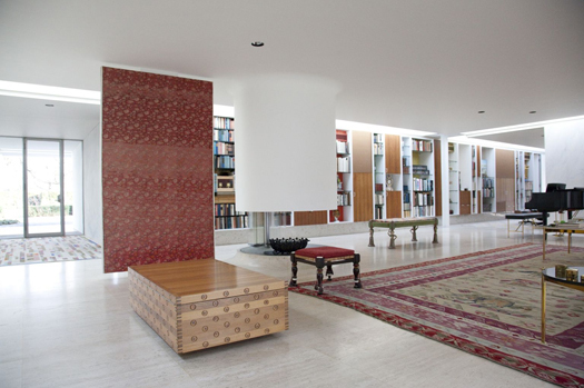
The entrance and fireplace of the Miller House. Courtesy of the Indianapolis Museum of Art
That center area had two foci, one traditional in function, if not style, the other wholly contemporary. The former is a plaster fireplace, a smooth oval extending from the ceiling to a few feet above the floor, where folding glass panels screen the flames. Such sculptural versions of the classic hearth were known as “feature fireplaces” in the home design magazines of the era, terminology that emphasizes their central role in the social life of the home. At the Miller House, a Kashmir shawl mounted on a panel screens the entrance from living room and helps to anchor the fireplace in the large open space. The panel functions like a theater curtain, hiding the action on the other side from guests at the entryway. Looking back at the entrance from the conversation pit, it also extends the decorative line of the storage wall.
Further accentuating that open center is the house’s most memorable element: the conversation pit. Upholstered in red and lined with silk and embroidered cushions, the pit provides a counterpoint to the marble floors, and an analogue in richness to the storage wall. (On a practical note, Girard provided alternate cushions and lighter-hued throw pillows for the warmer months.) Saarinen and Girard had both been moving toward the conversation pit in their respective work for some time. Girard’s 1948 living room in Grosse Pointe, Michigan, included a encircling built-in banquette, which created a similar lounge effect. Saarinen used a flower-like version as the central feature at the Emma Hartman Noyes House (1954–58) at Vassar College, designed at the same time as the Miller House. By 1960, Saarinen feared such pits were overdone, but they couldn’t come up with a better way to restructure the formal parlor.
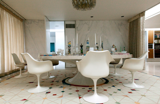
The third public element in the house was the dining room, set off in a precinct of its own between the kitchen and master bedroom suite. The dominating circular table allowed Saarinen to revisit the dining room his father designed for the Saarinen House, as well as create a built-in version of his own famous pedestal table for Knoll, first sold in 1958. Although the period Ezra Stoller photographs show fiberglass Eames chairs with Eiffel bases around the table, these were soon replaced by tulip chairs. Girard designed custom patterns for the seat covers, and Xenia Miller and her friends embroidered them.

The dinning area. Courtesy of the Indianapolis Museum of Art
Eero’s 96-inch round table is made entirely of marble, allowing him to achieve the seamless, single-material goal that had been an aim for Saarinen, Eames, Bertoia, and others experimenting with new materials and forms for furniture. The flared support holds a brass pump that supplies water to a recessed bowl at the center of the table, which can function as a fountain, a lily pond, or a tiny lawn. This pump, a baroque touch, seems like it must have been a Girard suggestion. In the 1960s, Girard would design two theatrical Manhattan restaurants, La Fonda del Sol and L’Etoile. In the styling of the Millers’ table for H&G, one can see the germ of Girard’s idea that meals were about more than just food. He’s turned Saarinen’s minimal base into an international landscape, with a tole candelabra, Indian carved angels, and California poppies in Siamese vases. The pink alabaster candy dish echoes the pedestal form of the table, and plays off the painted Bohemian glassware. We’re not at the Glass House, with its solitary ashtray and never used kitchen, anymore. Too often black-and-white photography and a certain sexism about decoration being the province of women (not architects) have made the icons of domestic modernism seem rather gray.
Of the famous glass houses, only the Noyes House, like this one, was built for a family. At the Noyes House, a certain New England Spartanism prevailed, with stone floors, Colonial chairs, and an outdoor passage from living to bedrooms (the Noyes kids say: chilly!). The Miller House was far more luxurious and aspirational. Never published photographs of the Miller family taken for a 1961 LIFE profile show it in use, with messy desks and kids leaping out of the pit, and I have heard that wheeled transport was not unheard of indoors. But what fascinates me is that no compromise was made here between comfort and design. Instead architect and interior designer were challenged to reconcile their ideals with architecture for real life, lived in public and in private, with TV and toys. Girard liked toys too much himself for one to imagine that it was a big stretch, but Saarinen is a different story. He had three children, but his description of the perfect house was so obviously in the Miesian mode, I imagine he must have had to reach farther back in time to think about what it was like for him (family design project!) to call a modern house home.
This essay was adapted from a talk given at the Museum of the City of New York on June 2, 2009 and research done for the book Eero Saarinen: Shaping the Future (Yale University Press, 2006).
