I was not planning to post anything about Sukkah City. I attended the post-tornado preview and was underwhelmed by the five sukkahs on display that night, already concerned that they had not been designed for the great outdoors. And the collapse of P.YGROS.C en route, one of the most technically interesting (if derivative of this lamp) seemed to prove me right. It all just looked like an architecture studio: so much effort, such worked-over results, and an inability to see the forest for the trees.
In retrospect, I see that the physical objects were beside the point. Sukkah City was a huge success for its organizers, Reboot, an organization of “thought leaders and tastemakers,” “catalyst to catalysts” of which I had previously been unaware. They got to hobnob with design idols like Thom Mayne and Maira Kalman, and received coverage in New York Magazine, The New York Times, and every possible architecture blog. What circulated was the renderings, which all had a lightness and volume three dimensions failed to produce. The fact that most of the sukkahs were only up for two days, while the renderings will be forever, further emphasizes the digital nature of the competition. (When the exhibition was over, the sukkahs were thrown in dumpsters, glass, logs, netting and all.) Did Fractured Bubble (the names!), voted the winner at nymag.com, really win anything?
One of few critical pieces written about the exhibition was a succinct review that pitted rendering v. reality on Human Scribbles.

As you can see, Fractured Bubble probably best made the leap from idea to Union Square.
My growing ex post facto dismay over the whole trumped up Sukkah City (who asked for this? to what purpose? Are corn husk cabins really so bad?) transformed into a larger fear that in the current recession, the circulation of renderings might become the profession. In 2008, I pitched an article comparing the post-boom era in architecture to the 1970s, when rotated grids and phantasmagoric accounts of the city were all we had to discuss. That was too boring and historical for my editor, but it may have come to pass. The best thing about Sukkah City was the tremendous attendance and interest in the sukkahs — imagine if that had been put to some practical use.
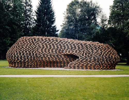
Pavilions, of which the sukkah are a sub-set, split the difference between paper and real architecture. Palettenpavillion (top) by Matthias Loebermann, was recently shown on BLDGBLOG. The commenters there started to ask the same questions I ask of the sukkahs: do they keep out the rain? is there a place to sit? do they lead somewhere? Palettenpavillion has a nice recycled theme, and is more technically skilled and visually arresting than any of the sukkahs, but its purpose as more than sculpture is unclear.

Same thing for the Living Pavilion on Governors Island, winner of another competition imagined, I suppose, as a mini-version of PS1’s Young Architects series (SO-IL, this summer’s PS1 winner, had a particularly sad-looking entry in Sukkah City). It makes pretty shadows on the grass, but leads nowhere. Better sighting might have given it a purpose as a lover’s lane, or picnic shade, bu, plonked on the Parade Ground it is a monument only to itself.
Which is all a long way of saying: let’s not go back to the grids. Architecture needs to serve a purpose, and it needs to be able to stand up to a wind. Let’s not confuse renderings with buildings.
