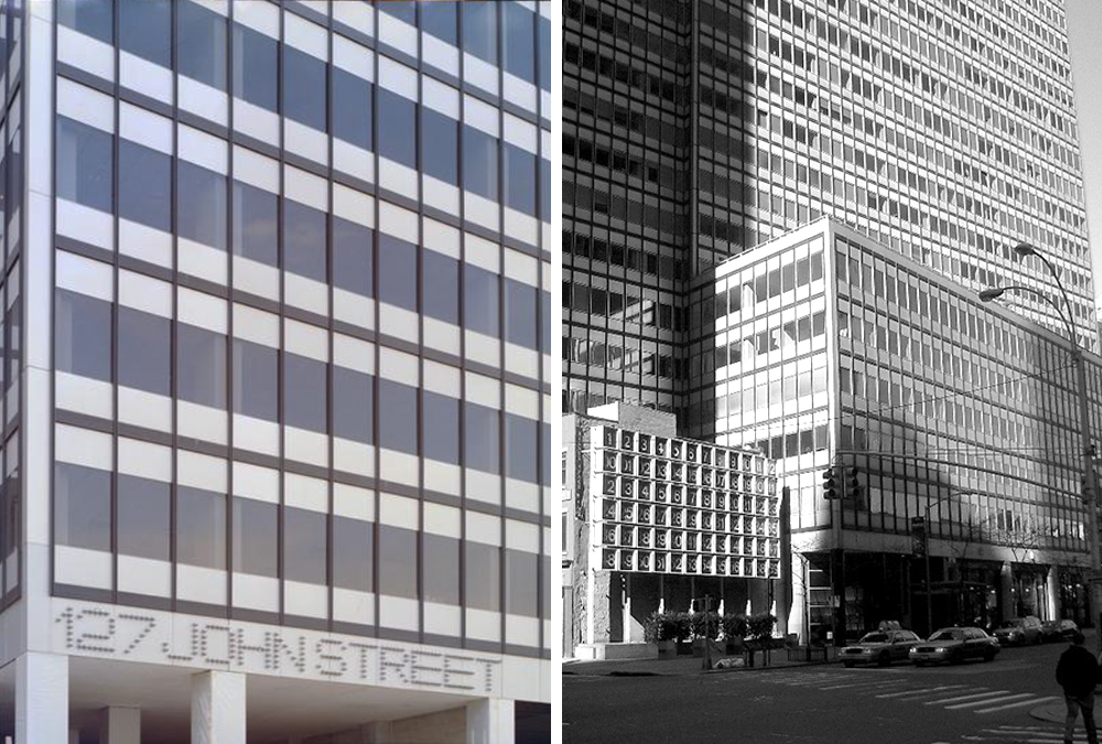
LEFT: 127 John Street building address. Photo, The Museum of the City of NY. RIGHT: Full building at 127 John Street. Photo, el imperio moderno.
In the 1960s, modern graphic design expanded beyond the printed page and into wayfinding systems and environmental graphics. Collaborations between architects and graphic designers increased, as a more holistic approach to design emerged between like-minded professionals. By the beginning of the 1970s, bold, geometric shapes and bright colors ruled the day from corporate high-rises to subterranean parking garages. And the sun never set over Helvetica.
In 1969, construction began on a 32-story office tower at 127 John Street in lower Manhattan. Brothers Melvyn and Robert Kaufman, the developers of the tower, hired Emery Roth & Sons as architects for the project and brought in Rudolph de Harak (1992 AIGA medalist) for the graphic components.
Emery Roth designed 127 John Street in the corporate modernist style of the period for which he was well known. De Harak, on the other hand, was not shy about pushing boundaries. He had recently completed another commission for the Kaufmans at 77 Water Street, where Melvyn had asked him to put something on the roof “because people fly over it.” De Harak responded by hiring a sculptor to make a full-scale replica of WWII-era British SE5 airplane, mounted on a light-up astroturf runway, accompanied by a windsock.
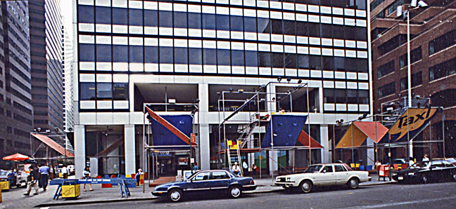
Canopies on Fulton street. From The Lower Manhattan Book.
The tower at 127 John Street, completed in 1971, filled the entire block from Fulton and John on its east-west axis and Pearl and Water on the north and south. From a street view, it fit the safe, reliable, corporate modernist image distinctive to Roth. Yet the graphics—the work of de Harak—were anything but safe or unremarkable. The numbers and letters of the building’s address and elevator lobby signage were fabricated using four-inch diameter, pin-mounted silver balls following the lines of Aldo Novarese and Alessandro Butti’s typeface, Microgramma. Banners in primary colors, stretched over steel scaffolding at 45-degree angles (foreshadowing Mayers and Schiff’s original TKTS booth in Time Square one year later) graced the John Street plaza. Galvanized, corrugated sewer pipe, ribbed with blue neon formed the 250-foot long corridor leading to the elevators. The tunnel became a go-to location for fashion photographers in the 1970s and provided the background for Waring Abbott’s 1976 shoot of the art-rock pioneers, Genesis. And, much to the delight of Mel Kaufman, who declared that “marble and travertine mausoleums are bad for the living and terrific for the dead,” de Harak hung a 12-foot long polished steel fishing lure over a pool of water in the lobby. The overall effect was described in 1973 by Ada Louise Huxtable in The New York Times as a “quasi-carnival of sometimes corny delights.”
Embed from Getty Images
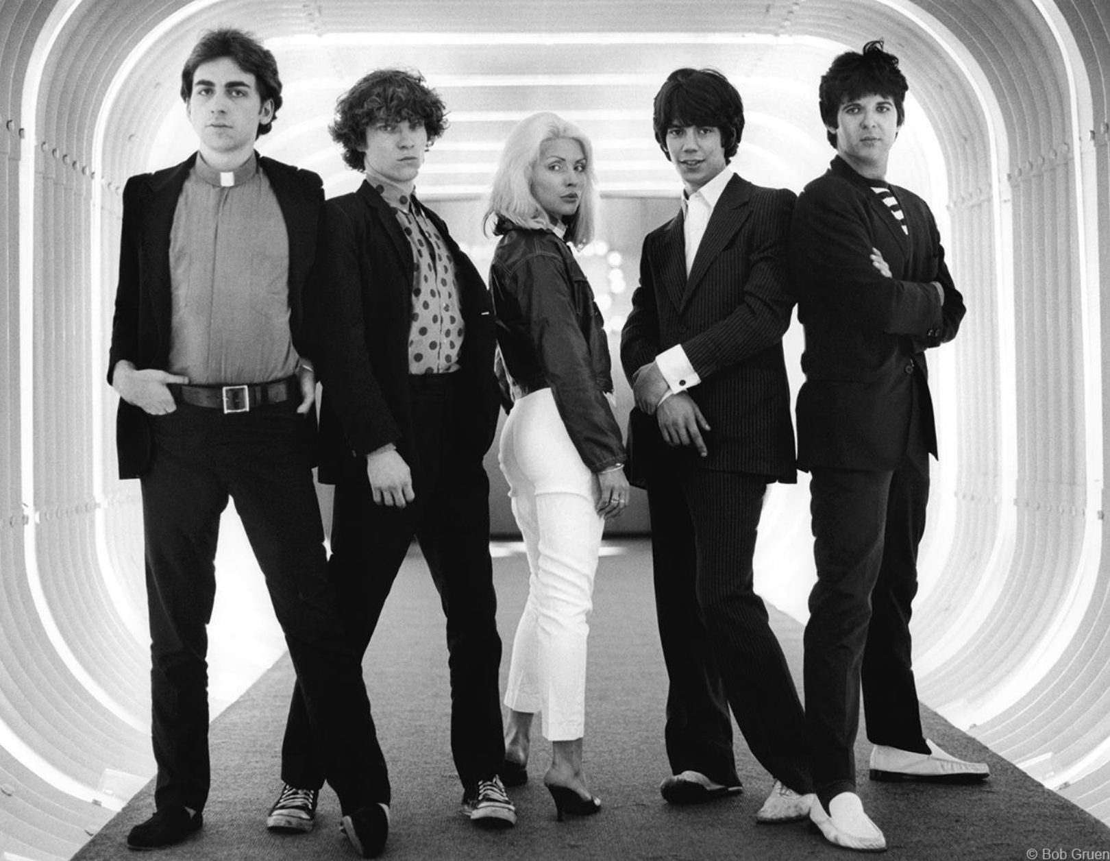
© Bob Gruen, 1976

Photo: Gail Worley
On the southwest corner of the site, a three-story building from the 1800s remained, with windows on the ground floor and a two-story brick façade above it. At Mel Kaufman’s urging to “do something” with the façade, de Harak created an object that remains today a quintessential expression of the design ethos of the period: an enormous, glorious, digital clock. The clock consists of a grid of steel boxes, 12 wide by 6 high—each one four-foot square—to form an exquisitely proportioned double-square field, 48 feet long and 24 feet high. The numerals are rendered in a perfectly scaled Helvetica Medium, white out of black, with the hours lined up on the top row and the minutes and seconds in the five rows below. Each numeral lights up in turn as the minutes and hours pass. The composition and ingenuity of the clock captures de Harak’s full embrace of the modernist canon that he consistently demonstrated in his print projects.
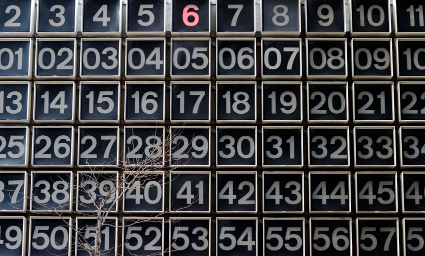
Photo: Trevor Little
The clock boldly contrasts with the other elements de Harak developed for John Street. The brashness of the tunnel and fishing lure, et alia, were eclipsed by the monumental timepiece designed in classic Swiss style—ornament and ostentation stripped away in service of simplicity and clarity. The breadth of styles in graphic design has certainly changed since 1972, and few examples of Swiss orthodoxy remain, but de Harak’s clock stands today, in its original state, as a testament to that period of graphic design. In a 2000 interview, de Harak lamented that the building had changed hands several times and most of his work had been destroyed. “But they kept the clock,” he said, and added matter-of-factly, “That was an interesting project.”
It still is.
