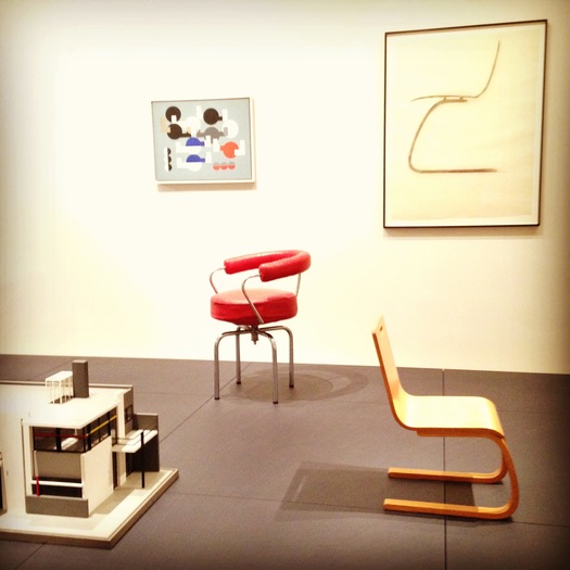
Installation view, "Designing Modern Women, 1890-1990," Museum of Modern Art (2013). Designers, from left to right: Gerrit Rietveld, Sophie Taeber-Arp, Charlotte Perriand, Alvar and Aino Aalto (all photos mine)
The key line in the introductory wall text at the Museum of Modern Art's new Architecture and Design collection installation, "Designing Modern Women, 1890-1990" is this:
The objects, design drawings, posters, and films on view in this gallery, all drawn from the Museum's collection, showcase women's creativity not only as professional designers, but also as clients, consumers performers, and educators.This redefinition of the limits of design practice, at least from the point of view of MoMA, is long overdue. We saw hints of this change in design curator Juliet Kinchin's previous shows, "Counter Space" and "Century of the Child," as well as the glorious showcasing of the primarily women's art of weaving in the monumental "Bauhaus" exhibition. Now the change has come home, to the permanent collection galleries that offer a chronology for modern architecture and design. Many of the objects and designers represented made an appearance under those previous themes of domesticity, childhood and design education. As the petition to recognize Denise Scott Brown's contribution to partner Robert Venturi's Pritzker, attempts to redress the gender balance in Wikipedia history, and recent projects like A Handbook of California Design have shown, women have always been in design history. Sometimes as critics, sometimes as clients, and sometimes as makers, often uncredited or under-recognized because they were working in and around the house. This new installation creates a sisterhood of many wonderful objects, from Eva Zeisel's 1948-49 Folding Chair to Cini Boeri's plastic suitcase, Paula Scher's Public Theater posters and Bonnie Maclean's psychedelia. The star of the show is a recently conserved kitchen from the Unite d'Habitation, a miracle of efficiency and clever design touches like sliding doors between work surfaces and the living room. (More official photos from the museum here.)
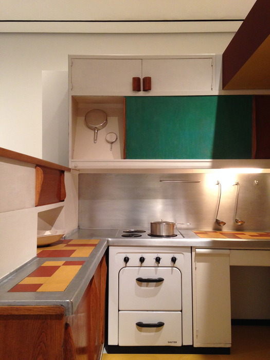
Charlotte Perriand, with Le Corbusier, and ATBAT. Kitchen from the Unité d’Habitation, Marseille, France. c. 1952. Pots by Garth and Ada Louise Huxtable (1958)
And yet, and yet, this redefinition seems awfully convenient. It allows Kinchin and curatorial associate Luke Baker to start the chronology where it has always started, with Charles Rennie Mackintosh, now AND Margaret MacDonald. Next in line is Gerrit Rietveld's Schoeder House. It's his name on the label, but the accompanying text explains the key role client Truus Schroeder-Schraeder had in conceiving the radical open plan. Eileen Gray, Lilly Reich, Sophie Taeber-Arp, Alvar Aalto AND Aino Aalto. Charles AND Ray Eames. And so around to Robert Venturi WITH Denise Scott Brown, their collaboration embodied by the hellaciously pastel Queen Anne Side Chair (1983). (I would have picked the Best Products panels.) Much of the large-scale chronology is the same old story, with the same heroes, only now they have female collaborators. (To be fair, in other cases, it is the design movements that stayed the same with woman-made examples of Scandinavian glass or minimalist china replacing the male.) Yes, we should not replace the male heroic narrative with a female one, but I felt a little sad that option was not entertained ... at least for this show. Or what about, as a thought experiment, Margaret, Aino, Ray and Denise get to have their names go first, just for a few months? This surface needs to show a few more ripples and snags, to catch the viewers' eye and make them think.
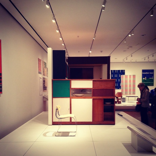
Unité kitchen, view from the living room
Even the kitchen, credited here to Charlotte Perriand WITH Le Corbusier and ATBAT, is referred to repeatedly on MoMA's blog as the "Le Corbusier Kitchen." Which is it? Reality is likely too messy for a list of names in any order. Either way, it should have been part of the Le Corbusier retrospective upstairs this summer, where it could have provided a necessary tactile example of Le Corbusier's practice, as well as made Charlotte Perriand's role in that practice more prominent. If we are going to salute "joint creativity" — Denise Scott Brown's recent formulation, repeated here in that same wall text — we need to figure out how to credit it properly, in male shows as well as female. Perhaps Truus Schroeder-Schraeder ought to be on the label too. Critic Ada Louise Huxtable appears as co-designer with husband Garth Huxtable of the set of pots and pans on display in the Unite kitchen. How could her greater claim to fame have been mentioned? Having the pots there seems like an in-joke, but its humor is not made explicit, or followed by subsequent examples of critic-design confluence. Esther McCoy worked for Rudolf Schindler before she shaped California modernism through her writing. Another small display credits important female MoMA curators like Elizabeth Mock, who turned the museum toward "Useful Objects" and housing in the 1940s. These moments are great, but if we're going to complicate the history, it needs to be complicated throughout the chronology: other female critics, who didn't also design, and other female curators, not from MoMA, could have popped up in subsequent decades.
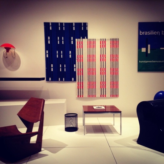
From left to right: Greta Magnusson Grossman, Grete Jalk, Eszter Haraszty, Florence Knoll
One was also confronted with the limits of the collections show. What MoMA has of many of these modern women is not their best, brightest, biggest work. If we're underlining their role in history, I wish the visitor could fully understand the range of their talent. I couldn't help comparing the small samples of Marianne Strengell's weaving, low in a case, with the wall-size rug, commissioned by Alcoa in 1957, that I saw at Cranbrook earlier this year. No Loja Saarinen. No Vuokko Nurmesniemi or Maija Isola from Marimekko (they only sell it at the store). The collections installation up this summer included the terrific Sheila Hicks Prayer Rug (1965) which could have remained, in the same location, providing textile punch. Only Eszter Haraszty's graphic Knoll Textiles call from across the room (it took Bard Graduate Center's 2011 exhibit on the company to push many more examples of her work out of museum storage). Denise Scott Brown and Gae Aulenti look lonely holding up the cause of postmodernism. Margaret McCurry? Swid Powell? Diller + Scofidio are represented in "Cut 'n' Paste" down the hall, but it would have made sense to include some of their 1980s work on domesticity here as well.
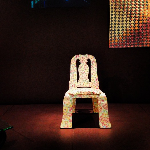
Robert Venturi, with Denise Scott Brown, Queen Anne Side Chair (1983)
History wasn't built in a day, and neither is it dismantled and reconstructed. But as Priya Khanchandani noted in Disegno, it's surprising that the museum and its curators weren't more self-reflexive here. The wall text,
invites you [emphasis mine] to consider the varied messages about femininity encoded through design, the importance of role models in visual practices where women remain underrepresented, and the need to recognize and encourage varied forms of creativity.I'm more than happy to do so. But I think the museum also has to show and tell more about how the instiution has considered these things, admitting they are still in the process of remaking their galleries. As with the Sheila Hicks, the real test of this installation's power is how many of the modern female makers, curators and collaborators remain on view, and how they are included in other ungendered rubrics. Does this exhibition cause a rethink of the role of male clients too? Does Lewis Mumford appear in a caption abut Catherine Bauer's planning work? The pollination from such a redefinition will have the longest-lasting effect on how we think about both genders making design. "Designing Modern Women" is an honorable start, but there are many routes from here.
