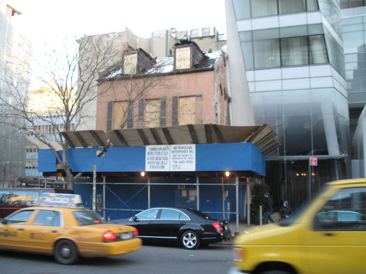
The endangered house next to the Cooper Square Hotel
New York City officials have to decide whether to stop the demolition of a small, brick house in the East Village. The Federal style house, which has stood at 35 Cooper Square since 1825, is scheduled to be replaced with a new building. Preservationists, under the gun, have been combing through records of the building’s past to build the case for saving it — as an important artifact of nineteenth century Manhattan.
But there’s a reason to save the building that has nothing to do with its past, and everything to do with the present.
The house is all that stands between two angled, glass-and-steel buildings (one of them, Thom Mayne's academic building for the Cooper Union, a masterpiece of contemporary architecture). Those buildings wouldn't be the same without their modest, gable-roofed companion.
Contemporary buildings feed on historical context. When that context is removed, even the best of the new buildings fall flat.
Picture (or, if you're in New York, visit) West 19th Street, between 11th Avenue and the Hudson River.
On the north side of the street is Jean Nouvel’s "vision-machine" — a 19-story apartment building covered in thousands of tilted glass panels. On the south side is Frank Gehry’s IAC building, the wavy, iceberg-like apparition. That’s already a lot of star-chitecture for one block. But next to the Gehry building, Shigeru Ban’s Metal Shutter House offers a touch of the Japanese industrial aesthetic, circa 2010. Next door is Annabelle Selldorf's shiny 520 West Chelsea, seen as a wall of unadorned strip windows.
Look southwest from the middle of the block, and you could be in Dubai or, worse, a contemporary architecture theme park in Las Vegas. The new buildings have crowded out context — the layering that makes New York, New York.
Just a few blocks east, the same effect — call it too much of a good thing — is even more pronounced. Della Valle and Bernheimer, a young Brooklyn firm, designed an angled, black-and-white glass building at 459 West 18th. At almost the same moment, Audrey Matlock's Chelsea Modern rose next door at 447 West 18th, its facade a flat mix of blue and white windows.
In fact, either building, bracketed by older, masonry buildings, would have provided a welcome jolt of modernism. Together, they appear to be competing for dominance, a fight neither can win. There’s a similar problem in the West Village, where Asymptote's terrific building at 166 Perry Street abuts Richard Meier's 176 Perry Street, looking like an annex. (Despite Asymptote's ingenuity, there are only so many ways to utilize white glass.) It doesn't help that Meier himself added a third glass tower to the original pair of buildings. Two Meiers is company; three's a housing project.

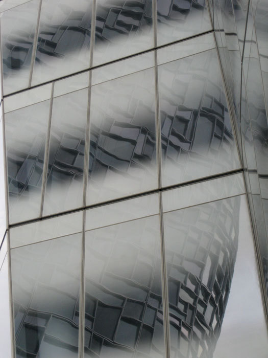
The Jean Nouvel building reflected in Frank Gehry"s building
“The shock of the new,” it turns out, is only a pleasant shock when there is old to measure it against. Even Mies van der Rohe, whose Seagram Building has been seriously diminished by the imitators that flank it up and down Park Avenue, would have to agree that sometimes “more is less.”
Frank Gehry’s Guggenheim Bilbao, considered the greatest building of the late 20th century, works because it is glimpsed at the end of a narrow city street, crowded with art nouveau facades. In a less urban, less urbane, setting, it might have been seen as an oddity. (Gehry shouldn’t take offense at this; context has always been important in his work.) One of the great strengths of his latest building — the residential tower at 8 Spruce Street — is that it plays off against the 1919 Woolworth Building: equally daring in its own right, and now part of an accretion of styles over time.
As for the original Guggenheim Museum, by Frank Lloyd Wright: Its power comes from the placement of its arcs against New York’s right angles (both the street grid and the window grids of the adjacent buildings). Compare the Guggenheim to another curvy engineering marvel, the Trylon and Perisphere of the 1939 New York World's Fair. The difference between a masterpiece and a passing fancy, it turns out, is largely whether one is placed in a city, or stranded in a sea of equally experimental buildings.
At the Shanghai World Expo last summer, there were probably 20 buildings as interesting, in terms of form and surface, as work by Nouvel, Gehry, and Zaha Hadid, and every one of them has been torn down. There hasn't been a peep from the architecture world because the buildings, set not on city streets but behind fairground turnstiles, were always considered "installations" — not “real” buildings.
New buildings depend on context if they're to be become architecture, not just site-specific artworks competing for attention in an architectural petting zoo. Greg Pasquarelli, a principal of SHoP, one of the busiest firms in the city, recently described his firm's idea of contextual design: “Making sure that the building looks nothing like the buildings around it.” He was referring to his penchant for placing new buildings among the old, but what about ensuring that old buildings remain among the new?
When deciding what to preserve, the city's Landmarks Preservation Commission should think of some buildings — like the house on Cooper Square — as buffers, essential elements in making sure new buildings live up to their potential (to enliven, not entomb, the city).
Reactionary? Not at all. If the trend toward placing sleek contemporary buildings cheek to jowl continues, it is the contemporary buildings that will suffer most.
