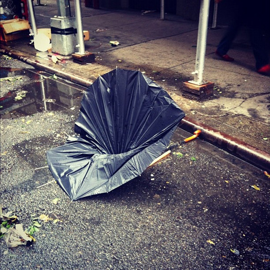
Broken Umbrella (photo by Lauren Manning and Veronica Acosta)
To assemble the "Masterpieces of Everyday New York" which currently fill the Sheila C. Johnson Design Center at Parsons The New School for Design, curators Margot Bouman and Radhika Subramaniam asked their colleagues to select objects that brought their city to life. Inspired by the popular book and radio series, A History of the World in 100 Objects, they then used these objects to present 65 stories of different times, places, lives and deaths in the city. Each faculty member contributed a text on their choice, some personal, some academic. In the spare, concrete-floored gallery at Parsons, different objects communicate across the room, and you can move in almost any direction and pick up a narrative thread. The exhibition kicks off a new curriculum for first-year design students that will use New York's museum collections as text, rather than a textbook, and will begin with the course "Objects as History: From Prehistory to Industrialization."
As I wandered through the masterpieces, I thought about what I might add to the collection (deli flowers, laminated workplace ID cards, all the variations on "Curb Your Dog" placards). It is a wonderfully elastic concept for both course and exhibition, one which would be interesting to see applied to places both smaller and larger, as a "Masterpieces of Everyday _____" roadshow.
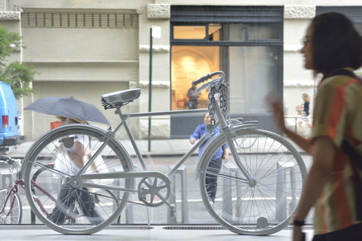
Ghost Bike (photo by Martin Seck)
I also looked for patterns. The curators had thrown open the exhibition for suggestions from all of the disciplines taught at The New School, so the results could have been cacophanous. But instead they seemed to coagulate around a few unspoken themes. The first was detritus: that broken $3, $5, probably now $7 umbrella. We all buy them, but they rarely last more than a few showers. Peter Asaro, Assistant Professor and Director of Graduate Programs, Media Studies, writes of the umbrella (species umbrella furvus ubiqutous),
Locomotion:Because they share a radially symmetric skeleton with the class Asteroidea, many people mistakenly believe the two to be related. However, furvus ubiquitous lack the vascular locomotive system of a true echinoderm. Rather, they rely primarily upon a large hooked protuberance at one end of their body to affix themselves to the hands, pockets, straps, and bags of their target host species, the New Yorker.
Sometimes they mistakenly affix themselves to a tourist.
Occasionally, they utilize their black bellows to gather wind and release themselves from their host’s hand and fly away in search of new host. Though this mode of transportation is rather risky, and the potential injuries are sometimes fatal.
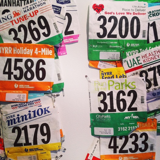
Runners Bibs (photo by Alexandra Lange)
The umbrella's thematic brethren were mostly to be found on the ground: bikes dismembered and abandoned, years of New York Road Runners Club bibs arranged like leaves, gum sticks on the sidewalk, even phone booths, once so important, now merely "husks." Gabrielle Bendiner-Viani, Visiting Assistant Professor of Urban Studies, contributed a photograph of herself and hr mother, standing in front of a phone booth on Kenmare Steet in the early 1980s.
Now, as an adult, out in the world, and thinking about how my young son will one day call me, these private little spaces from which to reach out to others in the midst of a public street are now only husks, replaced by devices in our pockets, which people imagine envelop them in privacy, but mostly create intersecting bubbles of sound and chatter as we walk down the street.Some of the detritus has deeper meaning: the ghost bikes memorializing cyclists killed on the streets, the convergence of votives made for the public funeral of Jon Greenberg on July 16, 1993 by his friends and collegues.
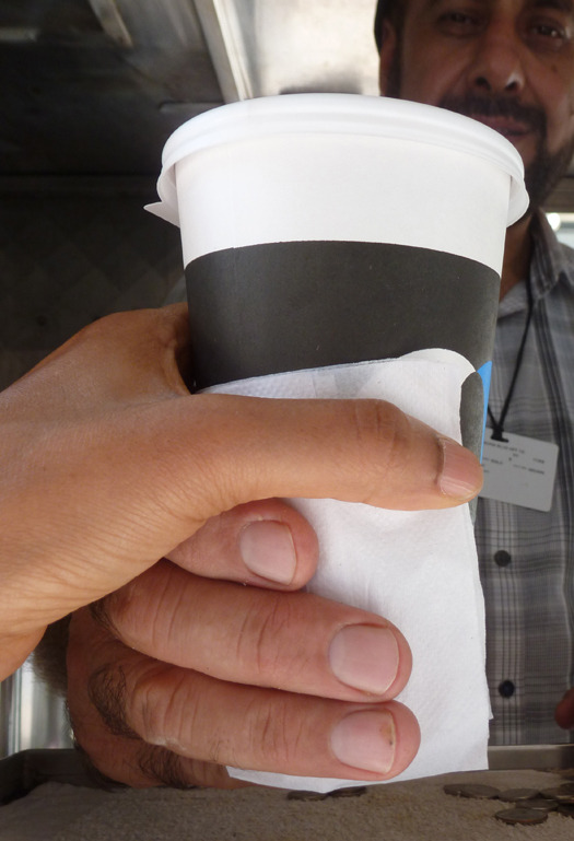
Morning Coffee (photo by Daisy Wong)
Another locus of entries is food, primarily that consumed or prepared outside the home. The coffee cup, the coffee cart, the take-out menu and the elaborate binders and minders purchased to wrangle your menu collection. New Yorkers, the exhibit suggests, do not cook, or if they do, it is not a mass masterpiece. Food in New York comes on wheels and in seemingly infinite variety, and is always there when you need it. I was reminded of a rural playground visit with my son when he was 3. After an hour or so of play he turned to me and asked, "Can we go to the cafe?" It is an everyday miracle in New York that there usually is a cafe. The most prominent food entry is the most historic: a pile of oyster shells. But these too represent communal and democratic snacking. Simone Douglas, Director, MFA Fine Arts, writes,
Since its pre-Columbian history, middens, the shell remnants of many meals of oysters, have evidenced human habitation in and around the waterways of pre NYC. From the outset they helped to sustain the life force of human habitation.
As the city of NYC formed, the middens became part of the subterranean structure of the city, coming to the surface like jagged teeth along roadsides and in architectural digs.
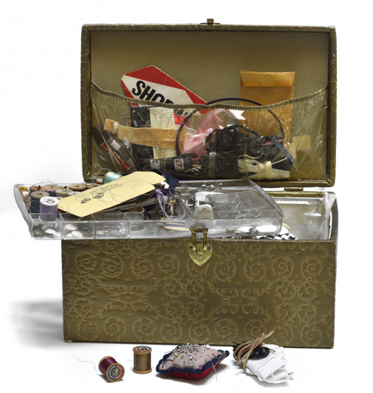
Sewing Box (photo by Martin Seck)
The last theme I noticed relates directly to those middens and the structure of the city. Dotted around the room, in forms tough and breakable (like those shells) are pieces of New York City infrastructure. The schist that is our bedrock, visible in the peaks of Central Park. The unseen-but-ubiquitous water stations. The overhead-and-ubiquitous water tanks. Plus a subway sign and Massimo Vignelli's 1972 subway map, and a book on the Holland Tunnel. The most unusual infrastructural choice was the DKNY Wall in Soho, advertising that, Hazel Clark argues, turned into a masterpiece and then a post 9/11 memorial.
Installed on the north side of the six-floor building at 600 Broadway, on the southeast corner of Houston Street, the DKNY wall served for nearly thirty years, as an unofficial gateway to SoHo. It featured the logo created in 1989 by advertising maverick Peter Arnell for the launch of DKNY, as a younger, more affordable companion to the Donna Karan brand. Referencing her deep family roots in the New York rag trade, designer Donna Karan cleverly re-branded New York with her own name - and who could have pulled this off in Manhattan other than a fashion brand? Yet the mural, painted in 1992, came to be much more than a symbol of the corporatization of the city (although it was that, too). The four cut out letters served as a metaphorical window on the city, a witness to the familiar and the strange. Through the letters the viewer is transported up to the northern extreme of Manhattan where a birds-eye view of the city rolls out like a huge grey urban carpet.
Coming to live here ten years after the mural was created, and less than a year after 9/11, I cherished the fact that the decision had not been made, as it might have been, to paint out the Twin Towers after they were destroyed. But from 2001, the mural was no longer an accurate representation of Manhattan (not that it ever really had been, with Lady Liberty’s ghostly presence hovering in the foreground). It had transcended its corporate imperative, to become a tribute to the city in less anxious times, a symbol of survival and hope.
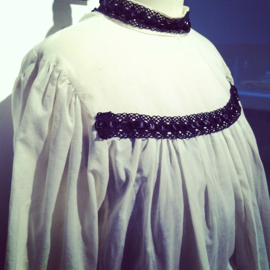
1911 Shirtwaist (photo by Alexandra Lange)
The DKNY Wall nicely pulls together the themes of infrastructure, memorial and detritus, while adding a fourth, fashion. New York's centrality to that industry turns up in this exhibition with another double-edged object: a shirtwaist made by current members of the International Ladies Garment Worker Union, Local 25 in the style of 1911, year of the Triangle Shirtwaist Factory fire. Cecilia Rubino, Assistant Professor of Theater and the writer and director of "From the Fire," ends her text on the shirtwaist with these questions, as relevant in 2013 as they were in 1911: "Where does the shirt on your back come from?" and "What’s the Cost?"
