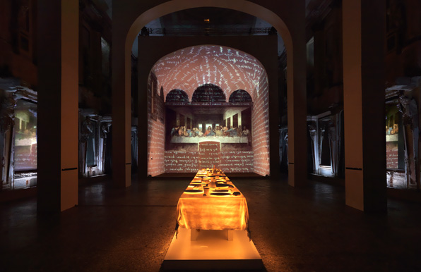
Installation photo, via Arts at the Armory.
"Leonardo's Last Supper: A Vision by Peter Greenaway" at the Park Avenue Armory is indeed a dud, though I have slightly different reasons for calling it so than Holland Cotter.
First, your 45 minute (for $15!) multi-screen experience begins with the cheese-tastic "Italy of the Cities," a postcard tour of Renaissance piazzas and planning courtesy of Piero della Francesca, Michelangelo, and assorted other Italian worthies. The vanishing points are dramatic, the columns regular, the Spanish Steps steep, but we bounce nonsensically from Florence to Rome to Venice to Milan. I kept expecting Lucy Honeychurch to appear from behind a column and drop her postcards. Instead, a male dancer in loincloth skipped between the urbs.
The second the cities stop flipping one moves from the antechamber to the main event, a recreation of Leonardo's 1498 Last Supper projected into a niche the same dimensions as the fresco's home in Milan's Santa Maria delle Grazie monastery. The bombastic classical music starts up and does not stop. Neither do the effects. We look briefly at the painting in its faded, patchy glory, and then things start to happen: the hands of Christ and the disciples glow gold; all but select figures fade to black-and-white; certain figures are outlined; Christ glows; light as if from a multi-pane window falls on and moves across the image.
All these effects happen, and happen again, with no explanation and no rest. There's a brief moment when the lovely face of (disputed) John or Mary Magdalen is shown large on the screen opposite the niche. It is a dear face, a cross between the Mona Lisa and the Lady with an Ermine, but animated flakes of paint fall from his/her cheeks, and s/he disappears in a whirl of decay.
Decay is clearly a theme here, the whirl of flaking paint returns several times, and Greenaway has justified his project by pointing to the terrible state of the real Last Supper. But decay looks terrible as a digital projection. I kept wanting to adjust the focus, and the close-ups, projected right, left and behind the central, real-size image, only make it harder to see the beauties.
If the point of this experience is to allow us to see the Last Supper anew, or better, I can't see how the restless activity helps. What we all need is more stillness in front of great works of art, not more bombast. Even here, in the chamber of the ersatz masterpiece, people were taking iPhone pictures of the digital projection.
Last, after being beaten into sonic submission, we move back into the antechamber, where the cities have been replaced by just one city: that depicted in Veronese's 1563 Wedding at Cana, along with the bride and groom, Jesus, and 123 other guests. If the Last Supper experience was elliptical, the Wedding at Cana experience is didactic. A loud voice interprets the painting for us, while on screen, figures are circled, the center line is delineated, the figures are numbered. It is like the most old-school art history lecture, with better visual aids. And just when you think it is over, the guests at the fringes begin to talk (in English accents) gossiping about the state of the kitchens, the bride, the mysterious young rabbi. Their images are excerpted as postage stamps floating onscreen, commenting on the (in)action.

The only positive I took away from my experience was the wonder of the Armory, whose 55,000-square-foot drill hall is the perfect place for large-scale architecture shows. Its vastness allows the enclosure to melt away into the dark, suggesting infinite enclosure. A postcard out front promises an installation of red-and-white quilts in March, organized by the American Folk Art Museum and looking stunning. I kept thinking about the Museum of Modern Art's future Le Corbusier exhibition--would it be too much to ask for a quarter-scale model of the Villa Savoye at the Armory? A few beton brut pillars? Better that than a beefcake Modulor.
