Second of my three installments for the New York Times Living Rooms series, this one on kitchens: What’s Cooking in Kitchen Design?
So how did we go from efficiency to entertainment? In Mad Men, Betty Draper has wall ovens and a stove-top island, both desirable today; the differences are the brown plaid wallpaper and cabinets made from dowdy knotted pine. In other words, what felt like a battle in the 1920s was, by the mid-1960s, a victory. The emphasis on time-saving consumer technology, born in the Frankfurt Kitchen and fueled by the postwar domestic revolution in the United States, brought us the microwave, the fridge-freezer combo, the automatic coffee maker and a thousand other gadgets; with those in place, we could relax. The barrier between the workplace of the kitchen and the social space of the living room broke down; we could invite the rest of the family in.
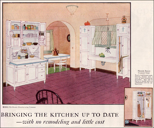
My favorite discovery during my research for the piece was the Hoosier cabinet, pictured above, a turn-of-the-century labor-saving device that put all ingredients and utensils within the cook’s reach. Many examples even had rule-of-thumb recipe charts developed by “home engineer” Christine Frederick pasted inside the cupboard doors. (For a great visual history of the American kitchen, buy America’s Kitchens published by Historic New England.)
My original inspiration for this essay was the upcoming MoMA exhibition Counter Space: Design on the Modern Kitchen, which opens September 15 on the museum’s second floor (always exciting when design breaks out of its third-floor ghetto). I interviewed curator Juliet Kinchin for the story, and the exhibit sounds amazing, starting with the installation of a real Frankfurt Kitchen (1926-1927), one of thousands installed in German social housing in the 1920s and 1930s.

Designed by Margarete Schutte-Lihotsky, the kitchen is (appropriately? ironically?) the earliest work by a woman architect in the museum’s collection, as well as one of the most influential. What first struck me about it — shallow, I know — was its color palette, which looks so current and so Remodelista. And those bins! I need those, and so do you.
On a personal note, since this was cut from the story: I grew up with the dread avocado fridge. Not my mother’s choice, what our house in Cambridge came with. Funny thing is, by next year, I think they are not going to be a joke anymore.
Finally, so my blog doesn’t become all D/R, all the time, just a link to Pentagram’s new post on my book Design Research, which shows inside spreads and talks about how the design and writing team worked together.
And another link to Architizer’s excellent summary, From D/R to IKEA.
