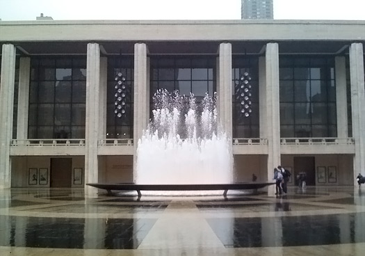
On vacation someplace green, so I can’t go on at length, but please weigh in on Mark Lamster and my new Design Observer feature, "Lunch with the Critics". First stop: the new Lincoln Center.
First impression: awkward. Did you not just almost come to blows with the waitress because the lobby lacks hierarchy and a clear sense of circulation? Same problem with the ditch outside. You thought it was smart to put the box office off to the north side of the lobby, but that means, all day every day people will be going down the steps and into the big revolving doors (which usually mean “enter here”) and then have to brush by the grandmas and go up some other steps to buy tickets. The northern entrance is hidden behind a big glass wall. They’ve made the lobby mostly restaurant, which is lively, but failed to make it a nice one.
Here’s where I have to rant about chairs. There are so many out there, wonderful, beautiful colorful chairs. Surely Lincoln Center could have picked different ones than the MoMA’s Cafe 2. A choice with personality would give this space a little identity. So beige.
Read the rest here. Dumbing it down or clarifying? Where should we go next?
