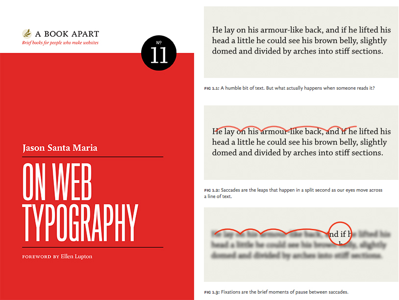
On Web Typography is a primer for anyone who wants to learn how to wield type with care and wit. (Left: cover. Right: spread.)
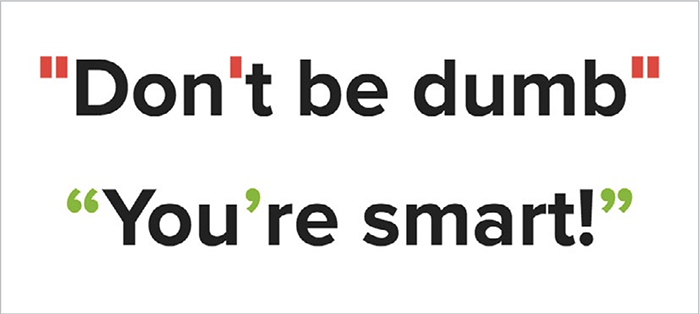
Proper quotation marks are often overlooked, but it’s important to know the difference. Curly quotes, usually called smart quotes, commonly look like filled-in 6s and 9s. Straight quotes, often called dumb quotes, are usually straight and vertical (FIG 1). Curly quotes are the correct punctuation for quoted text and dialogue. Dumb quotes are called as such because they are not only incorrect, but are also an instant sign of sloppy typography. Use of improper quotation marks shows a designer who either hasn’t learned the right way to signify quoted text, or didn’t spend enough time looking for a font with full punctuation support.

Figure 1: Proper quotation marks are usually curly or sloped.
Punctuation is a system. That’s why proper quotation marks and apostrophes look like they’re part of the same family as commas, periods, colons, semicolons, and more, whereas straight quotes don’t.
Straight quotes stem from the time of typewriters when keyboard real estate was at a premium, so reducing open and closing quotes to one key was economical. Unfortunately, this same choice of economy was copied to the computer keyboard and proliferated in the days of desktop publishing. Unless the software you’re using corrects them, the default result when typing a quotation mark from your keyboard may be straight quotes. On the web, due to lazy implementations or force of habit, we’re still plagued with dumb quotes.
Luckily, it’s easier than ever to get proper quotes and apostrophes on your web pages, by either using the raw characters and specifying UTF-8 encoding or using HTML entities. Better still, use one of the many CMS plugins out there to automatically convert dumb quotes to proper quotation marks. Any of those methods is better than resorting to a claw-handed key combination to type them out.
I made a single-serving site called Smart Quotes for Smart People to show how easy it can be. For more info on quotes and dashes, check out Jessica Hische’s excellent site Quotes and Accents.
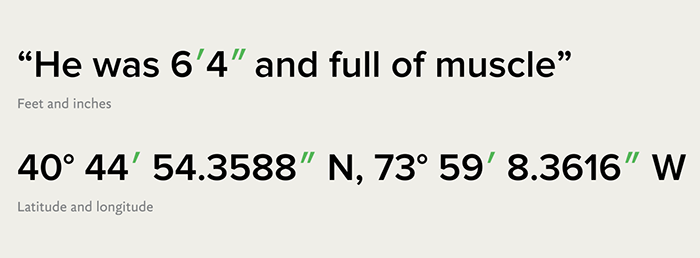
One last thing to note in the realm of quotation marks: primes. Primes look like italicized straight quotes and signify things like feet and inches, minutes and seconds, and coordinates on a map. Primes are not the same as dumb quotes; they’re a different set of punctuation marks altogether (FIG 2).

Figure 2: Primes bear a resemblance to quotation and apostrophe marks, but are unique marks in their own right.
