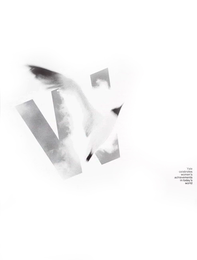
Druckrey's poster for Yale Women's Forum (c. 1968). The artful blending of letterform and image.
In the spring of 1962, Inge Druckrey, a tall, blonde student from Germany is sitting at her desk in Armin Hofmann’s graphic design class at the Basel School of Design in Switzerland. She is drawing lines with a pencil in a workbook, a pad with a special fold-over cover that contains lines that one could slip underneath the tracing paper. These are the last two hours of a nine-hour class. It is meant as quiet time, a meditative time designed to let the students relax and think about nothing but controlling the marks: uniform pressure, length, and alignment — evenly spaced vertical lines, horizontal lines, diagonal lines, circles and half-circles. It is a language that appears to only make sense to a few. Mark after mark, page after page, two hours go by in silence, but for the collective sound of graphite in contact with the paper’s surface and the occasional turning of a page. With her long, slender hands she makes these marks with joy, precision, and the appreciation for this gift. She is beginning to see.
This is the start of her quest to become fluent in the magic language of form. She became an expert, a master in composition, drawing, handwriting, calligraphy, letterforms, and spent most of her life devoted to teaching others how to see. The film called Teaching to See is about Inge Druckrey’s journey, which she dedicated to essential sight and insights. The film finds its gentle, persuasive pace through the editing and camera work of the young, Russian filmmaker Andrei Severny, a storyteller deep in his psyche, and from the insightful observation by Edward Tufte, the producer and her husband, who suggested that the film be “reduced to verbs.” That is, actions, not labels — gestures, not histories.
Inge Druckrey has been a passionate devotee to what Tufte calls “forever knowledge,” that indispensable understanding that one carries for life. She became the first European-trained designer to bring this way of knowing to the United States, first at the Kansas City Art Institute in 1966. Philadelphia College of Art follows, then the Yale School of Art, and finally, The University of the Arts — with some other stops at the Rhode Island School of Design and the Hartford Art School in between. Shortly after her retirement as professor emerita from The University of the Arts, where she had taught until 2010, the idea to create Teaching to See was born. Her steadfast belief is that elemental principles of form shed light on the essence of communication. At a screening of the film in Reykjavik, Iceland, a woman in the audience intoned, “I wish I could put you in my pocket so that you could teach me to see!”
The film celebrates what we are missing in this densely textured world that we inhabit. Just when we thought we had things figured out — seeing this film — we are quick to realize that we have been overlooking an indispensable gift, but one that can be sought, earned, and cared for. If only we knew how to see as intensely as she does. To simplify, to work and learn in a slower, contemplative way that allows us to feel and perceive, unhinged from any burden save for the deep knowledge of what is exactly before us. If only we had the opportunity to be guided by someone like Inge Druckrey. In the film, many examples appear and are not explained in detail — but it’s enough. One intuitively senses the care and thoughtfulness in their creation. Contrast, tension, and a sense of resolution are key to the most artful endeavors from music, to poetry, to painting. One wonders what would happen if architects or musicians took her class — for that matter, anyone in the arts.

Druckrey's poster for a Beethoven concert at Yale (c. 1979). "It has the immediacy to communicate and the complexity to stay within the viewer's consciousness."
In an interview in 2001, Rudolf Arnheim, the gestalt philosopher and psychologist stated, “Without form an image cannot carry a visual message into consciousness.” If meaning is inextricably linked to the way form is articulated, one could argue that in order to make anything of quality, to feel it, and to understand what the artist is trying to tell us, the artist must learn how to see abstractly — to master form. As Druckrey points out, “Training the eye is very, very important. You can’t come up with ideas if you don’t see — first.” There is much value here that translates across creative landscapes. Where and in what way does an architect place an entrance to an enclosed space, to a destination? Where are the transitions located and how are the dynamics of sound felt within sonata form? How does the shoulder transition in the curve of the letter “o?” Where does one end a sentence and where should a paragraph begin? It is form that every concept wears. The way it is articulated anticipates its communication.
The film opens with an impressionistic montage of sunlight and shadow, moving tree leaves, and a still profile of Druckrey. The dense landscapes with their flickering light and whispers of the moving leaves slowly and deliberately dissolve from one image to the next, mirroring her voice, calm and delicately accented. “You really learn to look, and it pays off that suddenly you begin to see wonderful things in your daily life you never noticed. And I would say it’s one of the most wonderful presents you get in an art education. To enjoy — seeing.”
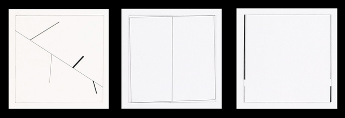
This journey begins with her students’ solutions to a compositional assignment. The students manipulate five lines within a square format. The objective is to train the students to be able to control the negative space: to create quiet and active compositions and to learn to see every aspect within this intimate space. Another compositional assignment consists of two squares placed within a similar format. What happens when the scale of the squares is changed? What if the position of the squares changes? If one puts either of the elements against the edge, what will happen? Another assignment tests the student’s ability to organize images within a grid of nine squares and to explore the inter-relationships within that clearly defined playground. These assignments are conducted in a laboratory atmosphere where trial and error, keen observation, and comparative judgments are the only demands.
Extending these abstract assignments to the representational world, students move to image translation — the expression of the essence of an object in stark black and white as well as in photographic images. The students discover the intrinsic elements that make the object instantly recognizable, whether through the hand-drawn image or through the lens. These representational images are framed through the same form language in the purely abstract compositions that precede them. In this way, students are able to discover, explore, and exploit the latent abstract power of the representational images. The connection is bridged between the primal power of the latent form of any image, its representational identity, and its ultimate purpose: to communicate.

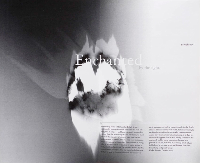
A student's interpretation of A Dream by Franz Kafka, from Druckrey's capstone course centered around narrative at The University of the Arts, Philadelphia
For anyone endeavoring to understand form at the sensory level, drawing must play an integral role. With its insistence on the coordination of hand and eye, drawing nurtures both calligraphy and the design of letters. But all of these endeavors must be undertaken with a feeling for form. Ken Carbone, partner in the respected New York firm, the Carbone Smolan Agency and who appears in the film, attributes his passion for drawing, his weekly figure drawing sessions, and his addictive commitment to filling countless sketchbooks, to his drawing class with Inge. Her students begin with observational drawings of a six-by-six-inch cube in space. They draw the cube freehand from various angles. It is the most basic of exercises to train the students to analyze space and structure, to intuitively understand and then to rationally construct on object. Students progress to more complex objects until they are drawing organic objects and scenes from nature. It is a revelatory experience for the students, not unlike the study of music — the eyes of the artist must be as acutely attuned to their task at hand as the ears of the musician must be to the slightest variance in sounds.
In the 80s, Druckrey teaches a course at Yale with renowned type designer Matthew Carter, creator of the Galliard, Bell Centennial, and Verdana fonts. Inge realizes that she has a special talent for teaching letterform design. She believes that typefaces derived from calligraphy, from handwriting, contain an evocative quality not found in other more mechanically inspired fonts. The film offers as evidence the 2005 Stanford Commencement Address by Steve Jobs. He extols the importance of his taking a calligraphy course at Oregon’s Reed College. “I learned what makes great typography great. None of this had even a hope of any practical application in my life… If I had never dropped in on that single course in college, the Mac would never of had multiple typefaces and proportionally spaced fonts.”

A student's compositional studies using lines, from Druckrey's basic design course at The University of the Arts, Philadelphia
As part of Druckrey’s introductory letterform curriculum, she integrated the pencil mark exercises from her student days. In addition to controlling the form, spacing and rhythm on paper, the students control the pressure that is applied to each line. Each line is to be dark at the beginning, light in the center, and then dark at the other end. Nancy Mayer, a student from Druckrey’s Yale days, remembers her challenges with letterforms, but is quick to remember her proclivity for putting these “Inge lines” down on paper. “This was just purely visual. There was no content. It was just lines,” she says. So, just like the piano student who practices scales and arpeggios absent any melody, the design student practices the coordination of eye and hand unencumbered by what these lines could mean. The lines are just presences, and if they are evenly spaced and transition from dark to light to dark again, they will form a beautiful rhythm on the page. By isolating the study of form from content, students can experiment more freely, and then use this insight to construct messages in their professional work.
What we realize in watching the film is that there is no math; logic is redefined as “visual logic.” No mechanical measurements. In the end, it is the eye that directs the action. You cannot mechanically measure organic forms or evenly letterspaced characters by measuring the distance between them. That counter-intuitively produces uneven optical spacing. Instead, the space must be felt; it must be seen.
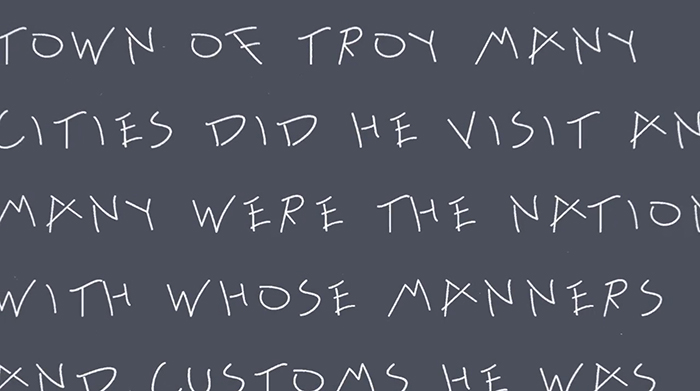
At The University of the Arts, Druckrey designed an advanced course that aimed to teach the students how to design their own typeface, creating a real, working font. Students draw inspiration for their designs from their own curiosity and imagination, merged with their observations of the evidence of letters that mark the world outside of their studio. It might be the gesture and visual language found in Korean or Indian script; it might be numbers from a parking ticket; the handwriting of a roommate, or letters scratched into wet concrete. Homer’s Odyssey was set in the typeface derived from the figures in concrete to compare the primacy of these gestural marks to early Greek writing styles. The students begin to understand how to create a common structure throughout an alphabet: how to make each character unique but still connect to the traditions of these glyphs within the vast history of these primal forms. Finally, each student must space the characters and “set the face”, so that it is readable.

A student's alphabet design based on marks made in wet cement, from Druckrey's type design course at The University of the Arts, Philadelphia
If there is a break in the flow of the film, it is more like a bend in the river. Here one visits Inge Druckrey’s masterpiece — a poster for a Beethoven concert given by the Yale Symphony Orchestra. It is deceptively simple in form, but manages to do what every designer aspires to do: it has the immediacy to communicate and the complexity to stay within the viewer’s consciousness — to be remembered, pondered, and analyzed. In this classic image that has achieved iconic status in design history, the formal rationale is subtle, yet complex. Druckrey provides an overview of her thinking. The large letter “B” filled with Beethoven’s notation in an original manuscript from the collection of Yale’s rare book library inexorably fades into to a black field suggesting Beethoven’s swings from periods of depression to episodes of intense creativity. The typographic abstraction is not immediate, but with careful observation one discovers her interplay of the message hidden in the negative spaces with a sense of personal satisfaction — an ode of sorts, to the abstraction found in Beethoven’s music and his conscious use of silence in his compositions. It is this kind of commitment to nuance that takes this design into another realm — the realm of art.
At a recent screening of Teaching to See at The University of the Arts, Kris Holmes, the internationally recognized calligrapher and type designer, moderated the question and answer session. When Inge was asked, “What do you see 50 years from now?” She responded, “I fear the loss of writing. It’s such an enjoyable experience and teaches you how to see.”
Inge Druckery is that very rare teacher who has given flight to talented and grateful students, for she has offered to them a part of her intellect and her soul. It is both a contemplative and expansive way of proceeding through the world. She lives and feels what she gives. She is art and passion, and Teaching to See illuminates an important part of living and breathing that we often don’t notice. Chris Myers, chairman of the graphic design program at The University of the Arts says at the conclusion of the film, “You have to perceive deeply.” Viewing the film, we realize that we would like to.
