
As a young designer, recently graduated from college and stuck in a series of dead-end jobs, Richard Poulin, the author of Rational Simplicity: Rudolph de Harak, Graphic Designer, was at a loss as to what to do next. In a move that serves as a lesson for anyone starting out, he decided to list the ten designers in New York City that he most admired and send them letters in the hope that they might agree to a face-to-face interview where he could ask for some advice.
Top of that list was Rudy de Harak, and much to Poulin’s surprise, the revered designer said yes. Armed with a portfolio that he had laboured over for six months, Poulin met the designer in his office. They hit it off, and soon he was working for de Harak, a relationship that set him on the path to a career in design that he remains on to this day.
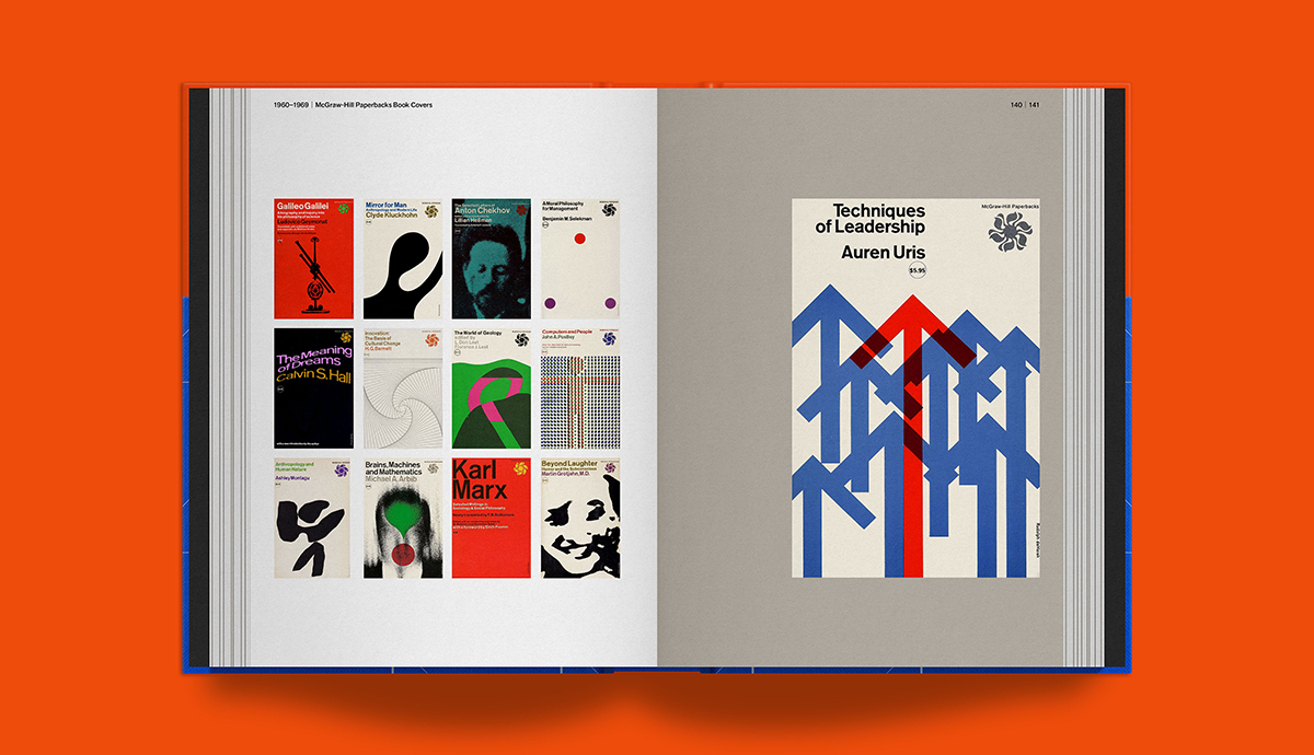
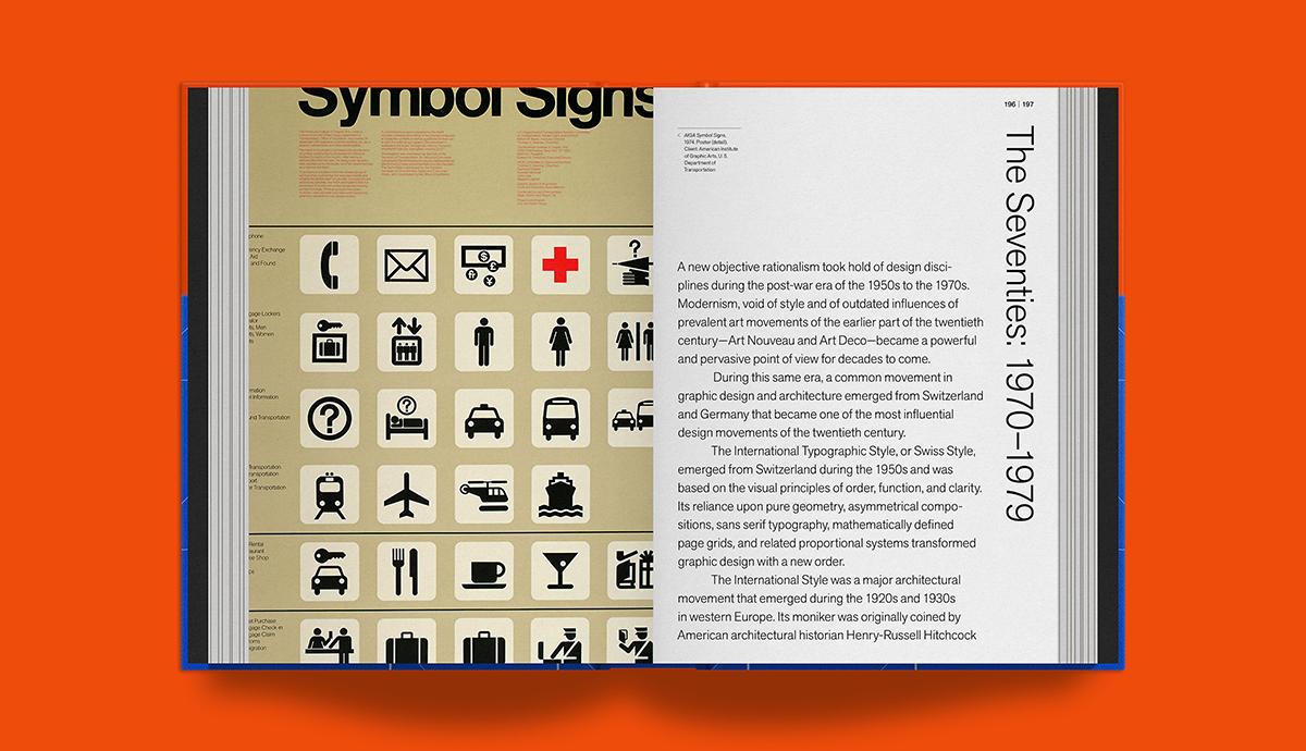
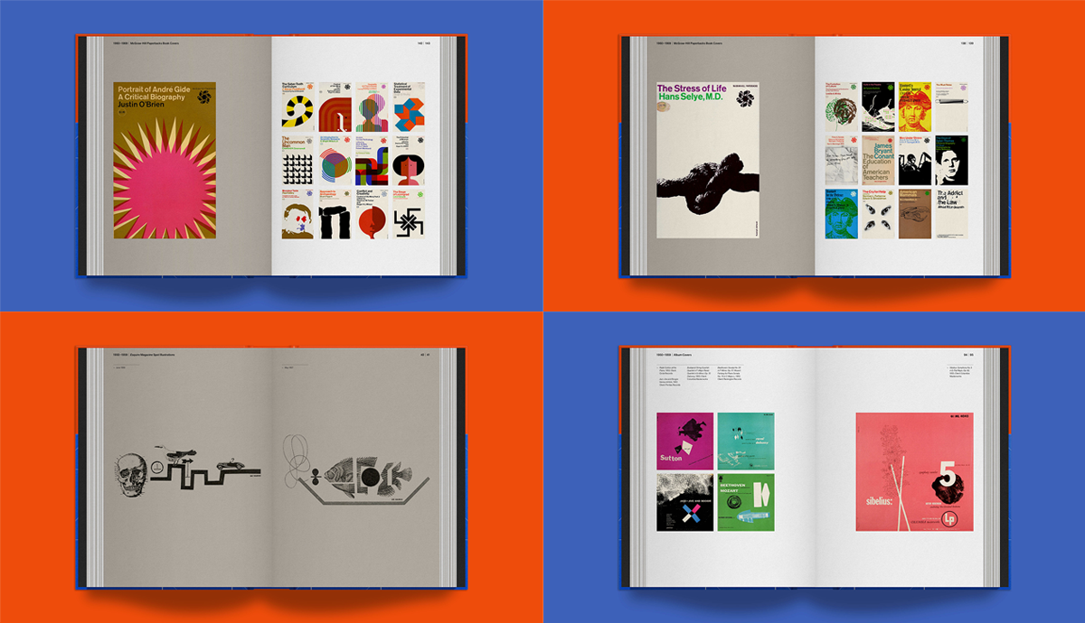
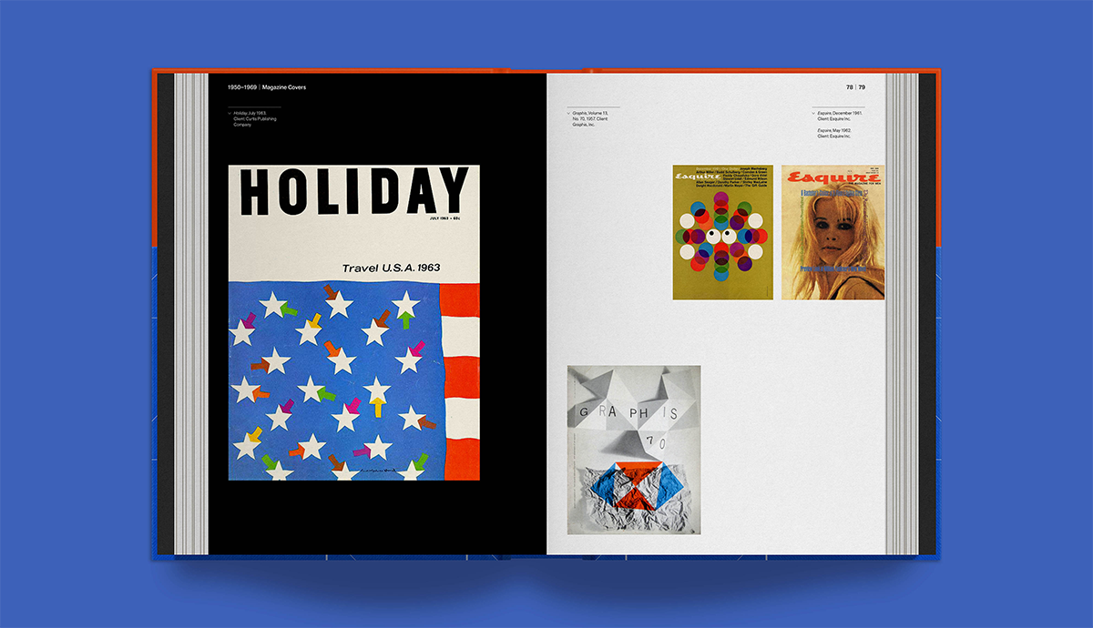
Forty years on from that initial meeting, Poulin has designed and written the long-overdue first comprehensive monograph of de Harak’s work. Richly illustrated with his seminal mid-century work, it includes book and magazine covers, exhibition and spatial projects, industrial and furniture design, and everything else in between. Currently funding on Volume, the book is a 408-page celebration of more than five decades of work, printed in six colours on two paper stocks.
“De Harak is one of the unsung heroes of mid-century modernist graphic design, and design in general, and he had a very definitive and unique point of view, but it was really never celebrated,” Poulin explains. “And he was a very influential teacher of graphic design for close to forty years [at Cooper Union, Yale University, and elsewhere]. He influenced generations of graphic designers.”
Design Observer caught up with the author as the campaign to fund the book kicks off, to hear more about how he first discovered the work, his unique working relationship with de Harak, and the man himself.
When did you first come across Rudolph de Harak’s work?
When I was at school, I worked five days a week for four years in the art and architecture library of Pratt Institute. So, my education, in many ways, was spending time with all these incredible books. And that’s where I first came across the work of de Harak. One of his major projects that really had an impact on me was 127 John Street in downtown Manhattan in the Financial District. It's where he was given the opportunity to redefine and reimagine the urban landscape and the lower facade of an office building, which was just a generic modernist steel and glass building. One day while I was visiting my mother who worked in the building, I saw for the first time his three-storey high digital clock and the building entrance — an aluminium tunnel lined with blue neon. I was in high school at the time, so I didn't really know what graphic design was, but it was truly a memorable experience and made a lasting impression on me until I met him.
What was it like working in the office of one of your heroes?
I started working for him in 1980. We worked together for nine years, but it was almost like working for him for double that time because it was a very intense period. He took me under his wing, and fortunately for me it was also good timing as the office was going through many different changes and I was given many opportunities. Without exaggerating, I literally worked six days a week with him. It was not a 9-to-5 job — I mean, no design job is — but I did everything. It was a wonderful, enlightening and educational experience. I came in as an entry-level staff designer. We were organised in three teams, but everyone did everything. And if you didn't understand something, or didn't have a certain skill, you were taught. It was very much organised as the more traditional atelier studio. It was a very nurturing environment. Since it was my first real job it was intimidating and overwhelming at times, but I knew I just had to dive into the deep end of the pool. Rudy was very much like that. He was very intense, and he could be very intimidating and demanding. But if you were able to deal with him and understand where he was coming from — because it all came from really a passion for design, and a passion for solving a design problem — then you could work with him in a very meaningful way, and also learn a great deal.
The work still looks as fresh now as it did at the time. Why do you think that is?
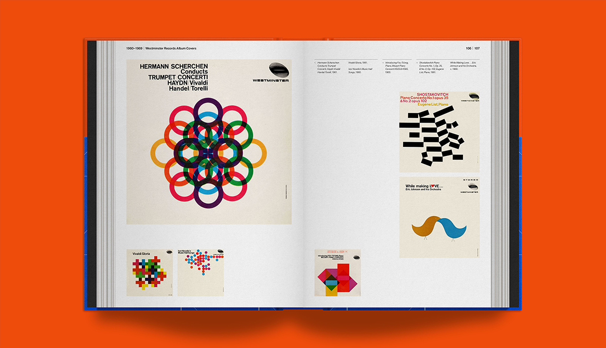
One of the main reasons why his work has held up so well is that it goes back to the modernist ideals that Rudy followed throughout his entire career. If you look at the early work, such as the Westminster album covers, or the McGraw-Hill book covers, or even his later work, like the Metropolitan Museum of Art Egyptian Galleries or Bookstore shopping bags, they're really timeless. And I believe, and I know he believed, that it was because he always looked for the essence in any design problem, and I'm quoting him now “the hidden order” of what that design problem was, what that narrative was, what that story was, and if you really paid attention to it, the solution would come to you, in a very obvious way. And rather than approaching it in a stylistic way, or more trendy way, that you would be able to rely upon modernist tenets and values of what that story should be graphically, or three-dimensionally. Bring it down to the essence of what it can be, and then people can react to it in a very primal and honest way. For example, on the album cover for Sound of the Alps he just used three bold, black brushstrokes that went up and down in a mountain-like fashion. It was that visual energy and purity and simplicity that you can make a connection to. I think that is very emblematic of his approach. It's timeless because the things that he relied upon we still rely upon as designers today.
Can you give us your best de Harak anecdote?
There’s not a specific incident I can quote per se, but so much of Rudy's work has been identified as pure, simple, rational. Many times, when you hear those words, people tend to think cold and impersonal. He was the extreme opposite of that, just in terms of his personality. He loved film, he loved jazz, and he loved the vitality of life. Just consider the kaleidoscope of flags, and banners and urban furniture, and the colour palette he used for 127 John Street. He created a circus-like environment of fun and visual excitement. And that's really what Rudy was all about. He possessed a humanistic point of view throughout his entire career and with all of his work that had real depth in its simplicity and spirit.
Why should design lovers pledge for a copy of the book?
Rudy’s work is phenomenal. It's rich, vibrant, and dynamic, and it certainly creates a wonderful visual story. At the same time, the narrative of his life is really important in terms of the struggles he had, how he arrived at certain points in his career, and the points in his career in relation to what was happening in the history of graphic design in the mid-50s, as well as what was happening in New York City, and in related disciplines, such as architecture. I'm trying to tie all that together, because I really think it is a very unique and exciting story to tell.
Click here to back the project on Volume and secure yourself a copy today.
