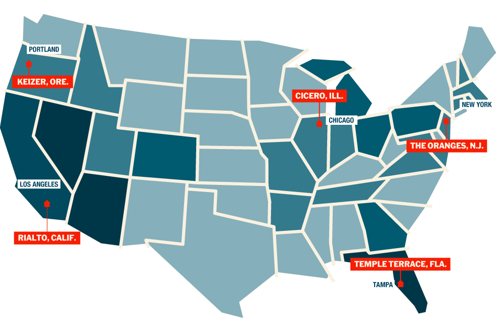
“Foreclosed: Rehousing the American Dream,” assigned interdisciplinary teams to five different I.S. suburbs (courtesy MoMA)
Last week, the Museum of Modern Art opened “Foreclosed: Rehousing the American Dream,” the second in an ongoing series of exhibitions exploring issues in contemporary architecture through what might be termed extreme charretting. The first exhibition in the series, “Rising Currents,” looked at how architecture and landscape architecture might react to and mitigate rising sea levels in New York Harbor through adaptive, “soft” infrastructure. (When Hurricane Irene came to town last August, it all seemed very prescient.) But even before that dodged bullet, “Rising Currents” succeeded in combining design and the public in multiple ways. Teams worked out loud at PS1, giving midstream presentations of their research; the project generated ideas that were then studied (at least) by public officials; MoMA’s Architecture and Design department injected itself into a broader public discourse than it had for some time. It seemed like a fresh and winning formula (Mimi Zeiger’s optimistic review for Places is here).
“Foreclosed,” which followed the same format of open studios and public presentations from May to September 2011 (covered on the MOMA blog), now culminates in an infographic-heavy exhibition on MoMA’s third floor, and opened the same week as the Obama administration announced new standards for how banks treat those in foreclosure. It also seems prescient. But I wonder if the museum, and the five interdisciplinary teams, haven’t tried to do too much in to a nine-month process, and into a single gallery. A preliminary read suggests terrific unpacking, but many question marks before we're able to put American housing back together.
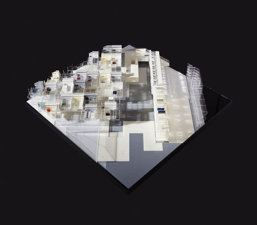
Architectural model, plan view, for Visible Weather’s Simultaneous City project for Temple Terrace, Florida. Photograph courtesy of James Ewing. © 2011 James Ewing
“Rising Currents” had an integrated map, with overlapping and familiar sites around New York Harbor. Here, the sites are five dispersed suburbs in California, Florida, Illinois, New Jersey, and Oregon. At MoMA none are presented as particularly interesting visually (though there’s a certain amount of bleak "as is" imagery in the online presentations), but as interesting data sets, illustrative of specific suburban problems. There’s growth versus open space, new models of the family, high unemployment and low levels of home ownership, abandoned subdivisions. If you are in New York, it is worth going to the exhibition in person, but only a very patient visitor would be able to absorb the materials, ranging from The Buell Hypothesis (“Change the dream and you change the city.”), each team’s statement of purpose and diagrams of their site, plus hours of video, at the museum. Most of the material is online, and frankly more comfortably accessed in parts and while seated. (Do I sound old? A knee operation will do that to you.)
For me, the most interesting shared idea in "Foreclosed" came in the form of lists. The task embedded in “Simultaneous City,” the project led by architects Michael Bell and Eunjeong Seong of Visible Weather is the identification of what people really like about suburban living and the question, Can they do that with less? Their list includes outdoor space, privacy, and room to move. Their solution involved a higher-density, energy-efficient mixed use development, owned in common by the citizens via a public REIT.
(Please wait while the video loads.)
Across the room, WORK Architecture Company’s “Nature-City” (a play on Ebenezer Howard’s hoary Garden City) was accompanied by Wieden+Kennedy-produced ads whose taglines revealed the nexus of economic, designer and environmental desire. “Be roommates with nature.” “Waste doesn’t get wasted.” “Your house doesn’t look like every other.”
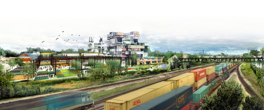
Rendering of Studio Gang Architects’ The Garden in the Machine project for Cicero, Illinois. Image courtesy Studio Gang Architects.
Studio Gang’s “The Garden in the Machine” (with due credit to Leo Marx) graphically breaks down the changing needs of the majority immigrant inhabitants of Cicero, IL, asking “What if the bungalow could be taken apart and sorted into separate pieces: bedroom, kitchen, lawns, and reassembled as needed?” Their proposal, also described in an op-ed in the New York Times written by Jeanne Gang and Greg Lindsay, is to take the grounds and materials of an abandoned factory and create the Recombinant House, where it is possible, structurally and financially, to add a bedroom for a new child, subtract one for the empty nest, share yards and attach a home office. The traditional home v. office zoning of the suburbs, they argue, is part of what is holding suburban economies back.
What is it that you really need? the architects ask. And How long will you need it? Their responses are flexible spaces and flexible financial instruments, a clever response to the frustration one feels over homeless here and empty houses there, people with too much space and those with too little. These are necessary questions, and there is no doubt architects need to be involved from the beginning with finding answers. The fact that every team felt the need to redesign the ownership structure of the suburbs, as well as the suburban home, indicates a willingness to go beyond the aesthetic that is one of the best reveals of this MoMA series.
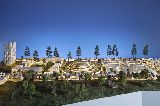
Architectural model for WORKac’s Nature-City project for Keizer, Oregon. Photograph courtesy of James Ewing. © 2011 James Ewing
And yet, one can’t discount the aesthetic. I can’t visualize an REIT, can you? And the museum clearly felt they couldn't exhibit one. Part of the rationale for bringing architects in early is not just to shake up the suburban form, but to offer a visible alternative model. Deconstructing the bungalow is all well and good, but what if I love my front porch? When you ask me to live with less, how much are you really taking away? Which is why the models, which dutifully occupy the center of the gallery, are such a disappointment. Instead of getting me excited for a hybrid town-country, work-play, walk-bike future, they read as architectural shorthand. The recent vogue for shipping container architecture has made the studio practice of treating program as blocks as a form of 3D sketching into real buildings. Too many of the models looked like stacks of blocks, dressed up with transparent panels.
The curators insist, and rightly, that these are not blueprints but visions. But the visions on display, by and large, replace knee-jerk saltboxes with knee-jerk contemporanaeity. It is more modern, but is it appealing? Once you've visioned something, it is very hard to tell people to un-see. Diana Lind wrote a fairly heated denunciation of the exhibition at Next American City; I didn’t feel the architects involved “demonized” the suburbs, but I also didn’t see a natural bridge between the visions and blueprints. I wonder if the show might have been stronger if it had stopped short of asking the architects to build new towns, which end up looking and sounding a lot like new Brooklyns. Three stories, home offices, granny flats, walkable. That's my life, but many of my friends don't want it.
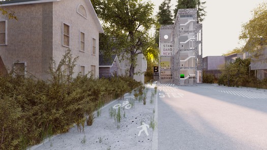
Rendering of MOS’s Thoughts on a Walking City project for Orange, New Jersey. Image courtesy MOS.
WORKac’s model has the benefit of scale, with rowhouse piers and a spiral Compost Hill (only in Oregon) with shades of Frank Lloyd Wright’s automobile objective. But even their model seems slightly cartoonish, with spongy low slabs and towers with house-shapes cut out, as if to allude to the disappeared dream. Studio Gang’s factory-into-suburb, as modeled, reminded me of Dia: Beacon, lovely but precious.
As Justin Davidson pointed out in New York Magazine, there’s still a chasm between urban architects and suburban architecture, and part of getting out of the foreclosed mess is not only creating a better checklist but one in a form people are willing to buy, rent or lease. That’s why the Wieden+Kennedy ads were so brilliant. Impossible to look away, they offered you an emotional investment in the new American dream … without having to show you the house.

Architectural model for Zago Architecture’s Property with Properties project for Rialto, California. Photograph courtesy of James Ewing. © 2011 James Ewing
