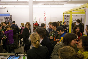
Opening night of the “Forms of Inquiry: The Architecture of Critical Graphic Design” exhibition at Casco, Utrecht, January 2008
The Audio-Tooth Implant receives digital signals from radios and mobile phones and transmits the sound along the jawbone to the ear. The conductive foam Electro-draught Excluder can be used in the home to deflect stray electromagnetic fields. The purpose of both of these hypothetical products is not to perform a function in the conventional sense, neither as a product nor a source of information. Rather, they are intended to be provocations or hypotheses through which their designers can collect the responses of the people who use them.
“Critical design,” as outlined by its key proponents, the interactive designers and educators Anthony Dunne and Fiona Raby, is design that, through its form, can question and challenge industrial agendas; embody alternative social, cultural, technical or economic values; and act as a prop to stimulate debate and discussion amongst the public, designers and industry.
The growing interest in critical design can be seen in a number of exhibitions dealing with this emerging genre — last year’s crop included “Don’t Panic: Emergent Critical Design” in London and “Designing Critical Design” in Belgium. Strangely, neither addressed graphic design. And the practitioners associated with it, such as Elio Caccavale, Noam Toran or Martí Guixé, come from product, industrial and interactive design backgrounds. As critical design gathers momentum, where is graphic design?
The “Forms of Inquiry: The Architecture of Critical Graphic Design,” exhibition was held at London’s Architectural Association last fall, and is now on its way to further venues in Europe and the U.S. Curated by Zak Kyes, art director at the AA, 19 graphic designers each submitted a representative example of their work along with a new piece — an “inquiry” into an aspect of architecture. While the explicit aim of the exhibition was to explore the intellectual and formal crosscurrents between graphic design and architecture, its subtext is the notion that the practice of graphic design itself can be “a specifically critical activity,” as the catalog essay puts it. So far, so interesting, but what exactly do the exhibition’s organizers mean by the term “critical” and, beyond the confines of this particular exhibition, does this represent a viable new direction for graphic design?
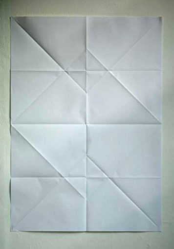
Manuel Raeder’s inquiry into flexible and ephemeral architecture, “Forms of Inquiry” exhibition
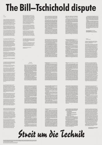
John Morgan’s inquiry into the 1946 Bill-Tschichold debate over the future of Swiss design, “Forms of Inquiry” exhibition
“Forms of Inquiry” does not reference Dunne and Raby explicitly. Yet in several respects the exhibition syncs with their ideas about “critical design” as something unfettered by medium and existing in parallel, and sometimes opposition, to regular industry-driven design practice. Graphic design in this exhibition is a contingent, shifting and insubstantial entity. The designers create unsolicited proposals for unspoken problems and, where they use formats that are recognizable as typical graphic design, things like magazines, newspapers and posters, none of them functions as one would expect. The posters, for example, don’t promote anything—one, by the German designer Manuel Raeder, is completely blank and another, by John Morgan, contains the text of two whole articles, making them almost impossible to read. Rather than being public and overt, here graphic design verges on introspection and obscurity. And that doesn’t mean that it’s art, although some of the participating designers do also practice as artists.
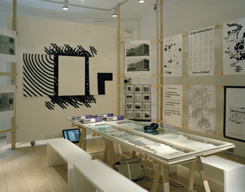
“Forms of Inquiry” exhibition at Architectural Association, London, October, 2007
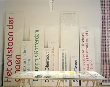
“Forms of Inquiry” exhibition at Casco, Utrecht, January 2008
In the catalog essay Kyes and his co-author Mark Owens choose the word “inquiry” in connection with this exploratory work, rather than another word such as “research.” “Research,” they say, is associated with the “paradigm of scientific data-gathering and problem solving.” “Inquiry” fits their purposes much better since it “suggests an almost anti-methodological methodology — posing questions and pursuing paths without necessarily knowing where they will lead.” That the authors prefer the term “inquiry” over “research” is perhaps a matter of semantics. That they prefer modes of investigation that are “intuitive,” over those that are “analytical,” is less straightforward.
What exactly is an intuitive investigation anyway? It seems to me that intuition is an important component of all kinds of research. Having a hunch about something is the motivating force that gets things going, but it isn’t enough to sustain an entire program of research. And yet the organizers of this exhibition give short shrift to practices that are pivotal to actual research — practices such as data gathering, analysis and interpretation. They are more interested in another meaning implicit in the word intuitive, which has to do with knowing things or finding things out through making. Can the practice of graphic design itself be an investigative tool?
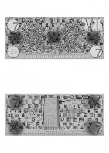
Metahaven’s inquiry into the collapse of Building 7 on September 11, 2001, “Forms of Inquiry” exhibition
The members of the Dutch-Belgian collective Metahaven (Daniel van der Velden, Vinca Kruk and Gon Zifroni) are extremely interested in the concept of research — their full name is Metahaven: Design Research. What began as a side project grew in importance for Van der Velden: he quit his day job as partner in a successful Amsterdam design firm, precisely so that he could concentrate less on client-commissioned work and more on self-propelled research. Metahaven is inspired by architecture’s capacity to make models and proposals as entities in themselves, independent from actual buildings — what is known as “unbuilt” architecture. This approach is most famously exemplified by avant-garde 1960’s and 70’s collectives such as Superstudio in Florence, whose anti-architectural practice took the form of photomontages, sketches, collages and storyboards.
Metahaven is curious to see if they can apply the qualities of “unbuiltness” to graphic design. Using a range of media associated with both architecture and graphic design, including models made of Pringles tubes and books and the paraphernalia of nationality such as stamps, flags, and passports, Metahaven produces proposals, which reflect on the iconography of power in a globalized society. Their contribution to the “Forms of Inquiry” exhibition focuses on Building 7 of the World Trade Center complex. This building also fell on September 11, 2001, but without being hit by a plane, giving rise to all kinds of conspiracy theories about its collapse being the result of a controlled demolition. Paradoxically the non-descript building only gained iconic status through its destruction. Metahaven made a long two-sided poster-like proposal, tall and thin, in the proportions of the building. Each side presents an intricate composition of logos and data concerning the building, representing the intersection of what they call the “logosphere” and the “infosphere.” On the second side the image of the building is missing, its shards, some in the shape of countries, almost obliterate the underlying collage of data.
The key to Metahaven’s work, they say, is “the connection between architecture, iconography and the political.” Whereas some of the pieces included in the exhibition merely refer to their subjects rather than actually researching them, in Metahaven’s case, it’s clear they’ve done the legwork. The piece certainly makes one question the function of a poster, and consider the odd circumstances of the destruction of Building 7. On paper, at least, graphic design appears well suited to the task of critique. It seems as if it would be much easier to pose a critical question through a poster than through a piece of furniture, for example. But when it comes to obtaining responses to a question or hypothesis, product design seems to have the lead on graphic design.
Critical design in the form of objects and devices may lack precision, but the results can be specific, idiosyncratic and poetic. Because product design exists in physical space, it forces participation, or at least a reaction, from those who encounter it. When Dunne and Raby inserted eight objects, that resembled furniture but that also contained various sensors, into eight different homes, they were able to monitor their new owners’ responses to them through photography, diaries and interviews. Observing peoples’ reactions and responses to a question posed in the form of graphic design, on the other hand, is much harder. So, as critical graphic design evolves, its inquiries broaden, and the conversation moves beyond the gallery, one of the challenges remaining for graphic designers is to find new ways to understand and incorporate the responses of their viewers.
