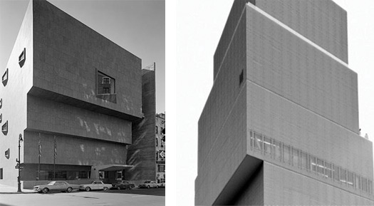
Back when I was in high school, some 25 years ago (ouch), the Whitney was already mired in controversy over its expansion plans. Michael Graves was the culprit then. Rem Koolhaas would come along in later years, and Renzo Piano after him. Marcel Breuer's gray granite fort somehow resisted all comers, a fact for which we should all be very glad.
The Whitney has never given up its dreams, however, and now has its eyes on a plot at the foot of the High Line in the Meat Market, with Piano as designer. I hate to think of the Whitney decamping from the Upper East Side, though I can appreciate the museum's desire for more gallery space. A satelite downtown sounds appealing, but like many of the trustees, I fear the costs of operating it might be prohibitive.
The Guggenheim's downtown outpost didn't work out. When big plans go awry, it's always the little guys at a museum — the registrars and librarians and designers and guards — who get stuck with the brunt of the pain. The news about the Whitney's expansion drew a rather splenetic response from Times art critic Roberta Smith, no fan of Breuer's building. It has, she wrote, "all the disadvantages of starchitecture and few if any of the rewards. Even in a country where museums are rarely designed with art in mind, it stands out as relentlessly unforgiving to works of all styles and periods. If the stone floor doesn’t kill, the oppressive overhead concrete structure almost undoubtedly will.
Unlike the Guggenheim, the Breuer building is not considered a must-see destination by tourists, regardless of what shows are on view." I'd just like to add my voice to those who find that opinion — and the nasty tone in which it is voiced — objectionable. Yes, the building has a brooding profile, but I've never found it resistant to art. The Whitney has a personality, and it actually belies first impression. You cross over that moat, and it's like you're in a place out of time. It's not oppressive. It's the one New York museum that has a sense of humor, that doesn't have airs. MoMA is Imperial. The Goog is chic. The Frick and the Morgan are old money. The MET is an encyclopedia. The Whitney? It's Calder's circus, Stuart Davis, Oldenburg's soft toilet, all those biennials that everyone hates — it's the 1962 Mets of New York art museums. (Those '62 Mets, incidentally: owned by a Whitney.) It even has its own scent. The Whitney smells like no other place in the world.
Perhaps I'm jaded by my own history, but I happen to think Breuer's stone flagging and concrete ceilings do just fine for art, thank you very much. Idiosyncratic? Sure, but that's okay. I hate to think that the only way to look at modern art is in giant white-walled warehouses. As for popularity, the place seems to be doing pretty well tourist-wise: that's part of the reason it wants to expand. (And apparently the folks in Vegas think it's pretty iconic.) Smith doesn't like Sanaa's New Museum any better; its galleries are "horribly proportioned and oppressive in their lack of windows." Well, I agree that the galleries are a bit claustrophobic, as I wrote in a recent piece on Design Observer, but, again, let's not get crazy. I like our two museums. Quirky ain't a bad thing. It's us.
