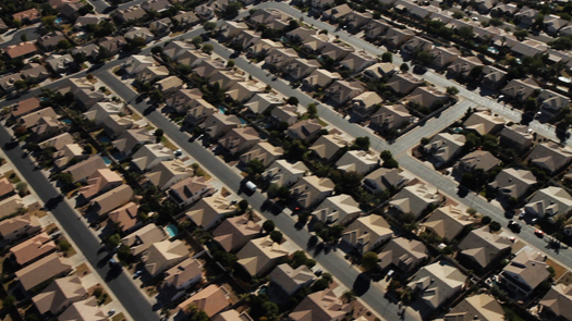
Phoenix suburbs (most images courtesy Urbanized)
What can you say about cities in an 85-minute documentary? In Urbanized, third in director Gary Hustwit’s design trilogy, a little of everything and not much. Theme after theme — sanitation, housing, bus rapid transit, bicycles, parks — each connected to a single city by a specific talking head, is raised and then dropped. We drift in space and in time, transitions often made by a felicitous reference that sends us from continent to continent. We don’t build from small-scale, ground-up interventions, like community gardens in Detroit, to large-scale professional efforts like city planning chair Amanda Burden’s rezoning of New York. We don’t move in spatio-economic terms from the slums of the second and third world (Mumbai, Cape Town, Bogota) to the towers of Beijing. Or vice versa, tracing bus rapid transit in New York back to BRT in Bogota (or, for that matter, in Curitiba, Brazil, a previous international favorite with trickle-up ideas). Only in one case, Elemental’s Chilean low-income housing project, do we see numbers. Nothing builds, except a simultaneous sense of wonder and frustration. After an hour, I was restless, as it was hard to sustain feature-length interest without a story arc.
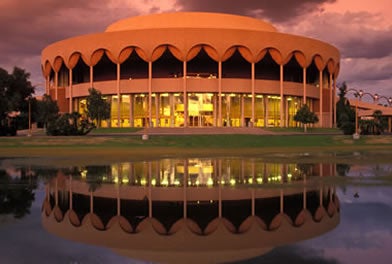
So when Grady Gammage Jr.’s round, pink face appeared on screen, I laughed. Here was a man with an urban story to tell. A lawyer and real estate developer in Phoenix, Gammage is the son of Arizona State University’s expansion president Grady Gammage, who grew the school, physically and architecturally, in the postwar years. ASU’s expansion in Tempe coincided with that of neighboring Phoenix, as both cities extended into the desert and became (their role here) extreme symbols of suburban sprawl. Gammage Sr.’s crowning architectural achievement is perhaps Frank Lloyd Wright’s worst building, a performance fantasia in brass, pink stucco and circles now known as ASU Gammage.
 Detroit people mover
If Urbanized director Gary Hustwit had been looking for a narrative, here was one ready-made. The birth of Phoenix from the desert as a one-story town. Wright’s Broadacre City in action, an acre for every family, a spaceport for every public building. The development of car culture and the drive-through. Racial politics. The foreclosure crisis. Community-building architecture that works, like Will Bruder’s Burton Barr Central Library. A public transportation system that doesn’t.
But what do we get instead? A few minutes of Gammage as Urbanized’s one obvious villain, chuckling as he tells us he likes what he has: “I live on a 3/4 acre lot and I like my backyard and I like my swimming pool. And I think living in a condo would be cute and interesting, and I'd like to do it about two months out of the year, but I like the way I live... so there you are, that's really what it's all about, at the end of the day.”
(He also cleverly manages to characterize his enemies by well-placed geographic and cultural cues: "The main negative of sprawl, as it is used as a pejorative term to me, is it spreads everyone out over a larger area of land, and eats up the bucolic, rural villages of... Vermont, by overrunning them with subdivisions, and that that would be a better lifestyle to preserve. So there's a perception, if you listen to NPR, that sprawl is always bad, and Phoenix is a poster child for bad sprawl.”)

ASU Gammage (via Arizona State University)
Cut to a drive-by shot of identical single-family houses, sun-struck, a symphony in beige. Then to Georgia Tech professor Ellen Dunham-Jones (cheekbones, designy glasses), trying not to scare anyone: "While I have my preferences of where I want to live, I certainly would never tell anyone I've made the right choice and everyone else has made the wrong choice. But I do think especially with the environmental crisis and issues of climate change, we do as a society have to begin to decide whether some of these choices come with additional costs. It's certainly not about eliminating the suburbs. But we need a different vision, with walkable, compact, connected communities."
Then it is on to Detroit, where we hear from the Brookings Institution’s Bruce Katz and the Georgia Street Garden Association’s Mark Covington, one of the handful of “civilian” talking heads (theme: ground-up reinvention). Then Beijing, with architect Yung Ho Chang and Rem Koolhaas (bigness). Brighton (energy use). Rio (technology). Cape Town (safe routes). New Orleans (community-centered development). Stuttgart (protest).
 Dharavi slum, Mumbai
As he has moved through the design professions, Hustwit has scaled up from a single typeface (Helvetica) through industrial design (Objectified) and now to cities. Each one has followed essentially the same structure, talking heads interspersed with images, one person and one idea leading to the next. No voiceover. No narrative. No critique. And not a lot of style. As Hustwit told Adam Harrison Levy, that’s the way he wants it. But this same technique leads to widely variable results, especially when, as in this case, something terribly important is at stake.
Helvetica was the best because of its limited scope. It wasn’t “Fontified.” Each designer seemed to be talking to the next, because they were all talking about the same narrow topic. Most of them know each other anyway (it’s a small world, type geeks). Objectified seemed more like a greatest hits compilation, with each superstar industrial designer selling themselves — though a few couldn’t be bothered — to the viewer. I remember liking Rob Walker, long before I met him, because he wasn’t selling anything. Only in a longer brainstorming sequence at IDEO, and in an opening montage of how Jasper Morrison’s Air Chair is made, was the behind-the-scenes work of industrial design made visible. The material (in both senses of the word) was uncontroversial — we weren’t yet in the unconsumption, unplastic era.
And now there’s Urbanized. In Levy’s interview, Hustwit says two things I see as contradictory. That his intention was for the viewer (and urban leaders) to create connections, and that the film’s incoherence is on purpose. But how does incoherence help? How can we help? I always questioned the project of making a single film about cities in general. Why not pick one? Or pick parks, or bikes, or housing? A city is not a font, and it is also not a chair, a wastebasket, or a toothbrush. I knew of almost all his examples, and I tried to connect the dots between them, but I failed, resorting to rearranging them like tiles in my head. I give him credit for not making all the news good, but it seems deeply strange to me to touch down in Mumbai, discuss the disastrous sanitation situation in slums, insert fiery quote from SPARC’s Sheela Patel, and move on.
 Georgia Street Community Garden (via GSCC)
The sprawl exchange above (an exchange only via editing) was one of few pointed moments. At times it was often unclear if a juxtaposition was meant editorially. When we hear Detroit community gardener Covington’s voice over shots of the much whiter crowd at Detroit’s Eastern Market, is that meant as critique or support? Or is it merely sloppy? Why did Rem get a few precious moments to complain about the unjustness of design competitions, when I thought we were talking about Beijing? Could an architecture doc possibly be mocking one of the genre’s stars? I’m not sure. And would someone outside the field even care?
Hustwit also fails to use his visuals convincingly. His footage, of cities from the air, of people walking pedestrianized streets, of shiny bauble buildings and abandoned storefronts, is mostly generic. Some of it was, in fact, crowdsourced. Why drive by the houses of Phoenix when we could walk? Why admire the fashionable bikers of Copenhagen one more time, when we could look at the architectural conflict between old and new at the heart of Beijing? Or spend a little more time on a Make It Right block in New Orleans (Malibu-on-the-bayou?). Even when we do see new things, following the heads as they walk (or bike) there’s little attempt to use the visuals to tell the viewer that much more about place.

Candy Chang, "I Wish This Was" project, New Orleans
Urbanized left me with the same feeling of incompleteness as last year’s Museum of Modern Art’s “Small Scale, Big Change” exhibition. I see why critics would argue, in both cases, that it is better for this film or that exhibit to exist. My criticism may seem both useless and aggravating. We should be glad there is a film about the state of cities, one that shows both positives and negatives, one that doesn’t let architects have the last word.
But I also think that Hustwit failed to ask himself a tough enough question before he went around the world. He wants people “to think just a little bit differently”? That’s not enough, and a better film, like a better exhibition, could have advanced the dialogue. His film reflects the incoherence of cities and design’s varied responses to their challenges, but doesn’t create a response. It hopscotches where it might immerse. It goes for the easy laugh at Gammage where it might dig in to how much we are willing to give up. (Where’s Charles Moore when we need him? Why recap Jacobs-versus-Moses AGAIN?) What’s wrong with a house, a yard, a pool? Tell us. Or better yet, show us by spinning a tale of space and place, environment and community that connects emotionally. By eschewing narrative and complexity, Hustwit shows the limits of his form. Urbanized has a more important topic than Helvetica or Objectified, and it is one that requires greater art to make change.
